Dimensions: 12 1/4 x 9 1/4 in. (31.1 x 23.5 cm)
Copyright: Public Domain
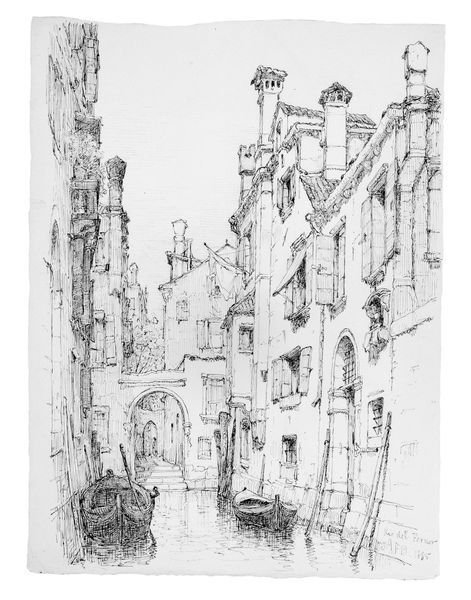
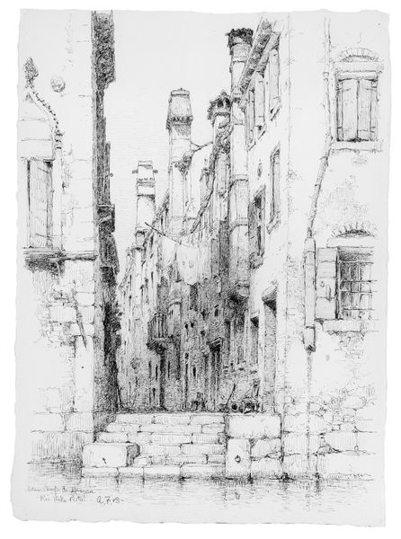
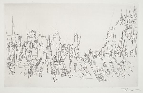
Curator: Here we have Andrew Fisher Bunner's "Rio del Piombo, Venice," rendered in pen and ink around 1885. What catches your eye about it? Editor: It feels remarkably still. Despite all the architectural detail, the sharp lines, there's a quietness to it. Like a forgotten corner of the city. Curator: Precisely. Bunner was part of a wave of American artists drawn to Venice in the late 19th century. Venice offered an escape from the rapid industrialization transforming the United States. It became this timeless, almost mythical place to artists. Editor: And you can really see it in the composition. The artist really directs the viewer's gaze. How would you say it directs our eyes and elicits this specific impression of tranquility? Curator: Note how he uses line and shading to create depth, drawing us down the canal. But it’s not a dramatic vista. Instead, he focuses on the narrow, intimate view between the buildings, capturing the everyday life, almost un-monumental character of the space. It becomes almost documentarian in this way, yet highly intentional about showing a city removed from our daily grind. Editor: There's also something interesting about how he chose to depict this in pen and ink, a very immediate medium, not like the oils commonly associated with Venetian paintings of the time. You look closely, it is full of minute details... the lines, the window shutters... yet all of those elements still give us a broad perspective on the location depicted. Curator: True. And the choice of a black-and-white drawing amplifies that contrast between timelessness and modernity I discussed previously, doesn't it? Stripping away color allows Bunner to focus on the interplay of light and shadow. In that, it subtly speaks to a sense of decline, and reflects Venice’s ambiguous position within the shifting socio-political map of the time. It's like he's hinting that there is more beyond these simple houses he portrays. Editor: The precision is certainly part of that tension, for sure. It is certainly intriguing that he gives attention to specific structural nuances over emotional coloring, per se. Well, looking at it from my perspective has allowed me to perceive Bunner's choice of this overlooked corner as a deliberate decision, laden with social meaning. Thank you. Curator: Likewise! The architectural rhythm created through precise rendering creates a mesmerizing yet balanced vista of its own accord. A great find!
Comments
No comments
Be the first to comment and join the conversation on the ultimate creative platform.