Copyright: Public Domain: Artvee
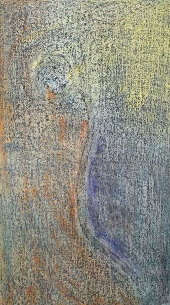
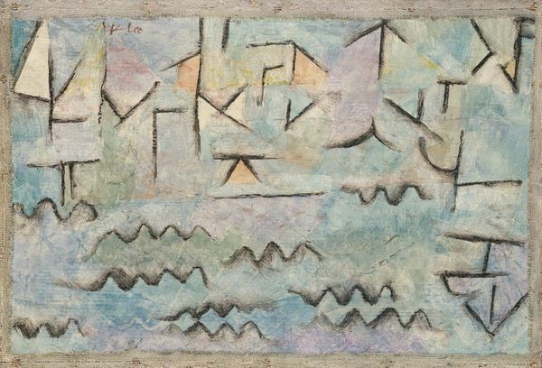
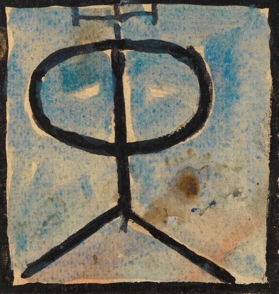
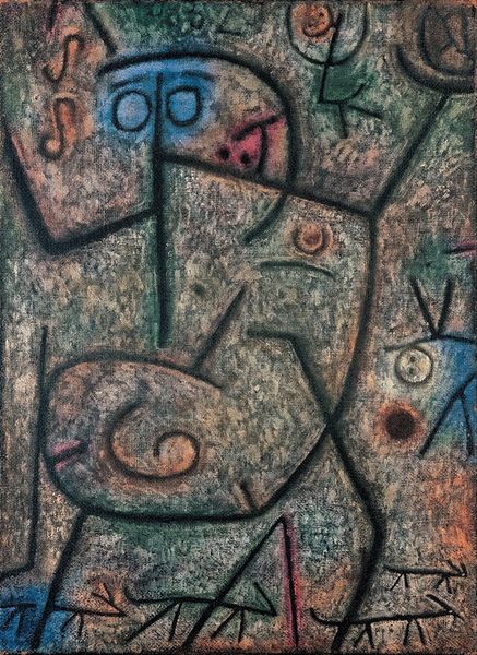
Editor: So this is Paul Klee's "Little Hope" from 1938, rendered in watercolor. It's…unsettling. The lines are so fragile and the colours so muted, it's hard to find a focal point, yet I feel drawn in. How do you interpret this work? Curator: Formally, the work presents a compelling study in contrasting linear elements. Note the juxtaposition of the tentative, almost hesitant, brown lines against the textured ground. This brown linear network delineates several rudimentary shapes which could be decoded as signifiers, albeit vague ones. Can you describe the effect the colour palette has on you? Editor: The pale blues and greens, contrasted by that isolated patch of purplish-red… it feels dissonant, almost mournful. It doesn’t resolve. Curator: Precisely. Klee employs colour not descriptively, but as an autonomous element, independent from representation. How might these dissonances and contrasting planes affect the viewer? Is there a possibility of any representational understanding? Editor: Maybe it speaks to a fractured identity, a sense of longing… perhaps reflecting the turbulent pre-war atmosphere. Curator: An interesting hypothesis. But note the visual relationship, in pure formal terms. Observe how the balance shifts. This interplay forces a reassessment. Is “Hope” really all that little after all? Does the structure belie the title? Editor: I see what you mean. Focusing on just the composition, there’s a sort of defiant strength in the lines that contradicts the apparent fragility. It challenges the surface impression of sadness. I’ll definitely be approaching Klee's works differently going forward.
Comments
No comments
Be the first to comment and join the conversation on the ultimate creative platform.
More like this