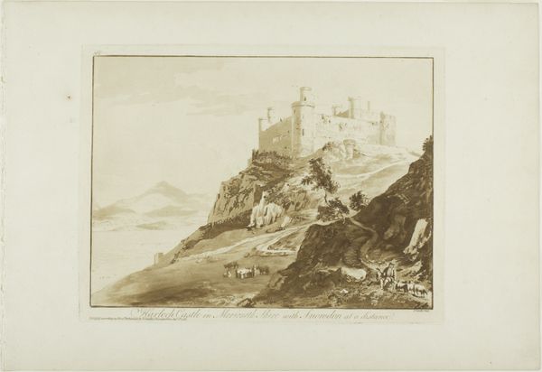
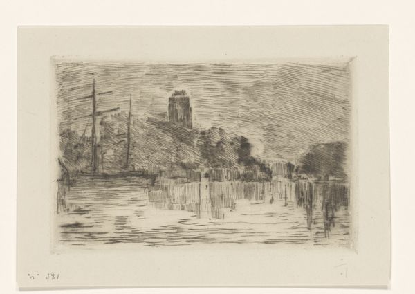
print, etching
# print
#
etching
#
landscape
#
etching
#
cityscape
#
realism
Dimensions: height 297 mm, width 397 mm
Copyright: Rijks Museum: Open Domain
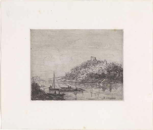
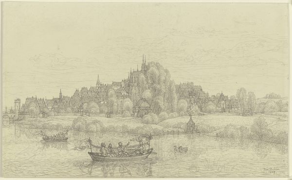
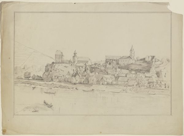
Editor: This is Carel Nicolaas Storm van 's-Gravesande's etching, "Gezicht op Kleef," dating from sometime between 1851 and 1902. It’s currently held here at the Rijksmuseum. I'm immediately struck by how the texture created by the etching brings this scene to life, particularly in the reflection on the water and in the layering of detail on the castle on the hill. How would you interpret this work, focusing on its visual construction? Curator: The success of this etching relies on a complex interplay of contrasting textures and tonal values. Notice how the artist employs short, dense strokes to articulate the rough facade of the castle ruins, juxtaposed against the smoother, horizontal lines suggesting the placid water. These elements create a dynamic tension within the static cityscape. What effect does the light have, would you say? Editor: Well, the subtle gradations of light really seem to unify the composition. It almost feels atmospheric, like a hazy day, but there are sharp lines too. I guess, maybe that combination of light and sharp lines, as you say, that creates an atmospheric effect in contrast to the details? Curator: Precisely! And that controlled use of light and dark, what we call "chiaroscuro", sculpts the forms, adding depth and volume. Note too the stark, singular line of the sailboat mast—a vital vertical element that counterbalances the horizontality of the river, guiding the eye toward the architectural forms that form the subject of this landscape scene. Editor: So, the balance of those contrasting lines adds interest to the composition, I see that more clearly now. It makes the eye want to follow and understand these different shapes and lines! Curator: Exactly, and this deliberate structuring contributes to the image’s success. Each line, each shape, each contrasting application, serves not only a representational purpose, but also fulfills a critical function in the overall visual architecture. Editor: This piece highlights how formal analysis unlocks ways of seeing how seemingly disparate elements function cohesively within an artwork. I learned a lot today!
Comments
No comments
Be the first to comment and join the conversation on the ultimate creative platform.
More like this