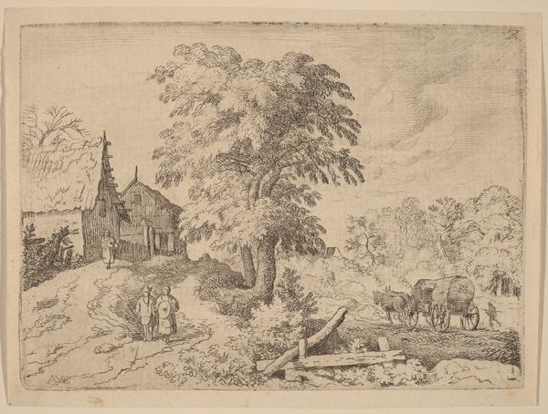
drawing, paper, ink
#
drawing
#
baroque
#
dutch-golden-age
#
landscape
#
etching
#
paper
#
ink
#
cityscape
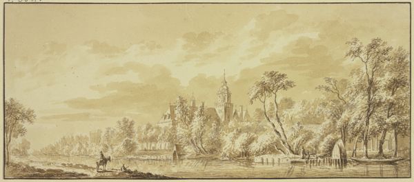
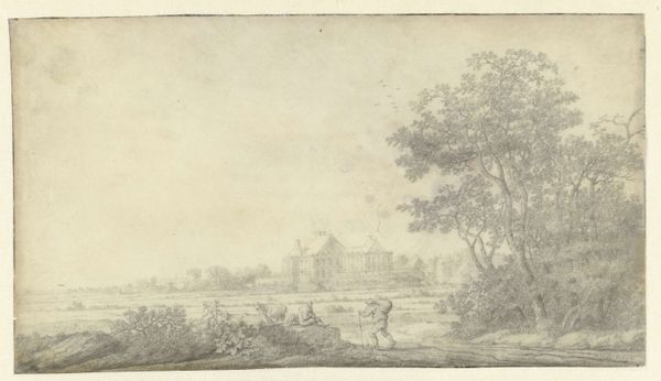
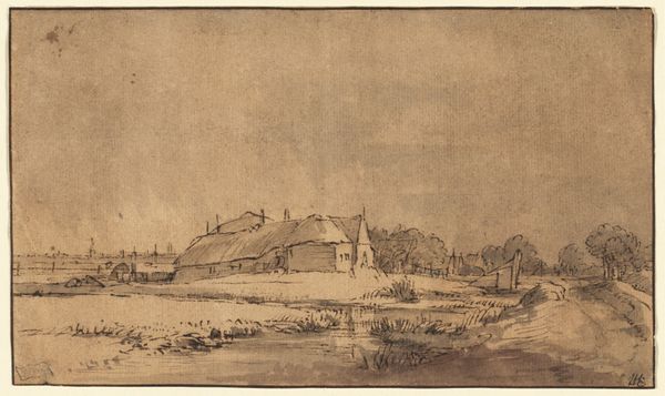
Dimensions: height 97 mm, width 155 mm
Copyright: Rijks Museum: Open Domain
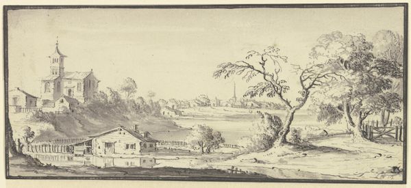
Editor: Here we have "View of the St. Laurenskerk in Alkmaar," a drawing in ink on paper by Jan de Bisschop, created sometime between 1648 and 1671. It strikes me as remarkably calm, with its monochromatic tones and the serene depiction of the church against the landscape. What do you see in this piece? Curator: I observe a careful arrangement of forms, primarily established through tonal variation. The artist's delicate application of ink delineates spatial recession. The architectural mass of the church contrasts sharply with the organic textures of the surrounding trees. Notice how the linear precision used for the building dissolves into softer, more fluid strokes for the foliage. It asks the viewer to contemplate the interplay of light and shadow defining shapes, don't you think? Editor: Absolutely, the light seems to skim across the surface, giving a sense of depth. It's interesting how the church, while prominent, doesn’t dominate the scene. The trees almost seem to compete for visual attention. Curator: Precisely. The composition favors balance over hierarchy. Consider how the artist distributes visual weight—the dark clusters of trees on the right echo the mass of the church on the left. It is almost a dialectical symmetry. Do you believe this tension contributes to the viewing experience? Editor: I think it does, making the eye move around the image and encouraging prolonged looking. I initially thought the artwork's calmness came from the subject matter but realize it also derives from the composition's intricacies. Curator: Agreed. The artist masterfully orchestrated a system of visual relations. We’ve decoded something important today. Editor: Indeed, I have refined my analytical skills through our shared perspective. Thank you.
Comments
No comments
Be the first to comment and join the conversation on the ultimate creative platform.
More like this