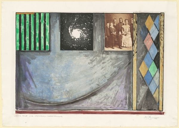
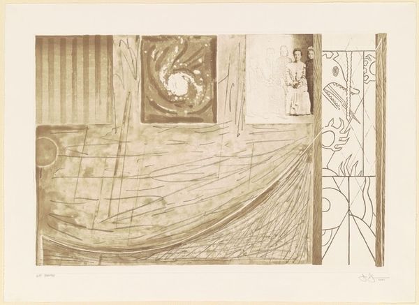
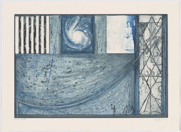
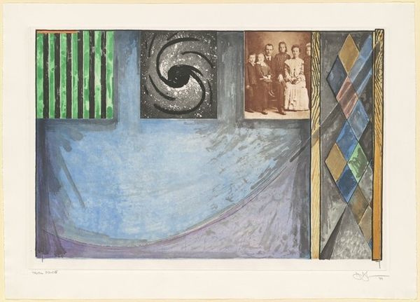
![untitled [TP] by Jasper Johns](/_next/image?url=https%3A%2F%2Fd2w8kbdekdi1gv.cloudfront.net%2FeyJidWNrZXQiOiAiYXJ0ZXJhLWltYWdlcy1idWNrZXQiLCAia2V5IjogImFydHdvcmtzLzk0ZmJmYzcyLWY2MzYtNDc4YS1hNzQzLTI2MDU2YWI4MmJhYy85NGZiZmM3Mi1mNjM2LTQ3OGEtYTc0My0yNjA1NmFiODJiYWNfZnVsbC5qcGciLCAiZWRpdHMiOiB7InJlc2l6ZSI6IHsid2lkdGgiOiAxOTIwLCAiaGVpZ2h0IjogMTkyMCwgImZpdCI6ICJpbnNpZGUifX19&w=1920&q=75)
mixed-media, collage, print, watercolor
#
mixed-media
#
contemporary
#
collage
#
water colours
# print
#
white palette
#
watercolor
#
neo-dada
#
abstraction
#
watercolor
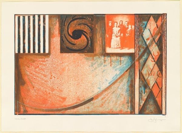
Dimensions: plate: 45.72 x 67.95 cm (18 x 26 3/4 in.) sheet: 56.52 x 79.38 cm (22 1/4 x 31 1/4 in.)
Copyright: National Gallery of Art: CC0 1.0
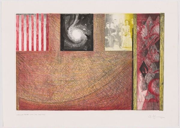
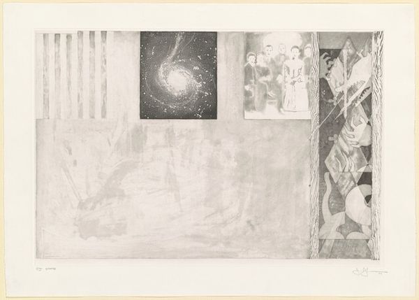
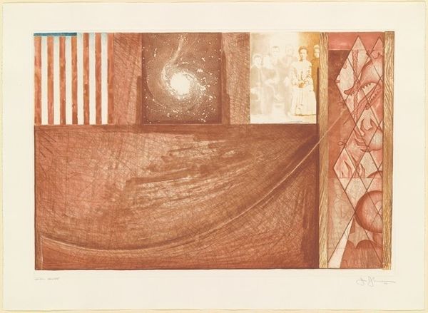
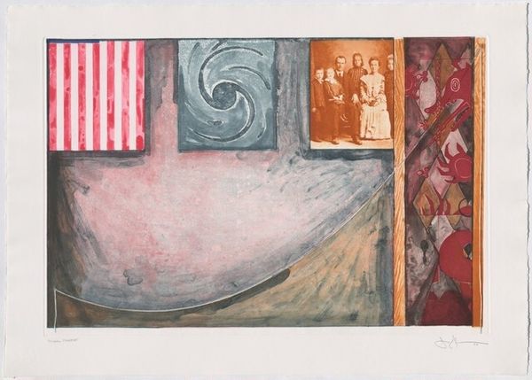
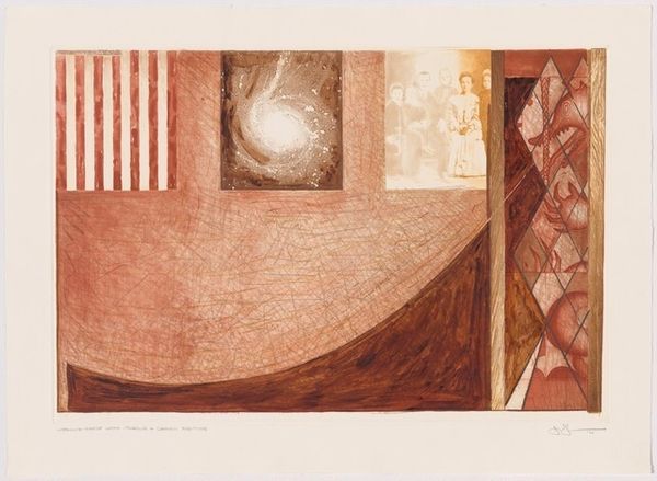
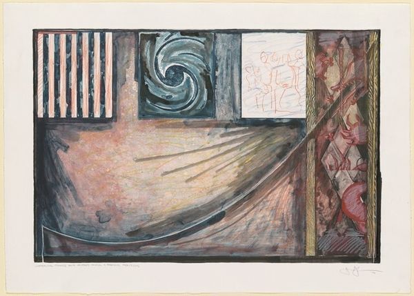
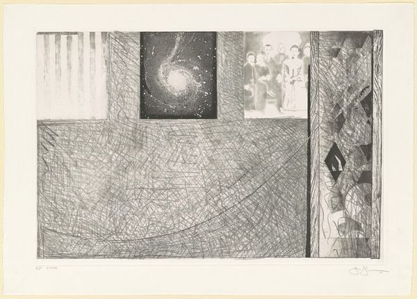
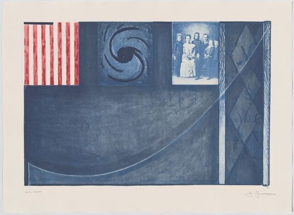
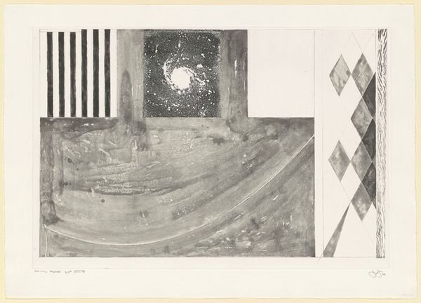
Curator: Before us hangs Jasper Johns' "untitled [TP]" from the year 2000, realized in mixed media including watercolor and collage elements. What are your first thoughts? Editor: It strikes me as a complex layering of personal and cultural fragments. The subdued palette lends it a wistful, almost melancholic mood. The geometric organization feels like a cabinet of curiosities—things brought together according to a mysterious internal logic. Curator: Precisely. Observe how Johns has divided the composition into distinct quadrants, each harboring unique representational and abstract elements. The juxtaposition creates a visual syntax, demanding decoding. Editor: Yes, the recurring motif of the American flag, for example—partially obscured here in its muted hues. It cannot simply be read as patriotic symbolism but, perhaps, something more… introspective about national identity. It's become such an expected motif for Johns. Curator: We might further consider the implications of placing the flag alongside the adjacent, nebulous, almost infinite galaxy panel. Are we meant to see parallels? A dialogue between earthly, constructed symbols, and something vastly older and inscrutable? Editor: And the family portrait... ghostlike and serene, amidst these grand concepts and abstract designs. I see them representing something familial. Perhaps a desire to preserve heritage amid so much flux. This interplay is what lends it this nostalgic atmosphere I described earlier. What would you make of this element formally, in the structural and tonal dialogue, that is, within the composition? Curator: The watercolor's washes act as a binding agent across the varied elements. Consider, for instance, the subtle gradations connecting disparate regions, modulating our visual trajectory. The careful tonal organization is designed to activate perception itself. Editor: So it's not so much about defining individual symbols, as considering their relationship within the artwork as a whole? The hand that has put them together and created this subtle and intricate palette with subtle themes we can touch and perceive as archetypes. Curator: Precisely, and furthermore, as a dynamic interplay of signification. It remains in flux—revealing new aspects with each viewing. Editor: Thank you, that gave me a much sharper and fresh way to engage and consider the themes this painting creates, in spite of the well trod symbolic motifs here. Curator: You're welcome; may you always approach the language of line and color as well!
Comments
No comments
Be the first to comment and join the conversation on the ultimate creative platform.
More like this