About this artwork
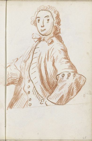
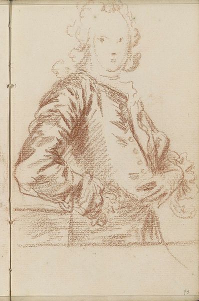
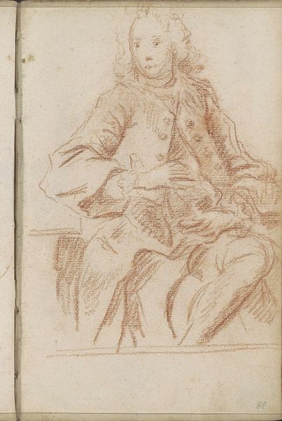
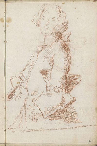
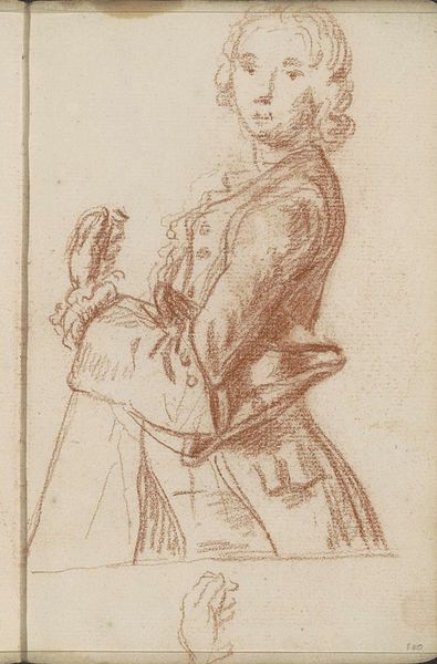
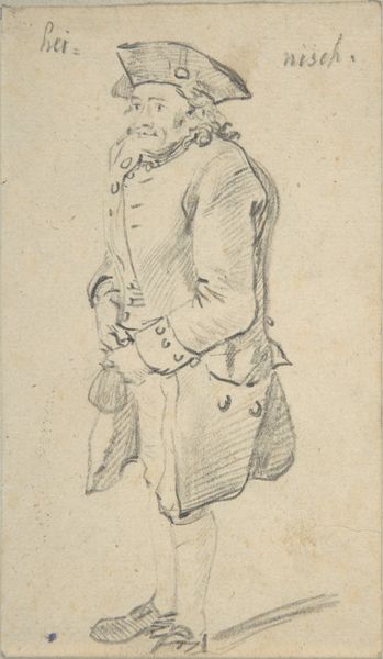
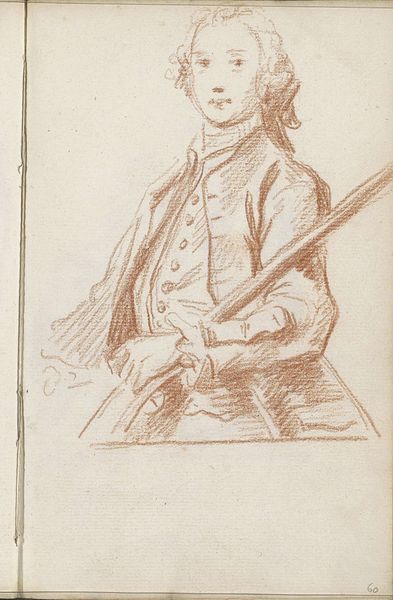
Editor: Here we have "Standing Man," a pencil drawing made by Petrus Johannes van Reysschoot sometime between 1710 and 1772. I'm immediately struck by the loose, almost unfinished quality of the lines, and yet, there's a real presence in the figure. How do you read this drawing, considering its form and composition? Curator: Indeed, the linear quality dictates the terms of our analysis. Notice the economical use of line – how few strokes define the form. Van Reysschoot isn’t trying to mimic reality, but rather extract an essence of form. Observe how the darker lines, specifically around the coat and cuff, create a focal point. Editor: So, it's not necessarily about replicating an exact likeness, but about creating an interesting arrangement of lines and values? Curator: Precisely. Consider the rhythm established by the buttons, for example, set against the relatively blank canvas of the face. How does this affect our viewing? Editor: I guess it creates a hierarchy, emphasizing the details of the clothing over the facial features. It makes you wonder about what Van Reysschoot prioritised. Curator: Indeed. Further observe how this emphasis shifts our understanding of portraiture itself. Are we looking at an individual or simply at form and design? The very barest implication of a face prevents it from being an abstraction, however. Do you agree? Editor: I see what you mean. There’s a balance, even tension, between the figure as a representation and the figure as a purely formal exercise in line and shading. I never thought about portraits in that way before! Curator: And the true art, then, lies in that delicate balancing act. It invites a more conceptual approach to seeing a portrait as not only an illustration but also as an abstract exercise.
Artwork details
- Medium
- drawing, pencil
- Copyright
- Rijks Museum: Open Domain
Tags
portrait
drawing
baroque
figuration
pencil
line
pencil work
Comments
No comments
About this artwork
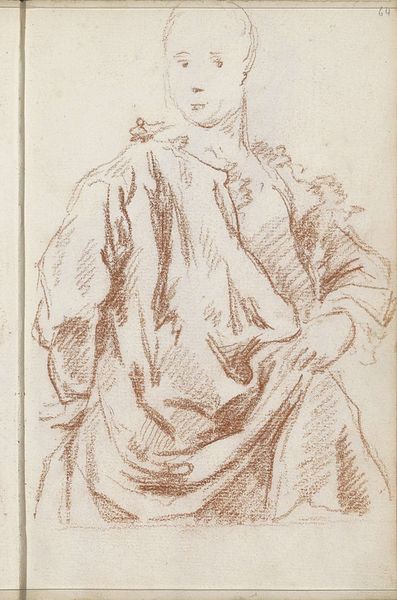
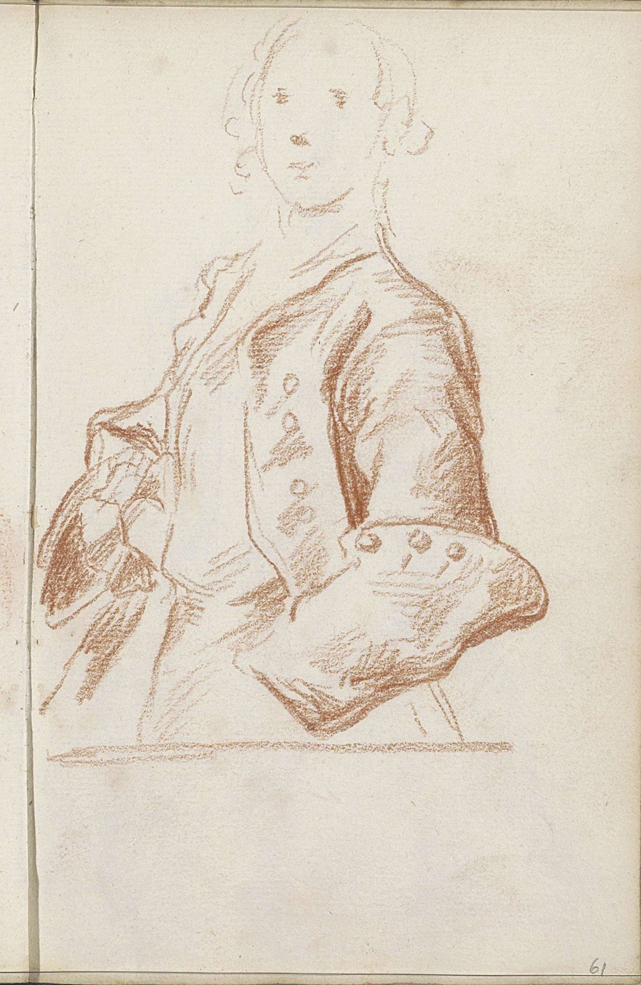
Editor: Here we have "Standing Man," a pencil drawing made by Petrus Johannes van Reysschoot sometime between 1710 and 1772. I'm immediately struck by the loose, almost unfinished quality of the lines, and yet, there's a real presence in the figure. How do you read this drawing, considering its form and composition? Curator: Indeed, the linear quality dictates the terms of our analysis. Notice the economical use of line – how few strokes define the form. Van Reysschoot isn’t trying to mimic reality, but rather extract an essence of form. Observe how the darker lines, specifically around the coat and cuff, create a focal point. Editor: So, it's not necessarily about replicating an exact likeness, but about creating an interesting arrangement of lines and values? Curator: Precisely. Consider the rhythm established by the buttons, for example, set against the relatively blank canvas of the face. How does this affect our viewing? Editor: I guess it creates a hierarchy, emphasizing the details of the clothing over the facial features. It makes you wonder about what Van Reysschoot prioritised. Curator: Indeed. Further observe how this emphasis shifts our understanding of portraiture itself. Are we looking at an individual or simply at form and design? The very barest implication of a face prevents it from being an abstraction, however. Do you agree? Editor: I see what you mean. There’s a balance, even tension, between the figure as a representation and the figure as a purely formal exercise in line and shading. I never thought about portraits in that way before! Curator: And the true art, then, lies in that delicate balancing act. It invites a more conceptual approach to seeing a portrait as not only an illustration but also as an abstract exercise.
Comments
No comments