#
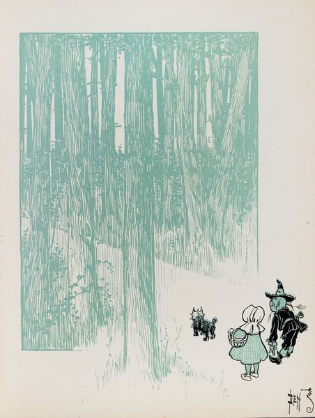
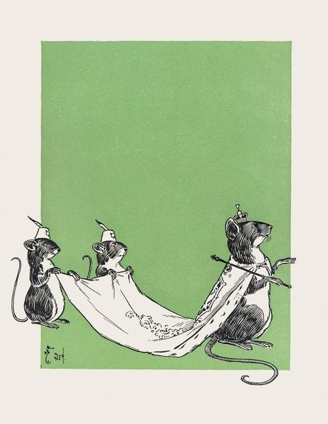
child-oriented illustration
#
quirky illustration
#
art-nouveau
#
childish illustration
#
fantasy-art
#
figuration
#
flat colour
#
line
#
watercolour illustration
Copyright: Public Domain: Artvee
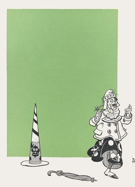
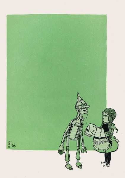
Curator: Looking at William Wallace Denslow’s "The Wonderful Emerald City of Oz" from 1900, I’m struck immediately by the scale of that flat green rectangle—it dominates the composition. It feels like a stage, stark in its presentation. Editor: It absolutely commands attention, doesn't it? And the single figure off to the right—that sentinel, that herald of Oz—loaded with iconographic weight. Consider the color: green, associated with growth, nature, but also, in some cultures, with envy and greed. What does this specific green mean here? Curator: Well, the image is watercolor and ink on paper, mass produced as part of the original book publication, making this color the definitive "Emerald City green" for many readers. I'm thinking about Denslow's choices and how this print functioned as an accessible object for early 20th-century children. This illustration itself participates in creating a brand, a mythology around "Oz," sold inexpensively. Editor: The figure’s costume! "Oz" emblazoned on his tunic, and even his "lunch" bag labeled. The roses on top of the rifle...they speak of a manufactured, somewhat saccharine fantasy world, carefully cultivated through readily digestible, child-oriented images and symbols. A very Edwardian mix of militarism and sentimentality, isn't it? The uniform juxtaposed with a bag labeled "lunch". It also reminds us of the art nouveau's influence, apparent in the botanical motifs that intertwine with this character. Curator: You're right, he's simultaneously guarding and peddling Oz, an early example of consumer culture influencing childhood dreams. The artist’s signature being so prominent indicates its value. Perhaps something was beginning here in relation to artistic skill and industrial application. The printing would probably have been outsourced, however, raising the value of Denslow’s authorship. Editor: So, through the figure, we access a manufactured ideal. The imposing flat green makes it real; you can possess it via purchase. The color then almost seems sinister… or strategic, rather, a tool for brand consolidation. Curator: Absolutely. Reflecting on this artwork through the lens of production makes it seem quite critical of consumerism's beginnings, almost anticipating the challenges surrounding authenticity and value in the 20th century, despite appearing on the surface very decorative. Editor: Examining it with the eyes of cultural symbols emphasizes just how calculated the whole world building process actually was. An intriguing start to a cultural phenomenon.
Comments
No comments
Be the first to comment and join the conversation on the ultimate creative platform.
More like this