Copyright: Pyotr Konchalovsky,Fair Use
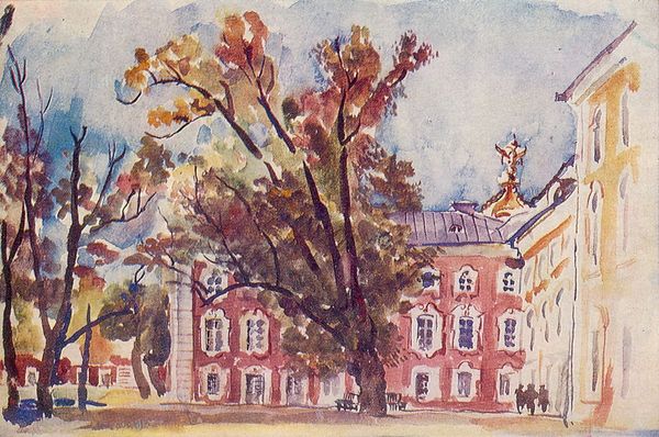
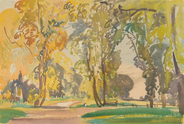
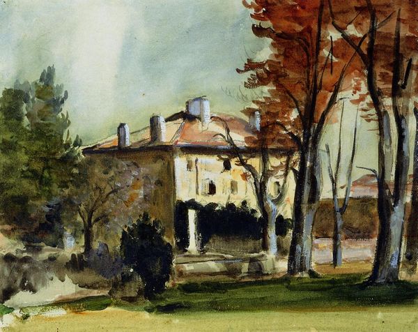
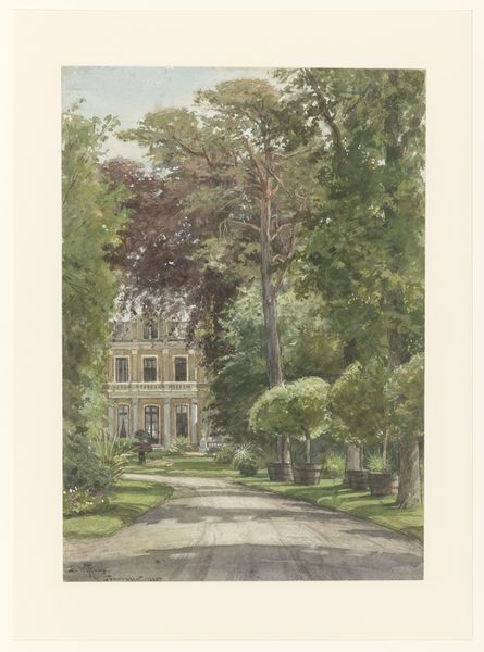
Editor: Here we have Pyotr Konchalovsky's 1931 watercolor painting, "Peterhof." It really captures this whimsical, almost fairytale-like vision. What do you see in this piece, from an art perspective? Curator: The initial thing to note is Konchalovsky’s skillful rendering of space, achieved through a sophisticated orchestration of colour and form. Observe the strategic placement of the darker, more robust tree trunks in the foreground—how these elements act as framing devices, guiding the viewer's gaze into the receding space of the composition. Editor: So it’s not just a pretty picture; the elements are intentionally arranged. Curator: Precisely. And the building itself, the namesake "Peterhof," is rendered with an intriguing contrast. Note the juxtaposition of the hard-edged architectural forms against the fluid, almost amorphous quality of the surrounding foliage. Editor: Yes, the building's structure is so sharp against the leaves and trees. Curator: The watercolor technique further enhances this contrast. The transparent washes allow for a layering of tones, creating depth and atmosphere, while the dry brushstrokes add texture and a sense of immediacy. Also, how do you think the color choices guide your perception of depth, here? Editor: It seems that he uses cooler colours in the distance. Curator: Exactly. The colour choices guide our eyes; a thoughtful design. Overall, we witness a harmonious, though somewhat strained, visual language. Editor: That tension makes it more interesting! Thanks, I learned a lot about analyzing composition today. Curator: My pleasure. There’s always more to discover by carefully observing form and technique.
Comments
No comments
Be the first to comment and join the conversation on the ultimate creative platform.
More like this