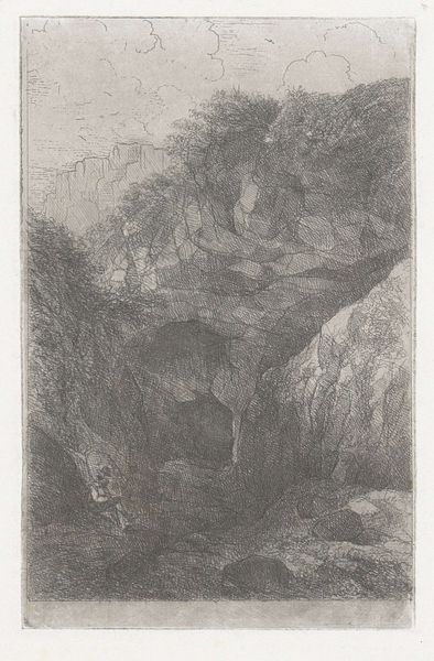
drawing, ink, graphite
#
pencil drawn
#
drawing
#
landscape
#
ink
#
graphite
#
realism
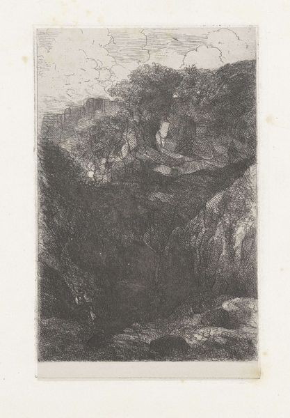
Dimensions: height 163 mm, width 94 mm
Copyright: Rijks Museum: Open Domain
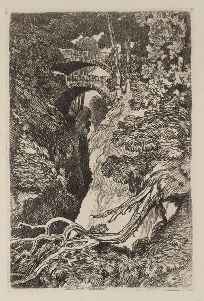
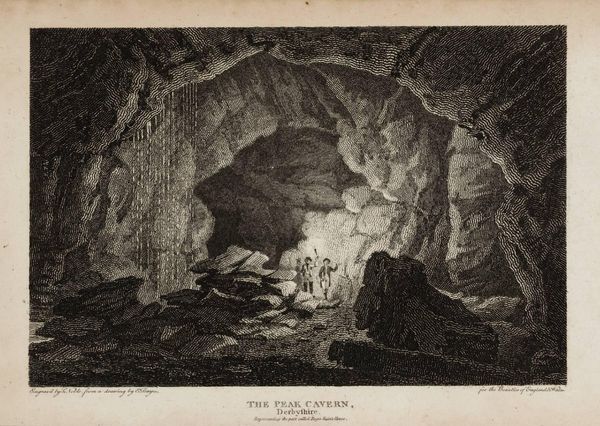
Editor: Here we have "Groeve in de Sint Pietersberg" by Alexander Schaepkens, created around 1859 using graphite, ink and pencil. I find the high contrast really striking, giving it almost a sense of foreboding. How do you interpret the composition of this piece? Curator: What immediately arrests my attention is the orchestration of light and shadow. Note how the artist uses hatching and cross-hatching to render the gradations of tone. The stark verticality of the rock face on the left, sharply lit, opposes the dense, almost impenetrable darkness of the cave's depths. Editor: Yes, and the figure seems so small compared to the landscape. Curator: Precisely. The diminutive scale of the figure serves to accentuate the immensity and power of the geological formation. Observe how the artist uses line to create a sense of depth, drawing the viewer's eye into the cavern. The textures are also remarkable, aren't they? Editor: Definitely, the roughness of the rock versus the relative smoothness of the worn path. Curator: Exactly. The artist contrasts textures in the application of graphite to mimic the variance that exists in the natural environment. This technique builds visual interest while simulating physical experience. Notice, too, how this meticulous detailing does not yield entirely to realism, and yet holds the scene within a carefully observed order. Editor: I see what you mean, it’s not just a record of a place, but a carefully constructed visual statement. I had missed that attention to texture, focusing only on the strong contrast in light and dark! Curator: Attending to such formal elements provides a means by which to engage in interpretation, isn't it? We understand that by examining the intrinsic characteristics of a drawing, we may also discover symbolic depth.
Comments
No comments
Be the first to comment and join the conversation on the ultimate creative platform.
More like this