acrylic-paint
#
concrete-art
#
non-objective-art
#
minimalism
#
op art
#
colour-field-painting
#
acrylic-paint
#
form
#
geometric pattern
#
geometric
#
geometric-abstraction
#
abstraction
#
line
#
pattern repetition
#
hard-edge-painting
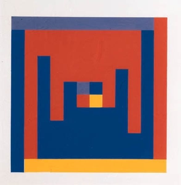
Copyright: Camille Graeser,Fair Use
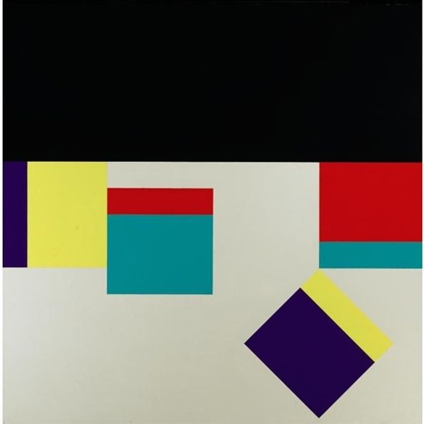
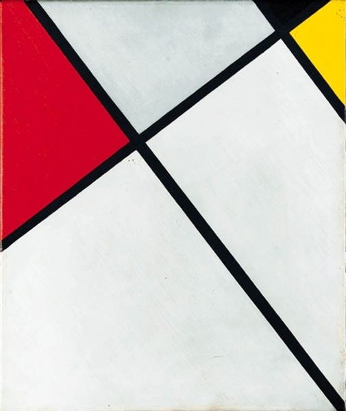
Camille Graeser made this ‘Harmonic Construction’ with what looks like flat colours, arranged geometrically, almost like a plan. I like the way the colours are both bold and somehow calming, the kind of colour palette you get with kids’ building blocks. I’m really drawn to the surface of this piece, it’s so smooth and precise, that the areas of colour seem almost printed, rather than painted. There's a wonderful, awkward tension, where the shapes just barely join each other. The negative space is just as important as the colourful squares, and feels like it gives the construction its form. I’m thinking of Mondrian, or maybe Albers – artists who used geometry to explore colour relationships. Graeser invites us to consider how simple forms and a limited palette can create complex harmonies. It’s a reminder that art doesn’t always need to be loud or complicated to be meaningful.
Comments
No comments
Be the first to comment and join the conversation on the ultimate creative platform.
More like this