drawing, print, etching, engraving
drawing
pen drawing
etching
landscape
etching
engraving
Dimensions: height 44 mm, width 41 mm
Copyright: Rijks Museum: Open Domain
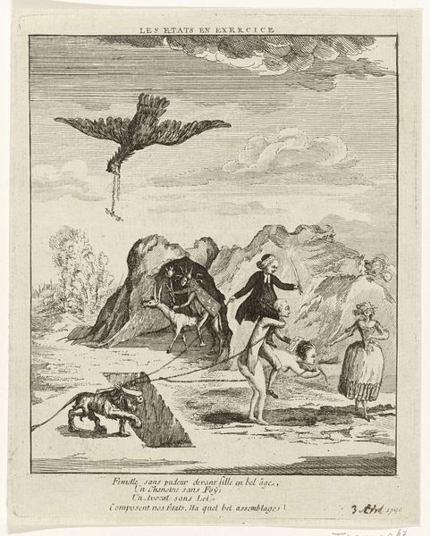
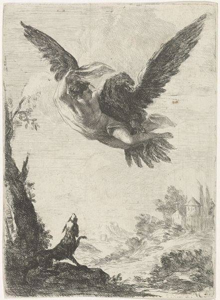
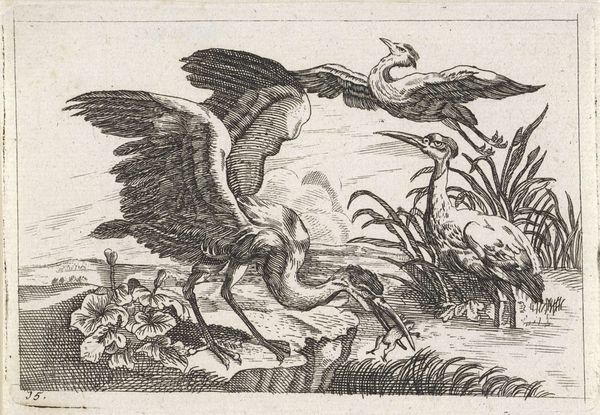
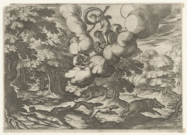
Curator: What a curious image! It feels like looking at a dream. Editor: Indeed. We're looking at "Fabel van de arend, de kraai en de schildpad" (Fable of the eagle, the crow and the turtle), an etching and engraving from 1769 by Simon Fokke. It's currently held in the collection of the Rijksmuseum. Curator: The line work is striking—very graphic and stylized. Everything is reduced to its most essential form. It's a dance of pure contour, really. How do you feel about the overall structure? Editor: I feel a weird sense of whimsy mixed with dread. The landscape is quite stark; that craggy rock in the foreground is very imposing. Then there's this odd trio floating in the sky, each isolated in its own little bubble of space. The poor turtle! Curator: Absolutely, and note the sharp contrast in textures. The meticulous cross-hatching on the rocks, mimicking volume and depth. Compared with the relatively smoother surfaces of the animals and clouds above. This creates visual tension. Fokke is using varied engraving techniques to delineate space and importance. Editor: It looks less like a landscape, though, and more like a stage for some kind of… moral lesson? Given the title includes a fable. Curator: Fables inherently rely on symbolism, yes. Observe how Fokke employs a high horizon line, which flattens the composition, drawing immediate focus to the subjects themselves. The spatial compression intensifies their relationship, highlighting their symbolic interaction within a structured narrative space. The eagle is a traditional emblem of power, the crow often associated with cunning, and the turtle, steadfastness or naiveté. Editor: This composition… it’s really doing something to me! It is sort of ominous. Is that because it's old and the animals don't seem cuddly? Like the turtle looks almost anxious, being flown up into the sky, and those birds are so steely eyed! All stark lines, all black and white. This really resonates even now. Curator: The absence of color is crucial here. It simplifies and universalizes the narrative, enabling the viewer to concentrate solely on the relationships between form and content. A calculated technique enhancing its allegorical effect, definitely. Editor: Well, after thinking about it this way I have a lot more respect for such a weird old fable. It’s not just telling a story but really using design to set the mood. Curator: Precisely. Fokke's command of engraving conventions imbues "Fable" with complex layers, inviting perpetual scrutiny, it merits the name!
Comments
No comments
Be the first to comment and join the conversation on the ultimate creative platform.
