drawing, print, ceramic, paper, watercolor
#
drawing
#
water colours
# print
#
ceramic
#
paper
#
watercolor
#
ceramic
#
decorative-art
#
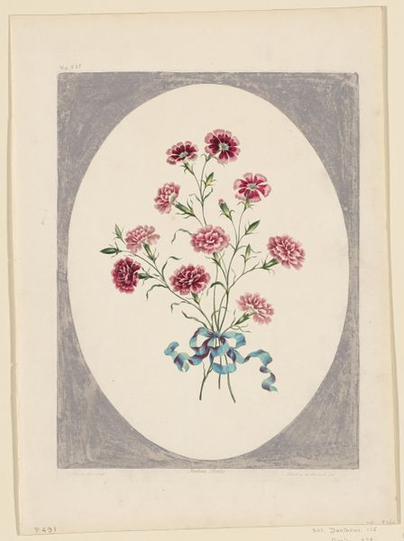
watercolor
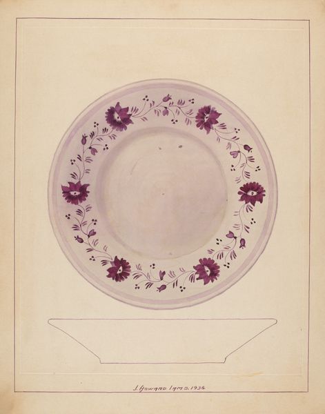
Dimensions: sheet: 12 1/16 x 9 9/16 in. (30.7 x 24.3 cm)
Copyright: Public Domain
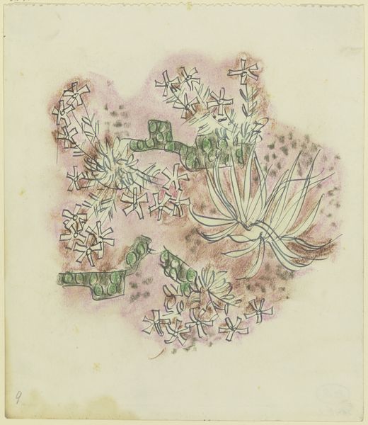
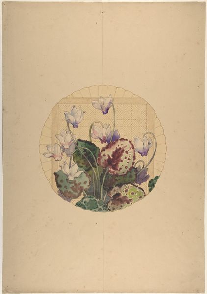
Curator: We’re looking at a 19th-century piece currently held at the Metropolitan Museum of Art: "Design for a Fruit Plate." It's rendered using watercolor and ink on paper. Editor: My first thought is… understated elegance. There’s something incredibly gentle in its presentation, from the wispy watercolor washes to the balanced composition, a near-perfect circularity. Curator: The beauty truly does lie in the details. Notice the composition—the rhythmic alternation of paired leaves and clusters of berries creating an ornamental ring. It suggests an engagement with botanical studies common at the time, translated into a design context. Editor: Agreed. The technique highlights a distinct approach to craft, seemingly at the intersection of utility and art. One has to wonder about the availability of pigments; the blue-green hue and singular shade of red suggest certain restrictions perhaps informing a creative response, almost improvisational. The design certainly reflects that material-conscious choice. Curator: And what about the symbolic nature of fruit and leaves in design? It evokes ideas of abundance and natural harmony, a fitting aesthetic choice for something intended to hold fruit. Its simplicity is key. The thin, consistent yellow circle provides definition without overwhelming the delicacy of the watercolors. Editor: From my point of view, this whispers about production and consumption habits of the 19th century. Imagine the socio-economic standing that permits a meticulously designed, rather than merely functional, plate. Was this a luxury item, handmade for a specific patron or intended for broader, industrial reproduction? Curator: The precise repetition of the leaves and berries would lend itself nicely to mass production, although this original is definitively hand-drawn. What truly stands out is the piece’s formal integrity— the skillful use of symmetry, color, and form to create a design both visually pleasing and conceptually rich. Editor: Absolutely. When considered as a blueprint for a final manufactured piece, one might then appreciate its directness: the economy of gesture, restricted material use. A potent, graceful design brief awaiting translation into something tangible. Curator: It's certainly been fascinating to view this artwork from our two vantage points, it highlights both the intrinsic artistry and the surrounding socioeconomic circumstances. Editor: Indeed, bringing greater context to our appreciation. It has brought added nuance to what I previously thought was a simple and pretty watercolor.
Comments
No comments
Be the first to comment and join the conversation on the ultimate creative platform.
More like this