Koningin Wilhelmina en prins Hendrik in een rijtuig in Amsterdam 1901 - 1905
0:00
0:00
maxcosman
Rijksmuseum
photography
#
portrait
#
pictorialism
#
photography
#
cityscape
Dimensions: height 165 mm, width 217 mm, height 245 mm, width 321 mm
Copyright: Rijks Museum: Open Domain
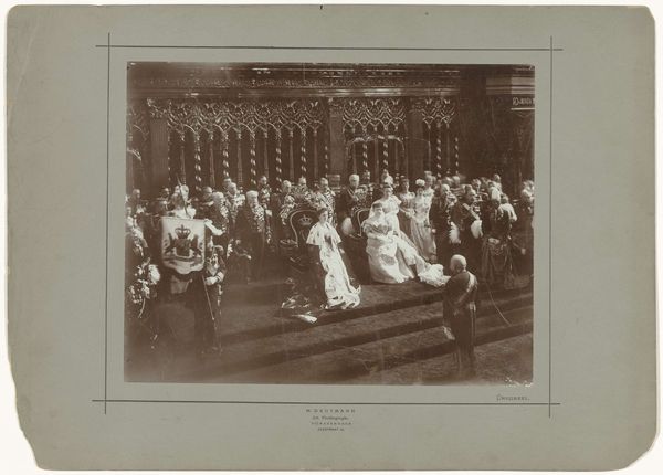
Editor: Here we have Max Cosman's photograph, "Koningin Wilhelmina en prins Hendrik in een rijtuig in Amsterdam," taken sometime between 1901 and 1905. It strikes me as quite formal, the way everything is arranged and composed. What draws your eye when you look at it? Curator: I am immediately drawn to the intricate interplay of light and shadow. The composition relies heavily on contrasting textures—note the smooth surface of the carriage against the rough, almost pixelated appearance of the cobblestones. The composition appears to lack a distinct vanishing point, almost flattening the space. What impact might this compositional choice have on our perception? Editor: Hmm, flattening the space. That definitely adds to the formality of the image, making it almost like a stage. I guess I was too busy looking at the *what* – the royals, the carriage – to see the *how*. It's less about a real moment, and more about the visual arrangement of elements. Curator: Precisely. The artist has created a structured environment with strong verticals balanced by curves found in the horse-drawn carriage. Even the choice of pictorialism with its slightly unfocused aesthetic can be perceived as a means to highlight specific compositional components rather than the narrative itself. Editor: So, by defocusing, he's focusing our attention on the structure… Very clever. I guess I was reading it completely wrong, assuming the soft focus was trying to be dreamy. Curator: Not necessarily, but exploring structural and material elements offers one path to interpretation. It allows us to look at not only the what but, more importantly, how it all works together as a photograph. Editor: That's really helpful. It makes me want to look closer at other photographs now and ask, how are the individual elements relating to each other. Thanks!
Comments
No comments
Be the first to comment and join the conversation on the ultimate creative platform.
