1581 - 1633
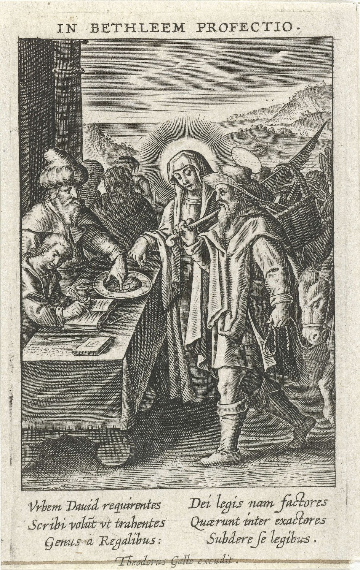
Volkstelling te Bethlehem
Theodoor Galle
1571 - 1633Location
RijksmuseumListen to curator's interpretation
Curatorial notes
Editor: Here we have Theodoor Galle’s “Volkstelling te Bethlehem,” an engraving from sometime between 1581 and 1633, currently held at the Rijksmuseum. It feels incredibly detailed, almost overwhelmingly so, with so much texture created by the lines. What catches your eye, and how do you interpret its composition? Curator: Focusing purely on form, the density of line work establishes a clear foreground, occupied by the figures and the registration table. Notice how Galle uses hatching to sculpt the forms, defining depth and volume, especially on the draped fabrics and the figures’ faces. What is striking is the tonal range despite it being black and white. Editor: It’s interesting you focus on the tonal range; it wasn’t something I considered initially. Do you see that affecting the emotional impact of the work? Curator: Absolutely. It enhances the visual drama. See how the engraver articulates light in a semiotic register: a clear symbolic representation, and notice how Mary and Joseph are in the center. I suggest the visual balance lies in the symmetry around that grouping in the horizontal axis and foreground-background in the vertical. Consider also how it all creates a cohesive compositional arrangement that underscores the narrative. Editor: That makes sense. So, disregarding the biblical subject matter, the strategic use of line and tonal variation really enhances the reading of the whole image? Curator: Precisely. Even divorced from its religious narrative, Galle's formal choices – the density of the lines, the chiaroscuro effect – contribute to its power and impact. It prompts us to consider how material qualities, seemingly neutral, profoundly shape the work's presence.
