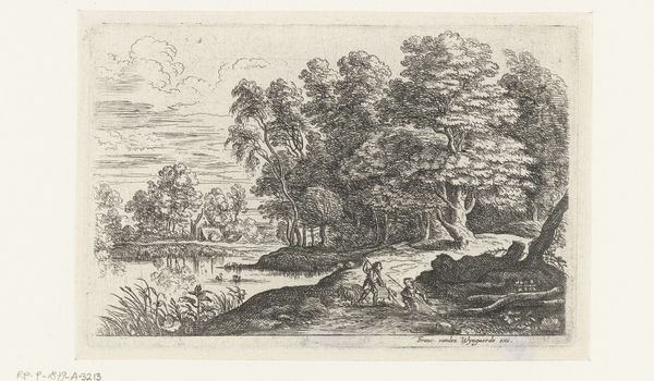
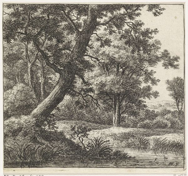
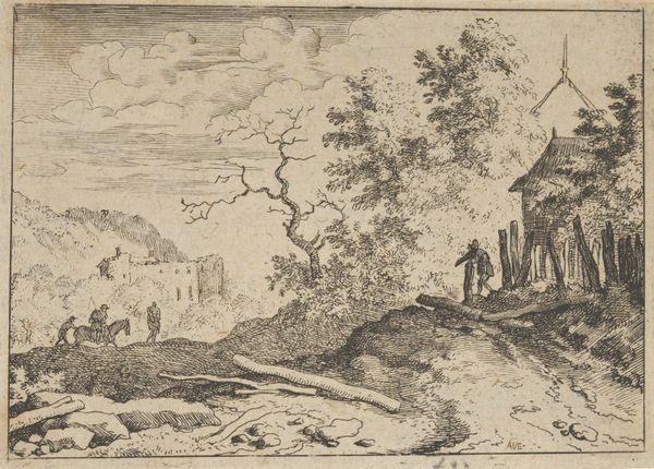
drawing, print, etching, ink
drawing
etching
landscape
ink
romanticism
Copyright: Public Domain
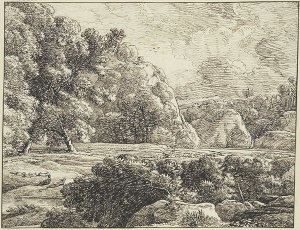
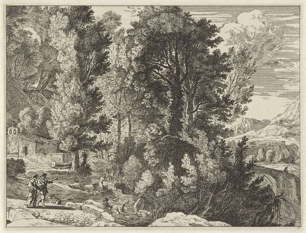
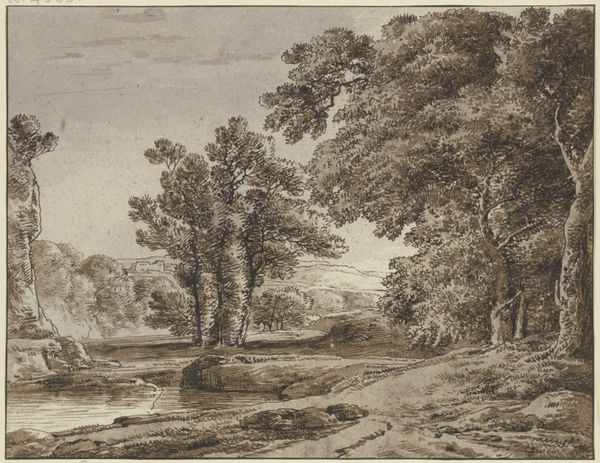
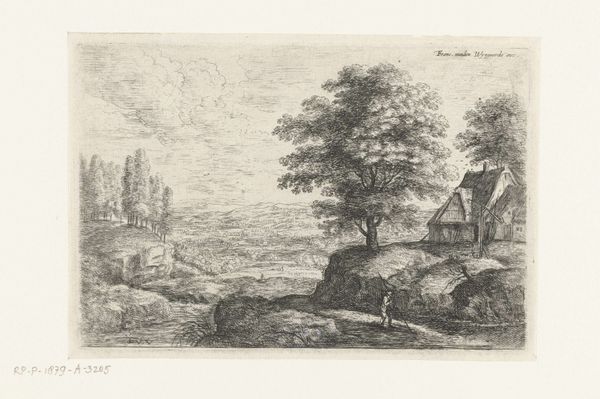
Editor: Here we have Franz Kobell’s "Landscape with a High Rock", an etching rendered in ink. It looks like a serene depiction of nature. What particularly strikes me is the contrast between the intricate foliage of the trees on the left and the stark, smooth face of the rock formation on the right. How do you interpret this work? Curator: The composition intrigues me, as you noted. Notice the way Kobell has distributed tonal values: a dense cluster on the left, balancing a far lighter expanse on the right. What is the effect of this contrast on the spatial relationships within the image? Editor: It makes the right side feel further away. Like we are peering into the distance beyond the rock. Curator: Precisely. Furthermore, observe how the textures differ. The meticulously rendered leaves and shrubbery provide a visual counterpoint to the relative simplicity of the rock face. Consider, then, how line operates here; cross-hatching suggests volume, but also implies flatness in areas. Is the artist attempting to reconcile opposing representational strategies? Editor: I see that, with the trees almost looking like a flat pattern. Perhaps he’s not so much trying to give us a realistic depiction, but more of a study in form. Curator: Indeed. And that brilliant stroke of sunlight in the background adds another layer, doesn't it? Note the geometry of it, the rays bisecting the space. A subtle reminder, perhaps, that even the most “natural” of landscapes is a carefully constructed arrangement. Editor: I'm starting to see how the contrast creates a sense of depth and the lines, rather than just depicting forms, seem to structure the whole composition. Curator: Just so. It’s a landscape, certainly, but more importantly, it’s a fascinating interplay of form and texture.
Comments
No comments
Be the first to comment and join the conversation on the ultimate creative platform.