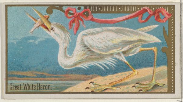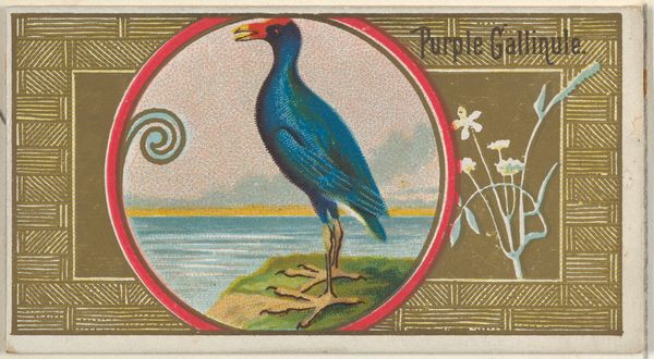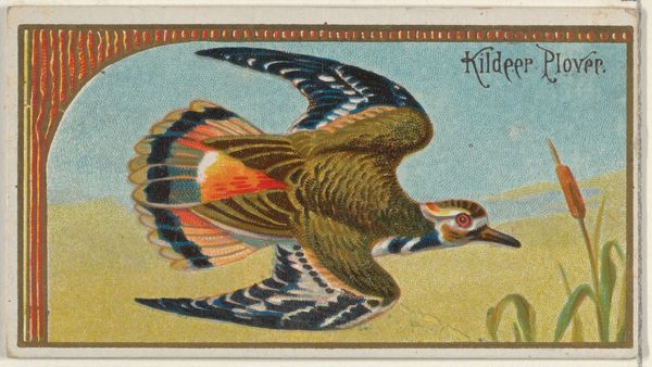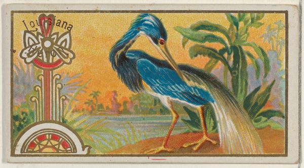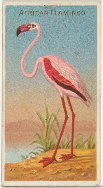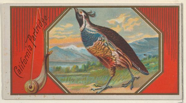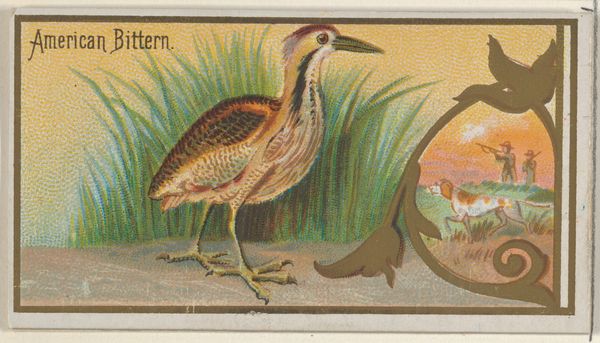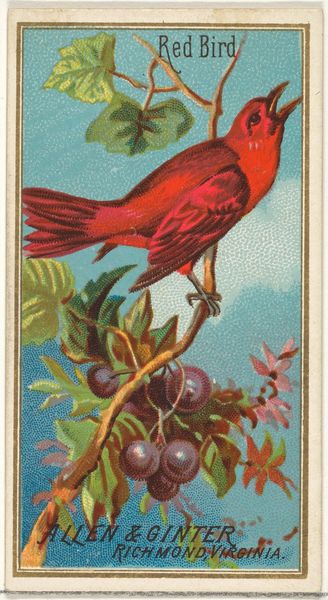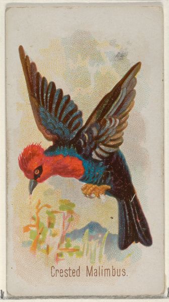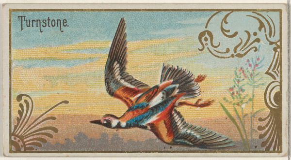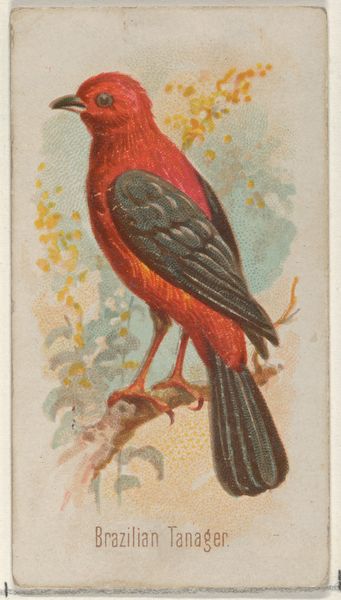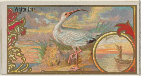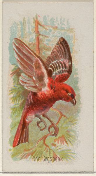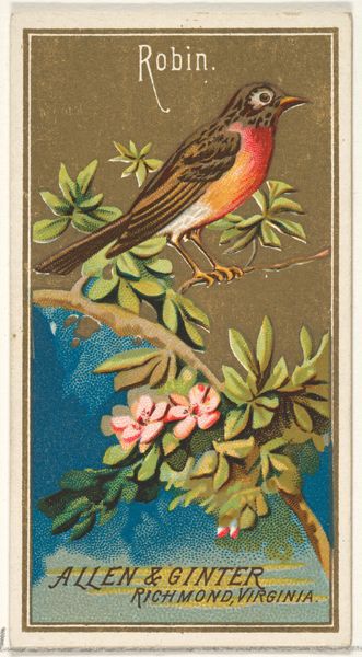
Scarlet Ibis, from the Game Birds series (N13) for Allen & Ginter Cigarettes Brands 1889
0:00
0:00
#
water colours
# print
Dimensions: Sheet: 1 1/2 x 2 3/4 in. (3.8 x 7 cm)
Copyright: Public Domain
Curator: The eye is immediately drawn to that shockingly bright ibis. I am curious why it contrasts with that pastel and more muted hunting vignette, don’t you think? Editor: It's an unexpected jolt of color. But let me introduce Allen & Ginter's "Scarlet Ibis" from 1889, part of the 'Game Birds' series designed for cigarette cards. Its vivid hue strikes me as an early, commercial appropriation of Japonisme. Curator: Commercial? Editor: Absolutely. Think about the rapid industrialization occurring at this moment in history. Suddenly, companies need to find ways to create brand identity to grab consumers' attention, even in ephemeral objects. It's fascinating how swiftly art movements translate to product design, like this application of watercolor techniques. Curator: The application of paint demonstrates some flattening, but the saturation itself feels… arbitrary, to say the least. The hue’s arbitrary vibrancy is interesting on its own. The bird almost emerges into abstraction—or perhaps is not far from art nouveau… Editor: But that placement right on a cigarette card changes how we read this aesthetic. The ibis is positioned to convey an upper class association through natural imagery to suggest leisure, status, taste… while directly linking it to nicotine addiction. I can imagine how a collector back in the day could follow different art movements through ephemeral material like these! Curator: Indeed! The composition becomes this odd push-pull between art and artifact. As far as visual dynamics, that contrast is rather magnetic even as its representational goals seem fairly pedestrian. I do enjoy observing the details of color interaction! Editor: It shows how diverse aesthetics are commodified and repackaged to address various segments of society.
Comments
No comments
Be the first to comment and join the conversation on the ultimate creative platform.
