print, typography
#
broadsheet layout
#
article
# print
#
typographical layout
#
typography
#
newspaper layout
#
history-painting
#
handwritten font
#
page layout
Dimensions: height 244 mm, width 355 mm
Copyright: Rijks Museum: Open Domain
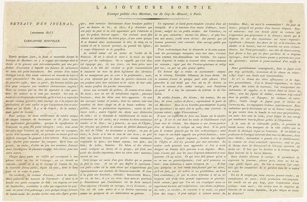
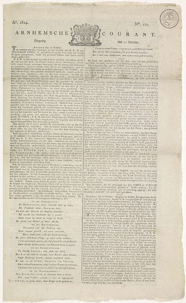
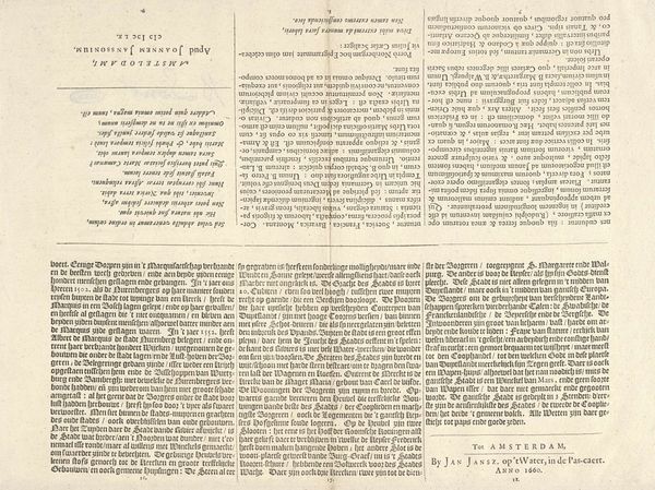
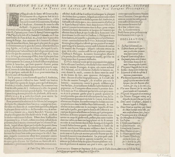
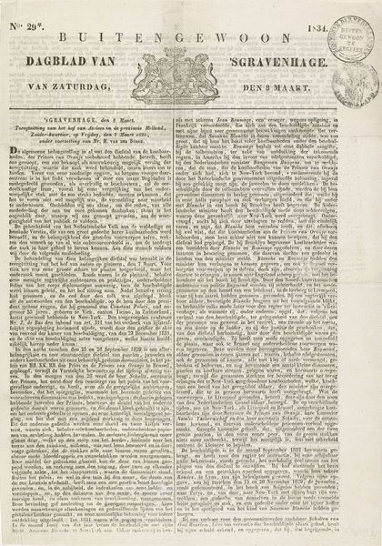
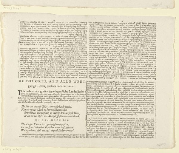
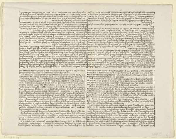
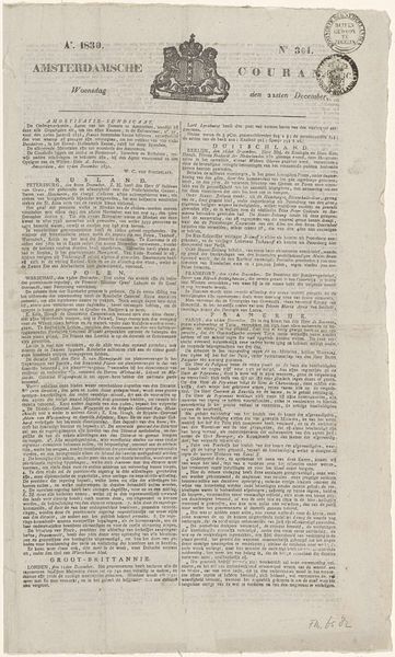
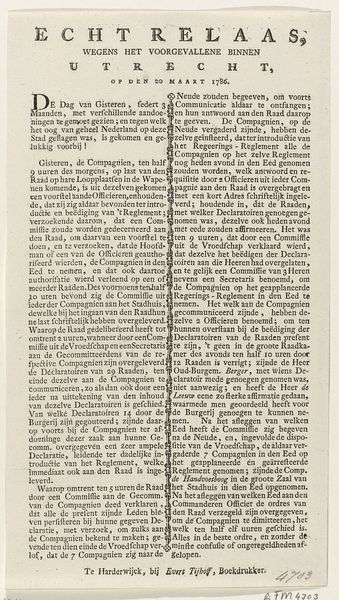
Curator: This print, "De blijde uittocht, 1815" by Aaron Martinet, caught my eye. It is a rather striking piece of typography from the Rijksmuseum collection. What are your initial impressions? Editor: It does look text-heavy. Like a page from a newspaper. Given that it uses typography and print as medium, it's quite interesting to examine its presentation and structure. But honestly, it also reminds me a bit of official announcements. How do you read this work? Curator: It is definitely working within and challenging the established printing practices. What I notice immediately is how the artist manipulates text. Notice the varying font sizes and styles—it disrupts the assumed hierarchy of information we might expect in print. What does this mean when considering how such publications became important vectors for social discourse during that period? Editor: Ah, you are thinking of it as playing with accessibility! Instead of a clean uniform style like in traditional proclamations, he or she created it by a style that visually engages readers by creating a mix of old styles that suggest both traditional legitimacy and contemporary change. Curator: Precisely! We can’t ignore the material conditions either. The ink, the paper, the very act of printing multiple copies… This wasn't some singular, precious painting, but something intended for wider consumption. In fact, think about who could access and disseminate printed materials at the time, who was being addressed, and why! Was this form of "democratized" art for everyone in society or select groups? Editor: That's interesting. I never really thought about the print itself being a commentary on who gets to participate in the discussion. Now, by calling it "De Blijde Uittocht" that sounds to me ironically. But the combination of text, presentation, distribution becomes crucial to understanding its real function, a very subtle one I believe! Curator: Exactly, and that’s a critical point about this era’s printed ephemera! The choice of materials, and the printing press itself as a technology for broader communication, were just as vital as the depicted subject matter to constructing meaning and influencing society’s understanding. I think I can never see things like before now. Editor: Right. Focusing on not just the *what*, but the *how* of art.
Comments
No comments
Be the first to comment and join the conversation on the ultimate creative platform.
