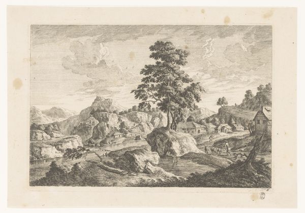
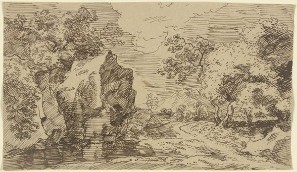
drawing, print, graphite
drawing
landscape
romanticism
graphite
Dimensions: sheet: 9 1/4 x 11 3/8 in. (23.5 x 28.9 cm)
Copyright: Public Domain
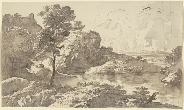
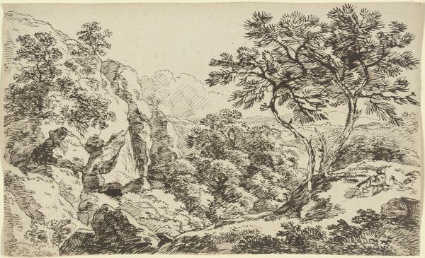
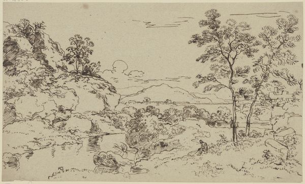
Curator: Alright, next up we have Carl August Richter’s "Landscape in Saxony," thought to have been created sometime between 1770 and 1848. It's currently housed here at the Met. It seems Richter rendered it with graphite. What strikes you first about this, from a material perspective? Editor: Immediately, the gradations in gray grab me—the layers are fantastic, but subtle, giving depth without harshness. It reminds me that even simple tools can reveal nature’s complex textures and depth. The way he builds form just through varying the pressure and distribution of graphite. Did he use varied hardness grades of the graphite for this, I wonder? Curator: Knowing Romantic sensibilities of the time, I wouldn't be surprised if Richter deliberately chose graphite for its tonal versatility—it lends a certain misty softness that fits right in with that emotional drama they so loved. It’s quiet drama, you know? Not thunderous. Editor: The softness also directs your eye, too. You wander almost aimlessly into the middle ground, following paths of least resistance because of the contrasting pressure he employed. But thinking of graphite also shifts my consideration to process. It is almost more about an interaction with material and environment, right? How the paper accepts it, how he grinds the material, than about an artist imposing their vision. Curator: Absolutely! There's something humble about it. And in this scene, observe how people become miniature when juxtaposed against the expansiveness of nature, almost getting swallowed by their surroundings. Perhaps, Richter is making a gentle remark about the role of humanity in the grand scheme? Editor: Makes me think about how landscape art has been linked to ideologies of ownership and power. Often paintings portrayed the resources or majesty a certain elite or country wanted to emphasize. But using such a delicate material seems like an implicit comment on the fragility of control. Curator: I love that idea of "fragility of control" being manifested even through the very art supplies. It just adds another layer, another tone to appreciate. Editor: Indeed. Overall, Richter manages to find, with subtle material choices, a balance between epic romanticism and almost pastoral quietude. Curator: Well said. Let’s move along.
Comments
No comments
Be the first to comment and join the conversation on the ultimate creative platform.