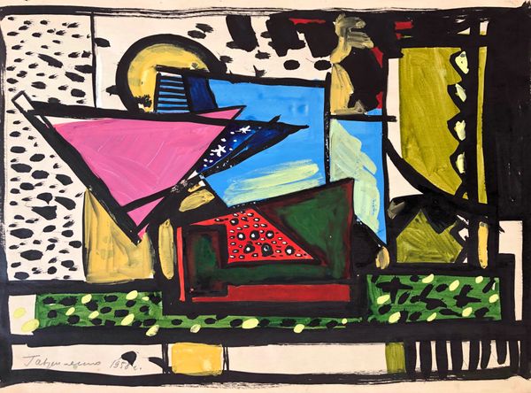
painting, acrylic-paint
#
art-deco
#
cubism
#
painting
#
pop art
#
acrylic-paint
#
geometric
#
line
#
cityscape
#
modernism
Copyright: Tarsila do Amaral,Fair Use
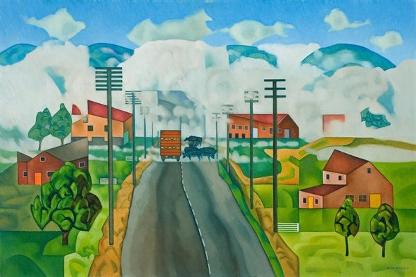
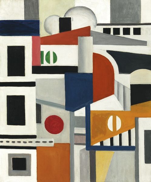
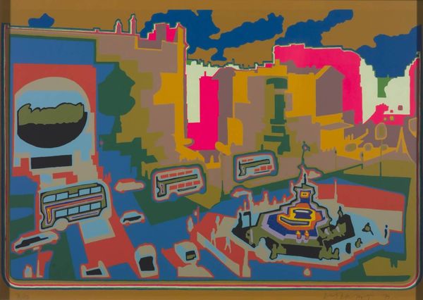
Curator: Tarsila do Amaral painted “A Gare,” showcasing a cityscape rendered through a Cubist lens. She employs vibrant acrylic paints and sharp lines. It’s a compelling exploration of urban space and industrial development. Editor: My first thought? Whimsical! It’s like a child's dream of a city—trains, factories, signals—all rendered in these bright, almost playful, geometric shapes. It's as if she's simplifying the modern world down to its basic components. Curator: Indeed, that simplicity is key. Amaral was working in a Brazil undergoing rapid industrialization. “A Gare,” which translates to “The Station,” reflects that transformative moment. She had studied with Léger, and that Cubist influence is quite evident, deconstructing reality. Editor: Exactly! There's this delightful flattening of space—everything's pushed forward, making the composition so dynamic. And the palette…it’s almost…appetizing. These colors seem to vibrate against each other. But the real question is: is it celebration, or critique? Is she embracing the industrial age or commenting on its impact? Curator: It's both, I believe. Many artists embraced this ambiguity, to create discourse. She uses this geometric vocabulary to explore a complex relationship with modernization, as urbanization introduced rapid social changes. Her style borrows elements from Art Deco as well as European modernism. The strong use of geometric elements such as circles, squares, and triangles suggests mechanical production but is applied in an aesthetically pleasing and attractive form, in an era that valued aesthetics alongside function. Editor: Ah, interesting point. It's less of a straightforward "yay" or "nay" to industrial progress, but rather an engagement with its visual language. It makes me wonder what a contemporary artist would do with, say, our digital landscape. Curator: Precisely. “A Gare” isn’t merely a pretty picture; it’s a historical document capturing Brazil’s changing identity, raising vital questions about what progress means for art and society. Editor: Totally. It’s deceptively simple. Beneath those bright colors and quirky shapes lies a sharp commentary on a country grappling with progress. Curator: A nuanced visual essay. One well worth considering, with so much debate over what and who progress really benefits, globally. Editor: Food for thought indeed, packaged in a vibrant, unforgettable form.
Comments
No comments
Be the first to comment and join the conversation on the ultimate creative platform.
More like this