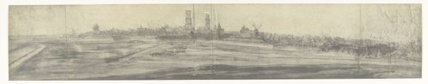
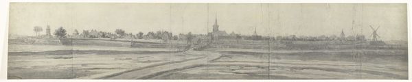
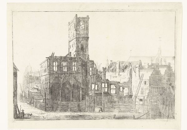
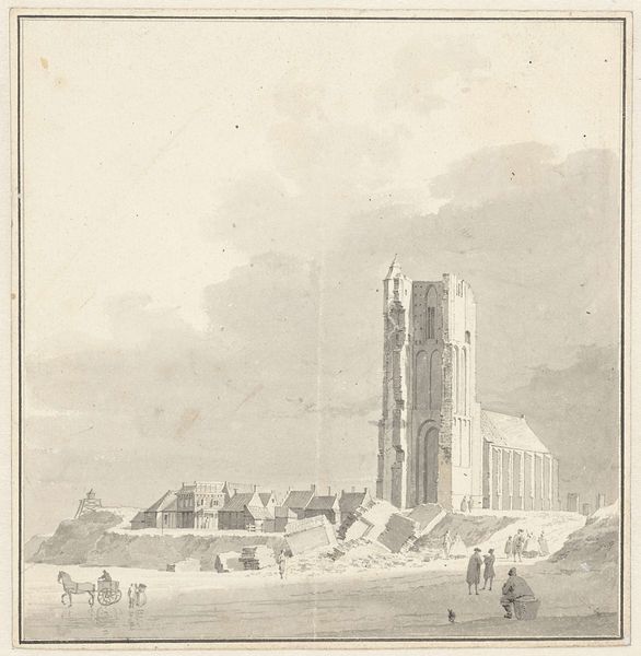
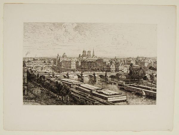
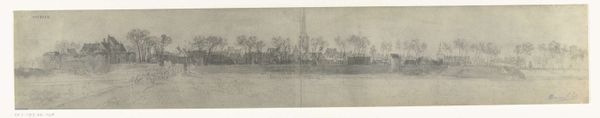
drawing, pencil
#
drawing
#
pencil sketch
#
landscape
#
charcoal drawing
#
pencil drawing
#
pencil
#
cityscape
#
realism
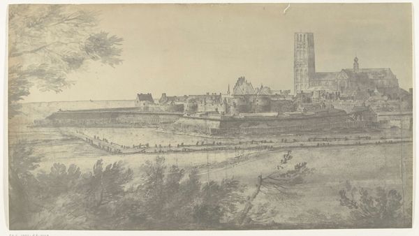
Dimensions: height 141 mm, width 988 mm
Copyright: Rijks Museum: Open Domain
Editor: This is "Gezicht op Utrecht, 1672" created sometime between 1900 and 1903 by the brothers Moreau. It's a pencil drawing that captures a panoramic cityscape. It feels quite delicate because of the fine lines and the muted tones of the pencil. What stands out to you most about this particular piece? Curator: The power of this drawing lies in its intricate composition, meticulously rendered with remarkable precision. Observe the subtle variations in line weight and the strategic use of shading to delineate spatial depth and architectural forms. Editor: Yes, the details of the buildings are pretty incredible, especially considering it's "just" a pencil drawing. The depth you mention is really evident. Curator: Indeed. Consider, for instance, the way the artist employs linear perspective to create a sense of recession, guiding the viewer's eye toward the horizon. Also consider how each distinct section and area is set up like its own little formal structure that exists within the sum totality of the picture. Editor: I see what you mean! The composition leads your eye around naturally. The repetition of vertical elements like the spires create rhythm, don't they? Curator: Precisely. This rhythmic structure contributes significantly to the drawing's overall visual harmony. Note, however, how the artist deviates from strict symmetry, introducing subtle irregularities to avoid monotony. It reflects the asymmetrical nature of urban environments. Editor: That's interesting – the tension between the structured and the irregular. I wouldn't have noticed it otherwise! Thanks for pointing that out. Curator: My pleasure. Ultimately, this work serves as a testament to the transformative power of visual syntax: Line, form, and composition as the main elements for decoding meaning. Editor: Right. Focusing on those pure visual elements gives me a much deeper appreciation for the artistry involved. I'll keep that in mind moving forward.
Comments
No comments
Be the first to comment and join the conversation on the ultimate creative platform.
More like this