print, engraving
#
narrative-art
#
baroque
# print
#
pen illustration
#
landscape
#
figuration
#
ink line art
#
cityscape
#
genre-painting
#
engraving
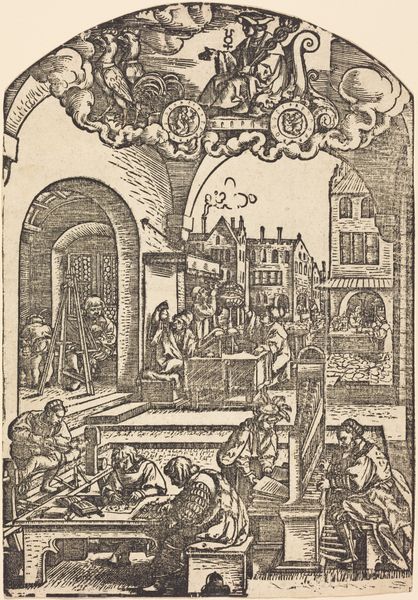
Dimensions: height 285 mm, width 363 mm
Copyright: Rijks Museum: Open Domain
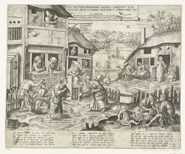
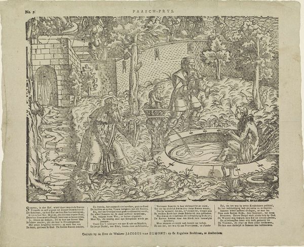
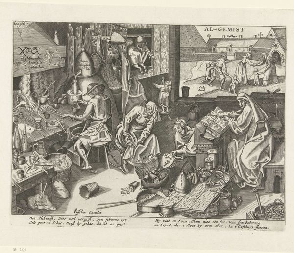
Editor: Let’s turn our attention to “Spreekwoord: Ick bints alleen niet,” a print made by Baptista van Doetechum around the early 17th century. The detailed engraving depicts what looks like a chaotic scene, divided into indoor and outdoor spaces. The mood feels frantic and unsettling, given the many figures engaged in various activities. What do you see in this piece, from a formalist point of view? Curator: This engraving's power resides in its intricate arrangement of form. Consider the division of the picture plane: an interior scene contrasts sharply with a more chaotic exterior. Notice how the artist utilizes line to create textures and delineate space, the contrast being most notable. The foreground, particularly, commands attention—the figures meticulously rendered with cross-hatching, contributing to a palpable sense of weight and depth. The perspective, though not perfectly scientific, functions to pull the viewer into the narrative. Observe how the architectural framework serves to both connect and separate these realms. What visual tensions do you perceive between the upper and lower registers of the image? Editor: I see what you mean. The rigid architecture contrasts with the almost frenzied landscape with people running and working. It feels like the architecture serves as an anchor of rationality contrasting the wildness of the world. It highlights a compositional tension that echoes in the thematic contrast. I hadn’t noticed that so strongly before. Curator: Indeed. Note also how the artist uses variations in line weight and density to direct the viewer's eye. Darker, heavier lines bring forward the figures, while lighter lines create distance. It’s this deliberate manipulation of visual elements that generates the print's dynamic character. Through analyzing these components, do we approach a greater insight into its meaning, beyond historical contexts? Editor: I do think so. By really looking at these formal qualities, it allows me to separate my own biases of what I think I'm supposed to get from this artwork. Thanks for highlighting all that. Curator: It's by understanding the intrinsic elements that we may understand our relation with art's capacity.
Comments
No comments
Be the first to comment and join the conversation on the ultimate creative platform.
More like this