mixed-media, print, ink
#
action-painting
#
abstract-expressionism
#
mixed-media
# print
#
form
#
ink
#
art-informel
#
abstraction
#
line
#
modernism
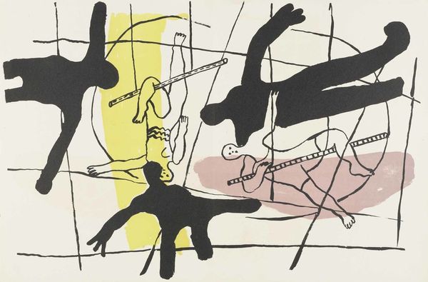
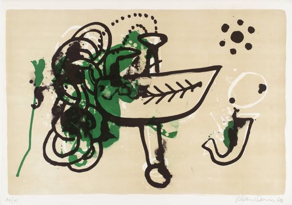
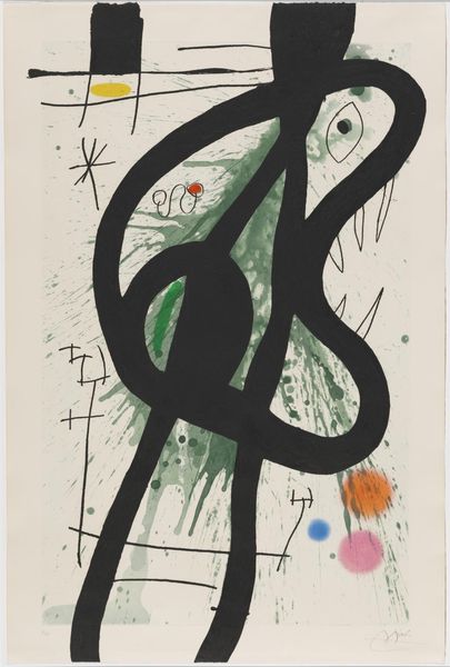
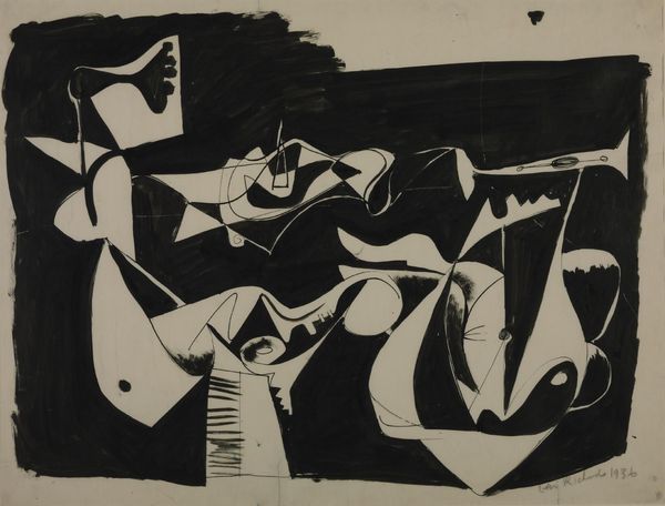
Dimensions: plate: 38.5 x 54.5 cm (15 3/16 x 21 7/16 in.) sheet: 50 x 66.4 cm (19 11/16 x 26 1/8 in.)
Copyright: National Gallery of Art: CC0 1.0
Curator: Let's turn our attention now to this mixed media print titled "Fond Rose," attributed to Gérard Ernest Albert Schneider. You can see it incorporates both ink and other elements. What springs to mind as you look at it? Editor: Well, "Fond Rose" seems a fitting name, that blush of color provides such a gentle, almost hesitant ground for those bold, confident strokes of black. It's as if a fleeting thought dared to express itself with sudden, unrestrained energy. Curator: That tension is interesting. The black forms certainly dominate, typical of Art Informel's embrace of spontaneous gesture, like a form of visual automatic writing. Do you find any symbolism in these particular gestures? Editor: Hmmm, symbols... I get a sense of containment versus release. That large looping line on the left feels like an enclosure, especially with that inky block weighing it down. Then on the right, those slashing, overlapping strokes suggest movement, even conflict perhaps? Like a chaotic dance trying to break free. Or even a zen koan rendered on paper... a gesture revealing enlightenment? Curator: An insightful interpretation. And it reflects a broader tension we find in many works within abstract expressionism—the negotiation between chance and control. Look at the careful composition, set against the spontaneous application of ink, reminiscent of Action Painting, where the act of creation itself becomes the focus. The blush rose of color gives the image the grounding the ink blacks lack. Editor: Yes, it's a kind of beautiful paradox, isn't it? Like finding stillness in a storm, or discovering a fragile beauty amidst raw expression. It reminds me of Japanese calligraphy and the beauty found in the simplicity and flow. And the green…that one spot! A small drop of life…or toxicity! Ha! Curator: It’s the rose ground for me, that shade holds the symbolic weight of sensitivity, which in turn amplifies that drop. It almost feels alive, and gives an other worldly context for all the other symbols. It shows, the way visual language can stir so many things for all who seek. Editor: It really does! I am off to create now, this stirred up everything!
Comments
No comments
Be the first to comment and join the conversation on the ultimate creative platform.
More like this