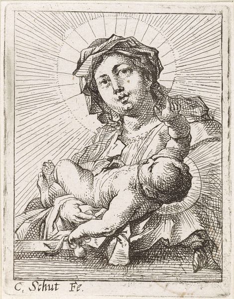
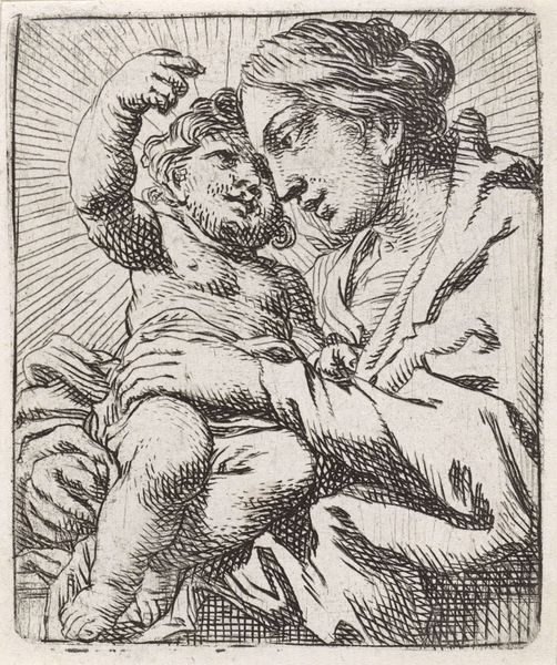
print, engraving
#
portrait
#
baroque
# print
#
figuration
#
line
#
engraving
Dimensions: height 85 mm, width 76 mm
Copyright: Rijks Museum: Open Domain
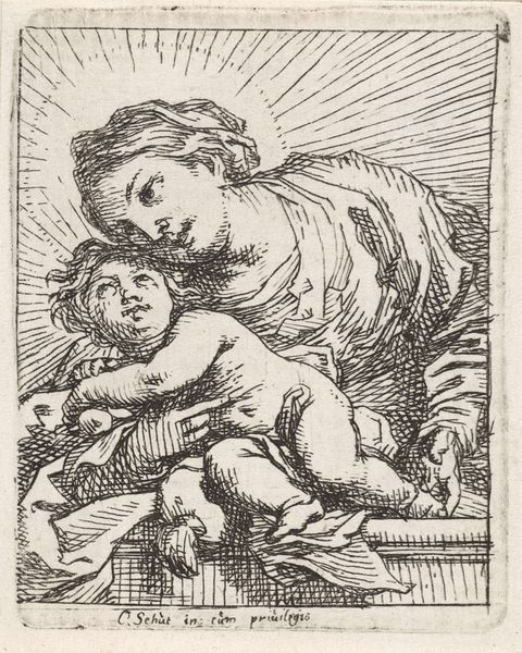
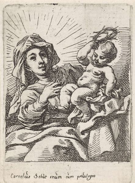
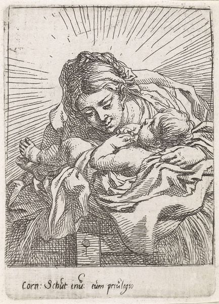
Editor: Here we have Cornelis Schut’s "Madonna and Child," a print from between 1618 and 1655. It’s at the Rijksmuseum. I'm immediately struck by the intimacy. It’s such a small, delicate engraving, but the radiating lines give it a monumental feel. What do you see in this piece? Curator: As a historian, I immediately consider the Baroque era and the context of religious imagery during that period. The Catholic Church used art quite deliberately to inspire awe and piety, especially during the Counter-Reformation. While this piece is relatively small, as you noted, the artist still employs classic Baroque techniques. The dynamic lines create movement, and the radiating halo emphasizes the divine nature of the Madonna and Child. The lines look very economic though - in your opinion, do they amplify the spiritual experience or are they somewhat detached? Editor: I think that the radiating lines draw your eyes and makes them the focus. But there is not so much texture to give it movement. They have an unrefined feel compared to the smooth treatment of skin. What I like about the work, the figures are so accessible. Curator: Precisely. Schut bridges the monumental with the personal. How do you think the printing medium affects the work’s accessibility? Is it the relative 'cheapness', small scale, and mass dissemination? Editor: Yes, it becomes portable, easier to copy, and arguably, easier to understand than a huge altarpiece, reaching a broader audience, wouldn't you agree? It brings religious iconography into the homes of everyday people. Curator: Absolutely! And by doing so, it democratizes religious experience in a subtle yet significant way, engaging a wider populace in the visual rhetoric of faith. It's a beautiful interplay of technique, religious messaging, and social reach. I’ve never considered printmaking that way!
Comments
No comments
Be the first to comment and join the conversation on the ultimate creative platform.
More like this