drawing, paper, ink, architecture
drawing
neoclacissism
perspective
paper
ink
geometric
line
academic-art
architecture
Dimensions: height 330 mm, width 204 mm
Copyright: Rijks Museum: Open Domain
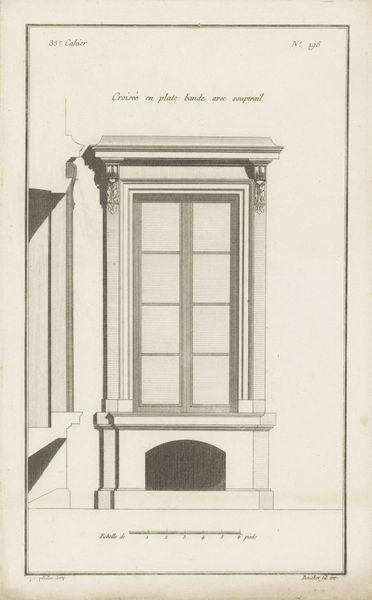
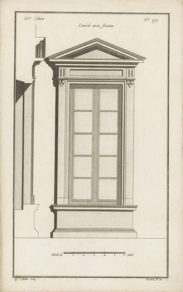
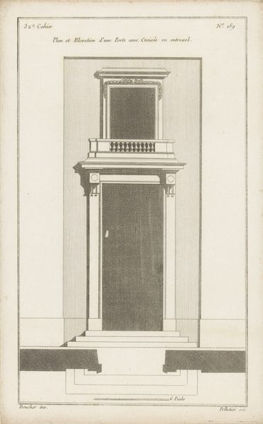
Curator: Here at the Rijksmuseum, we have Jean Pelletier’s drawing, "Venster met balusters," created between 1772 and 1779. The artwork is rendered in ink on paper. Editor: The stark geometry strikes me immediately. It's incredibly rigid, yet precise. There's a cool detachment in the window's design. Curator: Indeed, the linework emphasizes the rigid formality characteristic of Neoclassical architecture. Look at how the balusters, framing, and sash windows construct geometric patterns of shadow and light. This aesthetic, born in the 18th century, reflects a deliberate choice to break away from the perceived excesses of the Rococo. Editor: And one must acknowledge that these materials are relatively inexpensive, especially for architectural study purposes. Drawing like this allowed artisans access to patterns to guide their physical works, correct? It must be cheap and easy to reproduce to provide as a tool for construction! Curator: Precisely. These drawings would have been disseminated among artisans and builders, contributing to the standardization of Neoclassical elements. Notice the inclusion of measurement scales in the drawing! In addition to this standardization of aesthetic style and elements, such accessible drawings provided a more standardized workforce in its practice. Editor: Ah, the leveling force of Neoclassicism, right down to the practical dissemination of its very lines and geometries. You find little variation within. Curator: Not really. The slight variations can be noted between Neoclassical window styles. Notice the attention given to linear perspective, guiding the eye. The stark lines create a clear, defined spatial recession within the drawing. There is little detail in shading, but much detail to the individual features of the components. Editor: A curious thing, this balance between the artisanal craft evident in the ink medium itself and the rigorous, almost machine-like precision in the final composition. Curator: One reflects and reinforces the other, to great effect. Editor: Definitely an era that thought hard about visibility and access across class lines through something as seemingly small as an art style!
Comments
No comments
Be the first to comment and join the conversation on the ultimate creative platform.