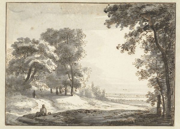
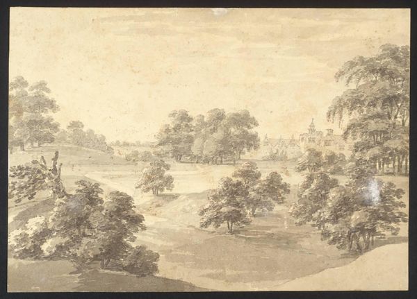
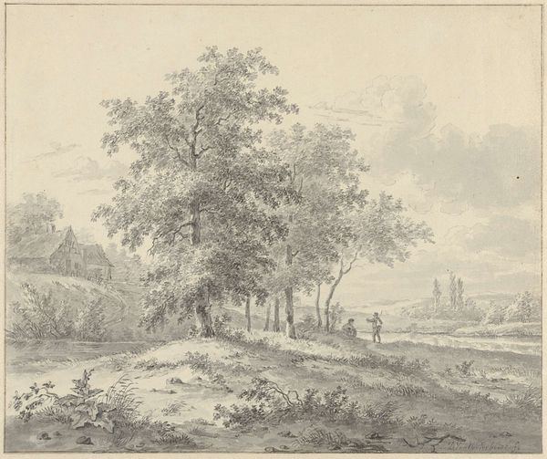
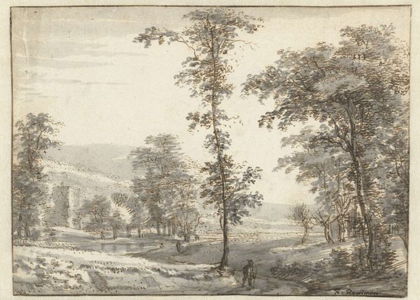
drawing, plein-air, watercolor, ink, pencil
#
drawing
#
plein-air
#
landscape
#
watercolor
#
ink
#
romanticism
#
pencil
#
cityscape
#
watercolor
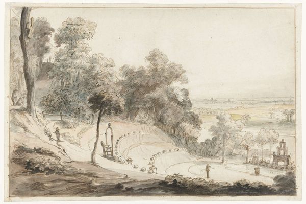
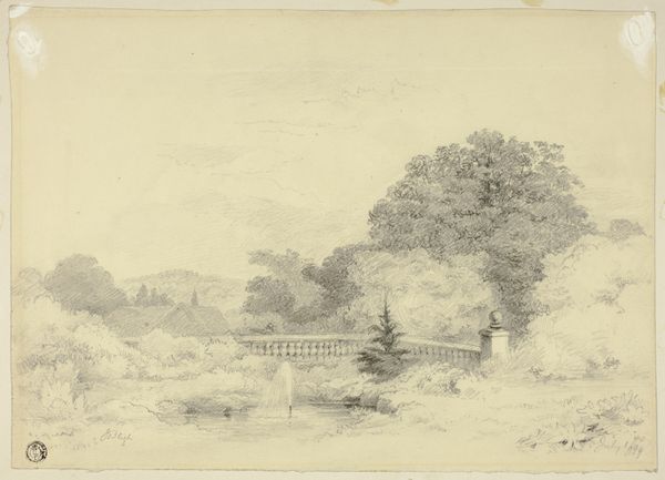
Dimensions: height 328 mm, width 485 mm
Copyright: Rijks Museum: Open Domain
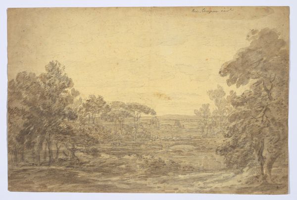
Curator: Here we have Joseph Farington’s "Gezicht op Blenheim Palace over het meer Blenheim," dating to 1792. The work combines watercolor, ink, and pencil in a meticulous landscape study. Editor: My first impression is one of tranquility. The monochromatic palette creates a hushed, almost dreamlike atmosphere. There's something incredibly peaceful about the receding planes and the almost skeletal trees framing the view. Curator: Indeed. Farington masterfully employs a subtle gradation of tones to establish spatial depth. Note how the delicate linework defines the architecture of Blenheim Palace in the distance, creating a focal point within the composition. It’s a considered exercise in perspective. Editor: I'm more intrigued by the process. A work like this suggests the artist was very conscious of being in the moment, capturing a real landscape 'en plein air'. Look at the apparent economy of means used – just pencil, ink, and watercolour. How much work did this require outdoors versus inside the studio? Also, it strikes me that this method must be very dependent on available light conditions at the time. Curator: Quite. Farington was interested in capturing the subtleties of light and atmosphere. If you examine the tree forms, the delicate washes of watercolor and the detailed under drawing of the pencil work together to define their forms. It shows close attention to botanical structure in the rendering. Editor: Yes, but there’s also something distinctly material about it. That handmade paper with slight discolouration; the individual touches of diluted inks…These reveal the artistic hand directly engaging with, and modifying, natural forms, but it leaves an interesting trace of artistic decision making that might not have been readily apparent in a larger oil on canvas production made later. Curator: The lack of bold color might typically diminish dramatic impact, but the strategic application of shading imbues a sense of volume and light that animates the scene. Farington used neutral color to suggest the inherent structure in the landscape; less a portrait than an anatomical study, of sorts. Editor: In that sense, the focus on understated media creates something valuable here; we consider the work needed for observation, decision making, and translating reality with meagre tools. These details are where, for me, the value lies. Curator: An interesting perspective. It brings forth new levels of insight to his work. Thank you. Editor: And thank you for elaborating upon the construction of it; considering that balance gives much to understand Farington’s methodology.
Comments
No comments
Be the first to comment and join the conversation on the ultimate creative platform.
More like this