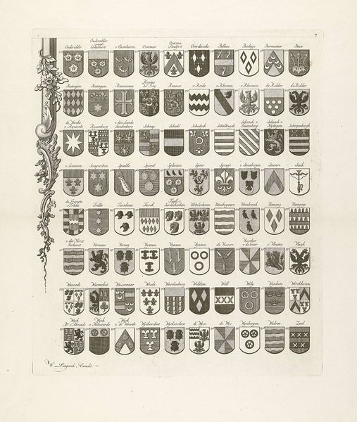
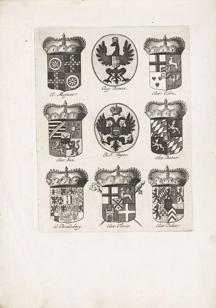
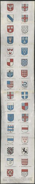
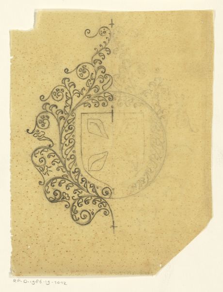
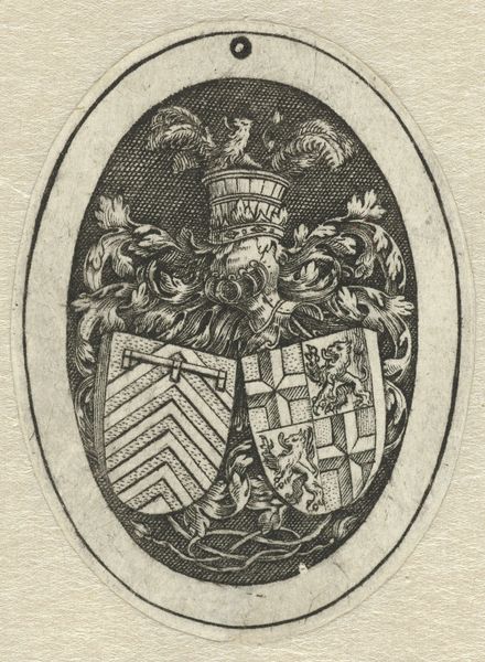
Wapenkaart van oude geslachten van Utrecht, blad rechtsmidden 1769
0:00
0:00
johannesvanhiltrop
Rijksmuseum
Dimensions: height 390 mm, width 325 mm
Copyright: Rijks Museum: Open Domain
Curator: Welcome to the Rijksmuseum. We're standing before a fascinating print by Johannes van Hiltrop, created in 1769, entitled "Wapenkaart van oude geslachten van Utrecht, blad rechtsmidden"—or, "Coat of Arms Map of Old Families of Utrecht, Right Center Sheet." Editor: It's quite a chart! My initial feeling is that there is an almost taxonomic quality—a need to arrange, display, and categorize these civic families—through these ornate shields. There's an odd sense of hierarchy, or aspiration to be included in the collection that seems like it must carry sociopolitical importance. Curator: Exactly! The work employs engraving on paper and represents a blend of portraiture, historical painting, and genre painting traditions. Look closely at the details within each shield. Editor: I'm drawn to the visual language deployed on the surface. What stories do these symbols, patterns, and even creatures try to communicate about each family's origin and reputation in the area at the time? Curator: These aren't arbitrary choices. Heraldry, particularly in the Baroque and Academic Art movements, used strict guidelines and symbolism. Lions might represent courage; stars, nobility. Placement and color were just as vital to interpreting what each family wished to express about themselves. It served almost like an early form of branding. Editor: Right! And, in turn, a stark reinforcement of the city's power structure by preserving only certain lineages to be remembered by history. As an engraving, consider its accessibility, allowing the message to spread throughout the region and reinforcing what families were worth the cost and labor of inclusion in such a piece. Curator: This particular print shows a distinct style reminiscent of the period’s focus on order and classification and, from a formal point of view, displays superb technical skill in its precise lines and balanced composition. The decorative border softens what could have otherwise felt purely functional. Editor: Absolutely. That ornamental flourish speaks to both wealth and social prestige of its contents. One thing’s for sure, this 'map' gives rise to deeper thinking about class, representation, and permanence. Curator: A snapshot of a time, expertly rendered, capturing power in ink. Editor: A perfect illustration of the art world's ties to politics and wealth in 18th-century Netherlands, ready for further investigation.
Comments
No comments
Be the first to comment and join the conversation on the ultimate creative platform.
More like this