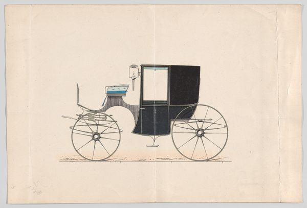
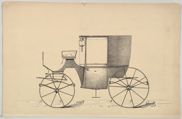
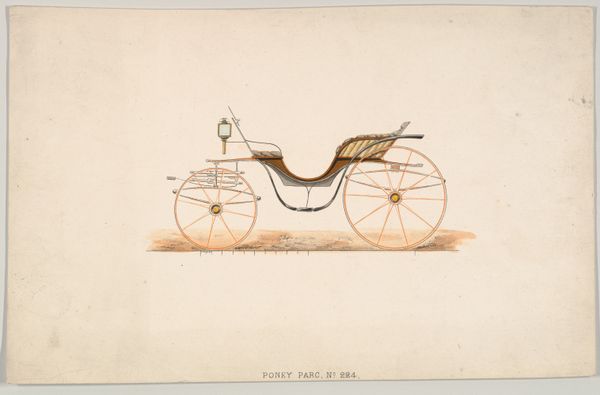
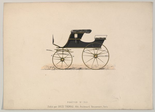
Design for Dog Cart Phaeton, no. 669, from Le Guide du Carrossier 1865 - 1875
0:00
0:00
drawing, coloured-pencil, print, watercolor
#
drawing
#
coloured-pencil
# print
#
watercolor
#
coloured pencil
#
academic-art
#
decorative-art
Dimensions: Sheet: 6 3/8 x 9 1/4 in. (16.2 x 23.5 cm)
Copyright: Public Domain
Editor: Here we have "Design for Dog Cart Phaeton, no. 669, from Le Guide du Carrossier," made sometime between 1865 and 1875. It combines drawing, coloured pencil, print, and watercolor. It looks almost like an architectural blueprint, yet also stylish and decorative. What compositional elements stand out to you? Curator: Note the dominance of line. The forms are defined by crisp outlines, meticulously rendered. Observe the contrast between the curvilinear wheels and the more angular canopy. This interplay creates a visual tension, a dynamism within a static image. Are you sensing a hierarchy of forms here, and how might this be working within the composition? Editor: Well, the canopy is the darkest part, drawing the eye immediately, followed by the body of the carriage, maybe. But the wheels, despite their delicate lines, are crucial for the structure. Curator: Precisely. Consider the symmetry and asymmetry: The wheels offer near-perfect symmetry, grounded by a stable axis; while the canopy, with its unique folds and subtle shading, presents a compelling asymmetry. How might that balance guide our eye and influence how we understand its functionality? Editor: It's interesting how the linear quality gives it an almost scientific feel, yet the watercolor washes soften the whole design. It prevents the image from feeling too sterile. Curator: A keen observation. This is also partly an effect of texture and tone: The texture creates subtle tonal variations within each form, particularly the canopy. Are there ways this effect helps delineate the design components to allow us to "read" them more easily? Editor: Definitely! It seems the artist is revealing an ideal form, but not just in a representational sense, it's ideal in its composition, too. Curator: An astute recognition! Editor: This focus on pure form really makes me appreciate the beauty of design. Thanks. Curator: A pleasure. It underscores the significance of close looking and structural comprehension.
Comments
No comments
Be the first to comment and join the conversation on the ultimate creative platform.
More like this