painting, oil-paint
painting
oil-paint
landscape
figuration
oil painting
expressionism
cityscape
expressionist
Copyright: Public domain US
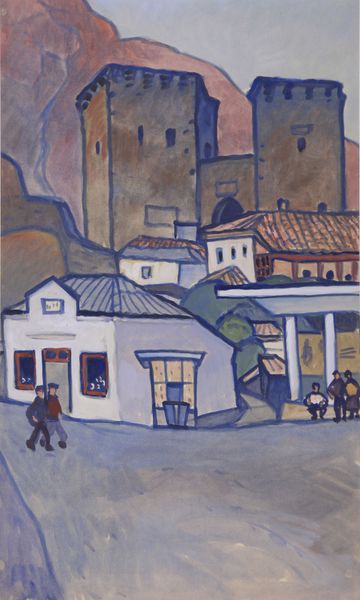
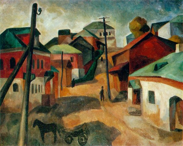
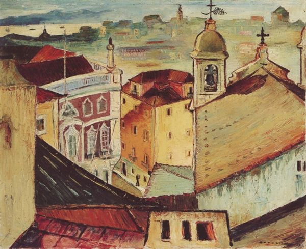
Curator: Looking at Konchalovsky’s 1913 work, “Design for the opera by Wolfgang Amadeus Mozart, 'Don Giovanni'”, I’m struck immediately by how he conjures up, for me, a feeling rather than a literal place. Editor: Indeed, that’s an excellent way to put it. The materiality, the rough handling of oil paint, leads us to the urban environment through its layered application rather than any kind of trompe l'oeil illusionism. We see the labor right there on the canvas, the thick brushstrokes creating buildings. Curator: Yes, the very materiality breathes life into the scene. The opera is, of course, itself a heightened reality, a stylized drama. And Konchalovsky somehow echoes that in his method. There's a lovely dreaminess here, even in the sharp angles of the buildings, isn't there? Like remembering a bustling piazza in the warmth of the sun. Editor: You know, it is interesting that you point that out, I notice that he gives equal attention to the staging of urbanity versus its potential disintegration. Konchalovsky, as stage designer, had to create compelling environments with limited means, this piece appears to focus on the visible traces of such constructions by celebrating the materials at hand. It has a wonderful rawness about it. Curator: I wonder if his own artistic background - he initially wanted to be a musician - seeped into this visual design for the stage? His use of color, in particular, feels symphonic, building to crescendos in those vivid rooftops and that dark sky pressing down. And those almost cartoonish figures in the foreground, are they singers waiting in the wings, or memories taking form? Editor: Well, speaking of the “figures” as material instantiations, these visual gestures have to contend with specific socio-historical realities within Russia that directly affected not only opera culture but theatrical practice at large in 1913. In my mind, Konchalovsky's rendering is an argument for elevating set design. Curator: Fascinating point. And it seems entirely apt. I’ll never look at Don Giovanni quite the same way. Editor: Precisely. Now we know that operatic design contains its own artistic merits worthy of display.
Comments
No comments
Be the first to comment and join the conversation on the ultimate creative platform.