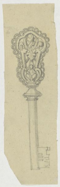
drawing, paper, pencil
#
drawing
#
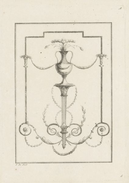
neoclacissism
#
paper
#
form
#
geometric
#
pen-ink sketch
#
pencil
#
line
#
decorative-art
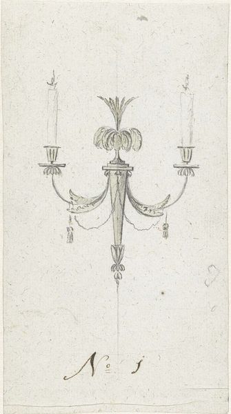
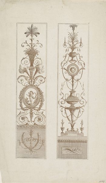
Dimensions: height 173 mm, width 83 mm
Copyright: Rijks Museum: Open Domain
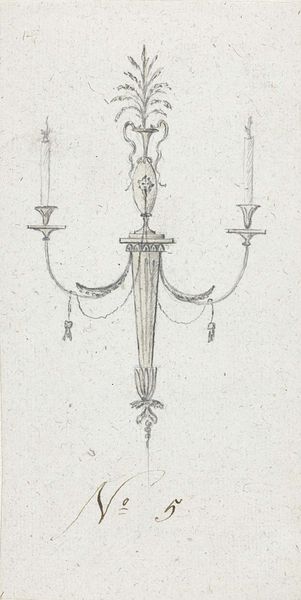
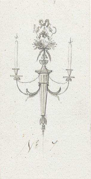
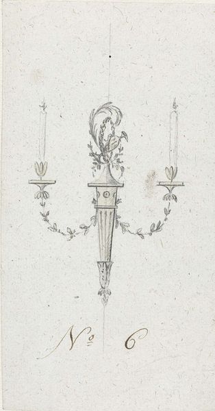
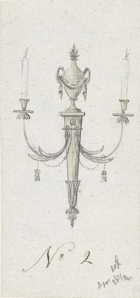
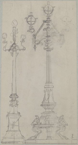
Curator: This elegant sketch immediately makes me think of long shadows in a grand hall. There's a simple grace, almost ethereal, to the piece. Editor: Indeed. What we are observing here is a design, rendered in pencil, ink and grey wash on paper, titled “Design for a Candlestick (No. 4)” by Abraham Meertens, dating sometime between 1767 and 1823. Curator: No. 4. That’s… interesting, isn't it? Like a glimpse into a catalogue of possibilities. I can almost feel the artist's hand pausing, considering this iteration against others unseen. Were there three that came before it? A dozen after? What was the fate of the entire family? Editor: That numerical designation points to the realities of decorative art in that era. Craftspeople didn’t have the luxury of limitless self-expression. Instead, artists and artisans generated a range of choices catering to elite taste and, of course, courtly fashion. What we are beholding is more likely than not a commercial venture, tailored to client’s needs and dictated by the vogue of neoclassicism. Curator: So you see precision; I see possibility. To me, the beauty of the lines suggests more than cold efficiency; this could also be personal—almost like a love letter penned on drafting paper, right? An ideal form, pursued not just for a commission but for pure delight in proportion. Editor: Delight, I grant you. And it's a potent reminder that even designs meant for reproduction bear the trace of their creator’s imagination. Note the subtle asymmetry in the foliage detailing: such individualized quirks add a flourish of the artist to the artifice of mass designs. Curator: Exactly! It's the imperfection, paradoxically, that illuminates its soul. And besides… that pineapple finial up top… it adds such a welcoming sense of unexpected playfulness, don't you agree? A warm touch of luxury, even. Editor: It’s a symbol of status, and hospitality. That is what Meertens was aiming for in that epoch. Curator: Ultimately, then, what does it say that a practical candlestick can also evoke poetry and hint at personal stories untold? Editor: It demonstrates how societal expectations shape individual expression, and that creativity will always make its mark within conventional lines. Thank you for sharing these observations. Curator: The pleasure's been all mine. A design meant to illuminate chambers of old; a reflection intended to still ignite inspiration today.
Comments
No comments
Be the first to comment and join the conversation on the ultimate creative platform.
More like this