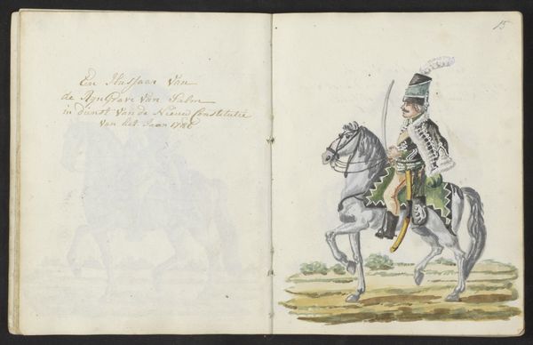
Curatorial notes
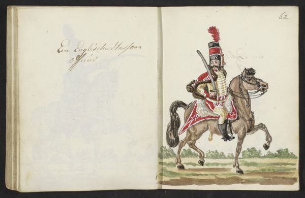
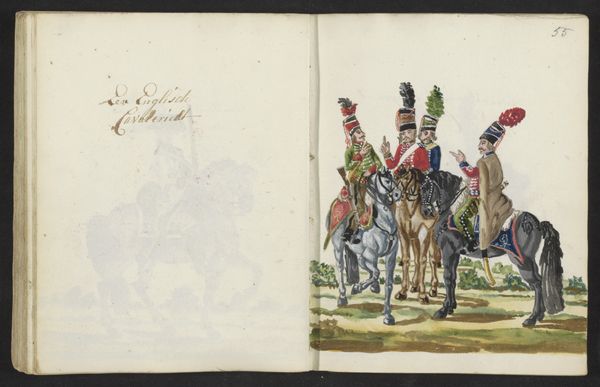
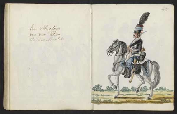
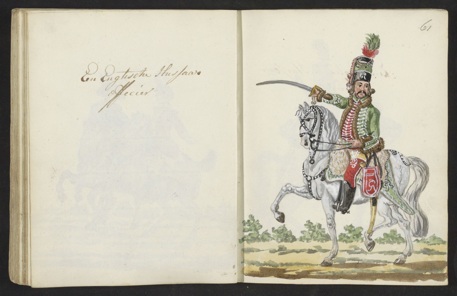
Editor: This drawing, titled "Uniform van Engelse huzaar," which translates to "Uniform of an English Hussar," dates back to 1795-1796. It appears to be made with pencil and coloured pencil, attributed to S.G. Casten. The detail in the uniform is incredible. What immediately stands out to you when you examine it? Curator: The meticulous execution certainly invites close inspection. The interplay of line and color suggests a clear hierarchy of visual elements. Note the relatively muted palette overall, with strategically placed accents of red. Consider how the artist manipulates the medium – pencil and coloured pencil – to delineate form and texture. What does this choice of medium contribute, do you think, to the overall impact? Editor: It gives it a softer, less formal feel than, say, oil paint. More like a study or preparatory sketch. But I’m also curious about the… the page. Why include the facing page? It creates this almost diptych feel. Curator: Precisely. The emptiness on the left becomes charged through its relationship to the figuration on the right. This relationship reinforces the pictorial qualities through a binary of full/empty, providing balance to the artwork through form, as opposed to symmetry. Are there additional shapes in this piece that support a reading based in a pictorial binary? Editor: I notice that the only strong tonal contrast is found in the Hussar's figure - his body - contrasted against the white horse, so they read as one mass; then, that duo contrasts against the emptiness behind. The sword also makes a diagonal that draws one's attention up the otherwise relatively static vertical shapes. The implied perspective from landscape further emphasizes the binary contrast. It almost creates a…stage. Curator: Your observations are astute. The artwork presents an interesting interplay between stillness and implied movement. We are invited to consider how the composition reinforces a pictorial reading, creating emphasis on specific structural properties and creating interest by balancing shapes. Editor: So, looking beyond the subject matter, understanding how the different material properties of pencil are articulated to draw the eye… fascinating. Thanks! Curator: Indeed, seeing is more than just recognizing. The careful deployment of visual grammar offers a richer aesthetic experience.