About this artwork
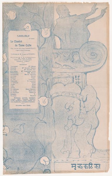
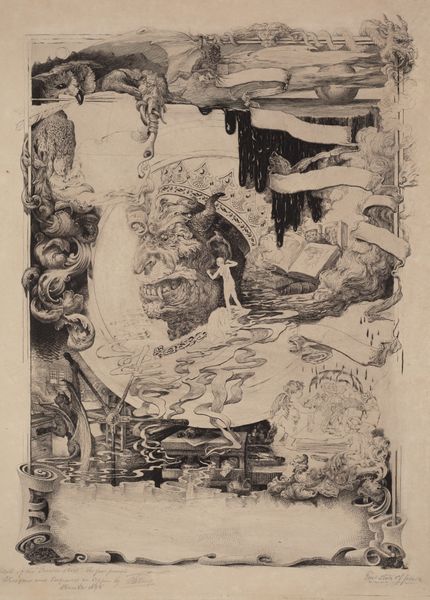
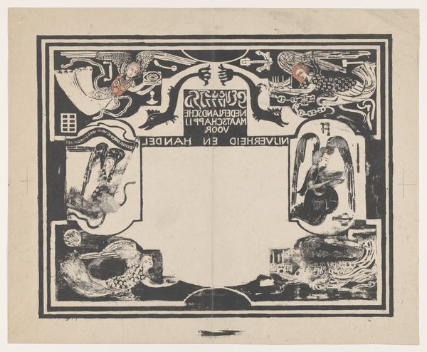
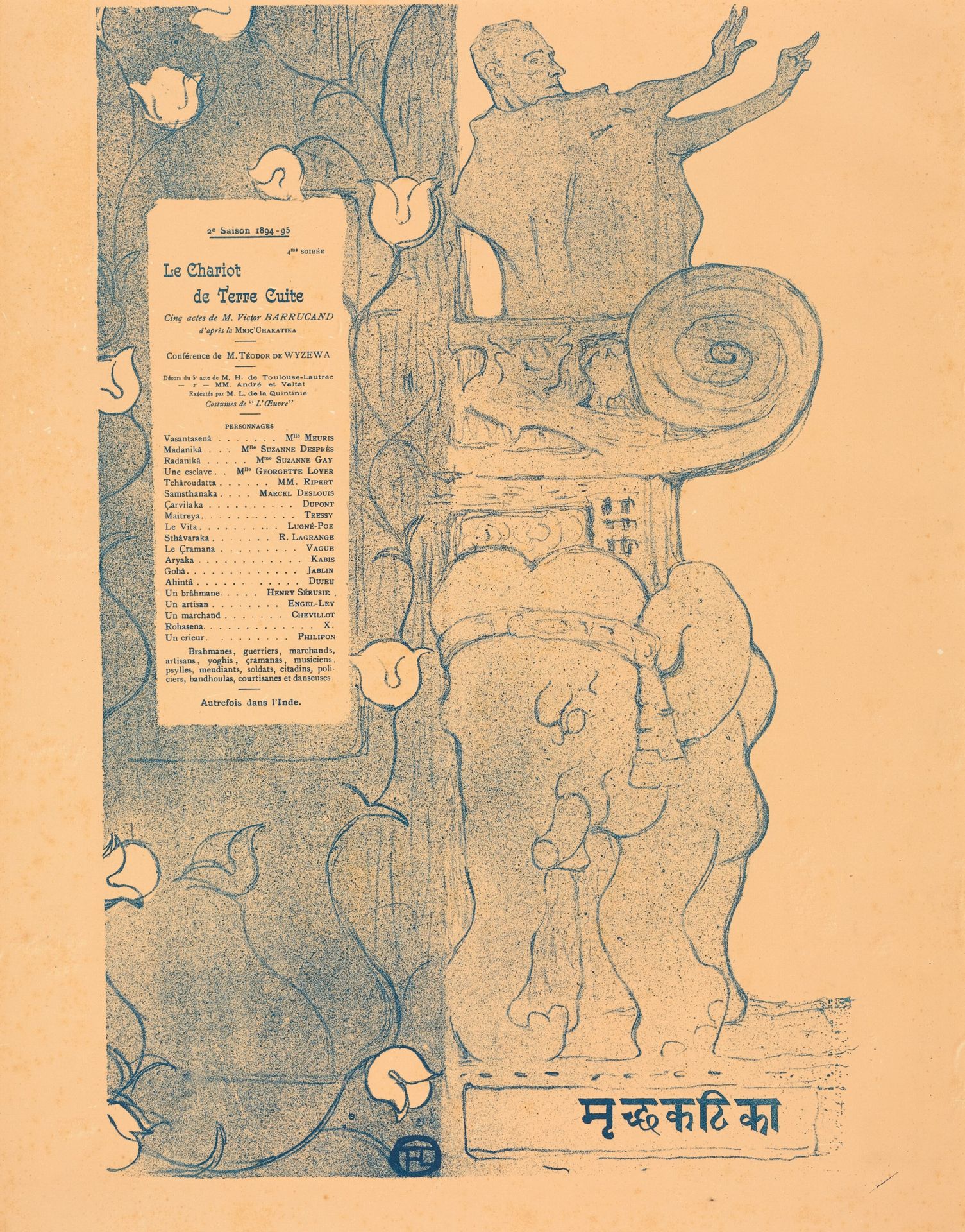
Curator: Let's delve into Henri de Toulouse-Lautrec's 1894 lithograph, "Le Chariot de terre cuite", a captivating poster that really pulls you in. Editor: My immediate response is that of subdued excitement—it’s dreamlike, in monochromatic blue, and exudes a sense of contained energy with these sketched figures and theatrical framing elements. Curator: Precisely! Consider that this wasn’t simply “fine art,” but a functional poster, printed in multiples, advertising a stage production. Its purpose was dissemination and the consumption of theatrical spectacle. Editor: True. Visually, Lautrec presents a fascinating composition: text on the left, architectural and figural elements on the right—leading the eye from the details of the performance to the essence of the drama depicted. I wonder about the tension between graphic design and the more artistic or 'fine art' touches? Curator: An excellent question. Toulouse-Lautrec here masterfully merges the craft of poster design with the art of capturing the emotional impact of the play, likely reflecting the booming poster production industry during this period. The very use of lithography allowed for rapid reproduction, turning art into an accessible commodity. Editor: You can really sense that accessibility in his economical use of line. He reduces the figures—the orator, the elephants—to their essential forms. It emphasizes a raw energy but, to my eyes, at the expense of depth and realism. Curator: While a realist would have fussed about precise replication, Toulouse-Lautrec highlights the drama. It's about how he captured movement and atmosphere that serves its true purpose to the play. His ability to blend utility with a distinctive aesthetic really emphasizes its appeal for broad consumption. Editor: That said, focusing solely on his craft is limiting. I'm more inclined to examine his bold use of graphic elements in constructing an image that speaks to a modern and popular sensibility. It moves away from traditional illustration or painting in favor of emphasizing more abstract semiotic strategies. Curator: Absolutely, viewing this work in context—its role as advertising, its production process as lithography—broadens our understanding of what art *was*, and what it *could be*, in the late 19th century, with its increasing overlap between commercial and fine art. Editor: I concur. Appreciating its blend of styles is what allows one to view “Le Chariot de terre cuite" not just as a print, but also as an integral statement about fin-de-siecle Parisian artistic identity.
Le Chariot de terre cuite
1894
Artwork details
- Medium
- lithograph, print, poster
- Copyright
- National Gallery of Art: CC0 1.0
Tags
Comments
Share your thoughts
About this artwork
Curator: Let's delve into Henri de Toulouse-Lautrec's 1894 lithograph, "Le Chariot de terre cuite", a captivating poster that really pulls you in. Editor: My immediate response is that of subdued excitement—it’s dreamlike, in monochromatic blue, and exudes a sense of contained energy with these sketched figures and theatrical framing elements. Curator: Precisely! Consider that this wasn’t simply “fine art,” but a functional poster, printed in multiples, advertising a stage production. Its purpose was dissemination and the consumption of theatrical spectacle. Editor: True. Visually, Lautrec presents a fascinating composition: text on the left, architectural and figural elements on the right—leading the eye from the details of the performance to the essence of the drama depicted. I wonder about the tension between graphic design and the more artistic or 'fine art' touches? Curator: An excellent question. Toulouse-Lautrec here masterfully merges the craft of poster design with the art of capturing the emotional impact of the play, likely reflecting the booming poster production industry during this period. The very use of lithography allowed for rapid reproduction, turning art into an accessible commodity. Editor: You can really sense that accessibility in his economical use of line. He reduces the figures—the orator, the elephants—to their essential forms. It emphasizes a raw energy but, to my eyes, at the expense of depth and realism. Curator: While a realist would have fussed about precise replication, Toulouse-Lautrec highlights the drama. It's about how he captured movement and atmosphere that serves its true purpose to the play. His ability to blend utility with a distinctive aesthetic really emphasizes its appeal for broad consumption. Editor: That said, focusing solely on his craft is limiting. I'm more inclined to examine his bold use of graphic elements in constructing an image that speaks to a modern and popular sensibility. It moves away from traditional illustration or painting in favor of emphasizing more abstract semiotic strategies. Curator: Absolutely, viewing this work in context—its role as advertising, its production process as lithography—broadens our understanding of what art *was*, and what it *could be*, in the late 19th century, with its increasing overlap between commercial and fine art. Editor: I concur. Appreciating its blend of styles is what allows one to view “Le Chariot de terre cuite" not just as a print, but also as an integral statement about fin-de-siecle Parisian artistic identity.
Comments
Share your thoughts