drawing, print, paper, ink, woodcut
#
drawing
#
medieval
# print
#
paper
#
ink
#
woodcut
#
northern-renaissance
#
watercolor
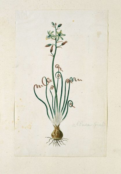
Dimensions: 7 5/8 x 4 3/4 in. (19.37 x 12.07 cm) (image)
Copyright: Public Domain
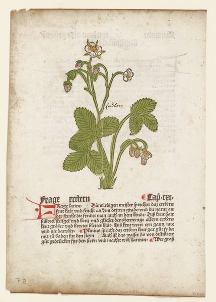
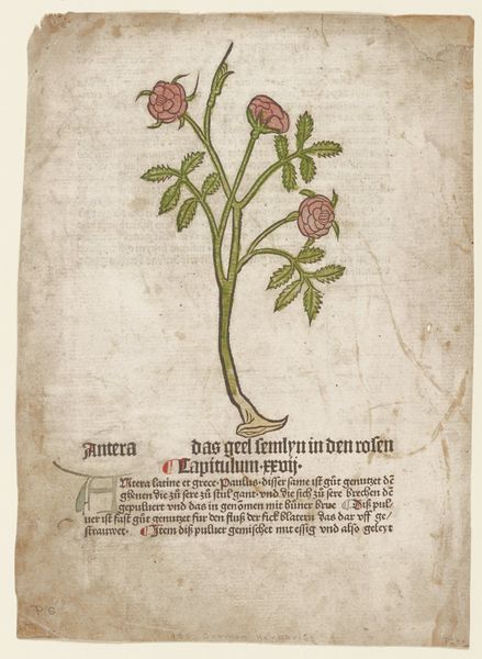
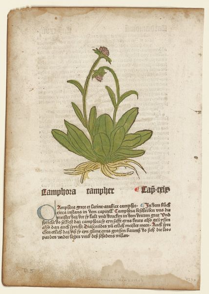
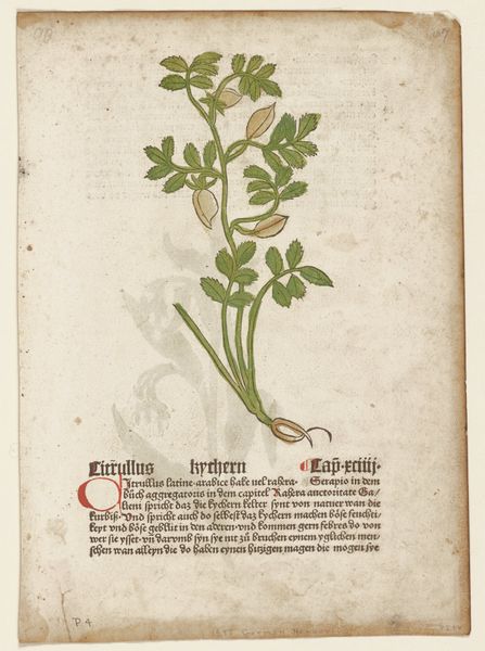
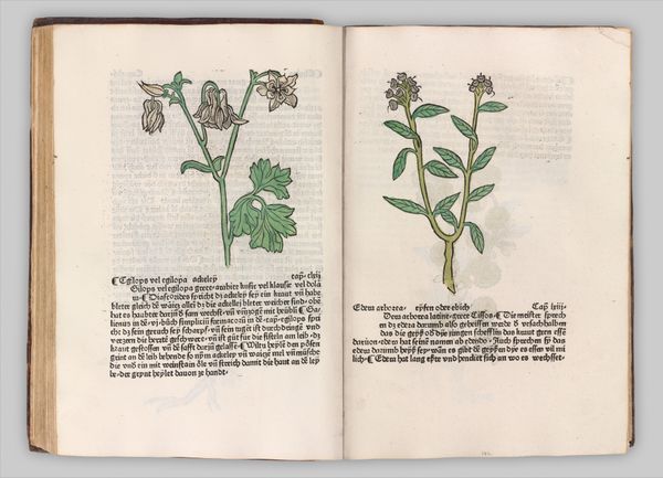
Editor: Here we have a page from Johannes de Cuba's "Viola," created around 1485. It's a woodcut print with ink and what appears to be watercolor on paper, and it's currently housed at the Minneapolis Institute of Art. The initial impression is its stylized simplicity. The shapes are so defined. How do you interpret this work, looking at it from an art expert’s perspective? Curator: Well, if we analyze it purely in formal terms, consider the flatness of the image, indicative of a Northern Renaissance woodcut. The colour palette is quite limited, almost austere, using blue and green primarily to distinguish the floral image from the heavy block of text. Look at how the composition employs the block of German text as a structural element in relationship with the botanical illustration. Editor: So, the text isn’t just content, it's part of the form itself? Curator: Precisely. The image above acts as a visual header and exemplifies unity and balance by drawing the viewer in and distributing visual weight to hold their gaze across the entire sheet. The controlled lines define the leaves and flower petals with minimal shading that contributes to the design. Editor: The linework does feel deliberate, almost like a graphic. Curator: Indeed. Note also the relationship between positive and negative space. While the text dominates, the illustration occupies just enough area to create a balance and ensure it does not become subservient. It leads the eye to decode its message and draws one into the page's verbal discourse. What else catches your eye? Editor: The coloring! It feels… intentional, yet almost naive. There’s a contrast between the sophisticated line work and the flat blocks of color. Curator: I find that the application underscores the piece's construction as a carefully wrought assembly of components: textual, illustrative, and chromatic. It avoids any illusion of depth, reaffirming the essence of the picture plane. Editor: It's fascinating to consider the layers of intention, especially concerning the interaction between text and image. Curator: Yes. De Cuba created a unified artwork and the interplay between image, line, and space gives the artwork its unique dynamic.
Comments
No comments
Be the first to comment and join the conversation on the ultimate creative platform.
More like this