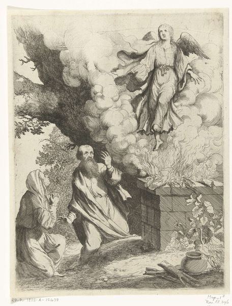
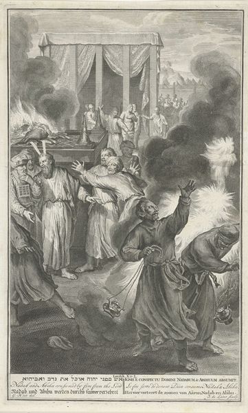
print, engraving
#
baroque
# print
#
pen illustration
#
old engraving style
#
caricature
#
figuration
#
line
#
history-painting
#
engraving
Dimensions: height 163 mm, width 126 mm
Copyright: Rijks Museum: Open Domain
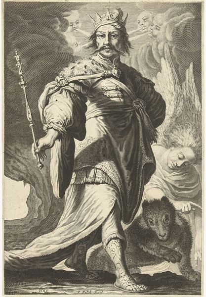
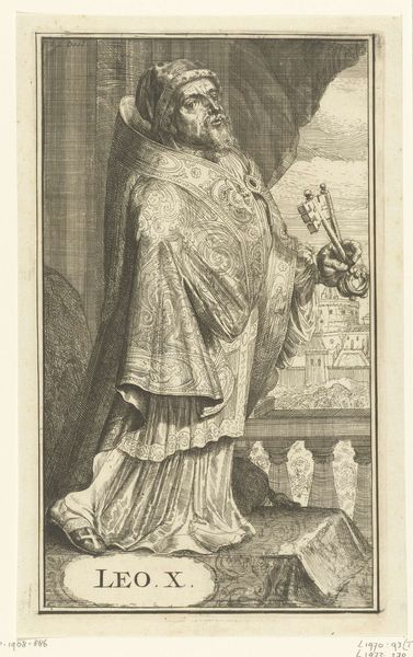
Curator: Alright, let’s dive into this intricate engraving. This is Romeyn de Hooghe’s "Sibille van Cumae," created in 1688. What strikes you initially about this baroque piece? Editor: What first catches my eye is the contrast – all that fire and fury with the slightly grotesque figure in the center. The overall feel is rather dramatic, theatrical even! It has a kind of nervous energy. Curator: Indeed! De Hooghe masterfully employs line work here to generate that dynamism. The frenzied scratchiness around the flames compared with the rigid lines defining architectural forms give the impression of chaotic destiny meeting with societal order. Tell me more on what’s striking your eye? Editor: It's a tad bit nightmarish actually. Almost like a scene from a fever dream. Maybe it's the old engraving style combined with that almost caricature-like representation of the sibyl, her gaze, and overall stance. Are we looking at the rejection of something, perhaps knowledge or tradition, symbolized by the burning books? Curator: That's very insightful. Historically, the Cumaean Sibyl was a priestess, known for selling prophecies written on oak leaves to Tarquinius Priscus, a king of Rome. Tradition holds he found her prices too steep, scorned the idea and the sibyl then burnt several of the nine books. This image is powerful in conveying the fleeting nature of fate and the consequences of disregard. Editor: Fascinating! And looking at it through a formalist lens, the composition also plays a crucial role. The figure is almost emerging from the shadows. I guess that the positioning and contrast effectively separate the profane act of burning from other actions happening around it.. it also accentuates the central drama! It feels symbolic. Curator: Exactly. Note also the almost obsessive attention to detail – from the texture of the drapery to the subtle facial expressions. Even the lines indicating smoke from the fire contribute to a layered narrative, wouldn’t you say? It's all very thoughtfully constructed to deliver a singular, thought-provoking impression. Editor: It certainly is! Looking closely now, I also admire how the linear work emphasizes her hand and outstretched palm. Its as if she’s stopping the prophecy she just got rid of... So I guess I feel much better versed to look for this again! Thank you so much!
Comments
No comments
Be the first to comment and join the conversation on the ultimate creative platform.
More like this