drawing, paper, typography, ink
#
drawing
#
art-nouveau
#
paper
#
typography
#
ink
#
geometric
#
decorative-art
Dimensions: height 250 mm, width 325 mm
Copyright: Rijks Museum: Open Domain
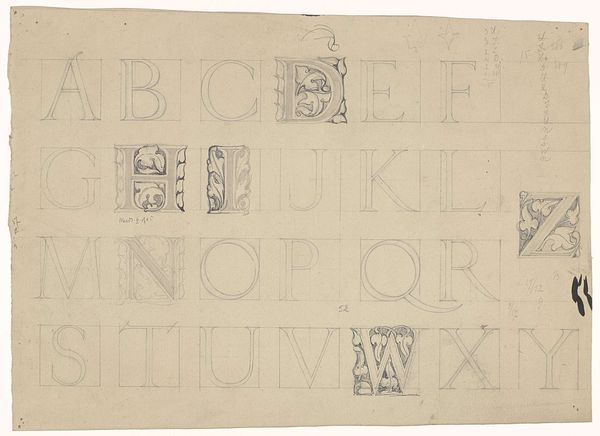
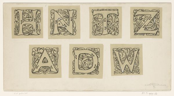
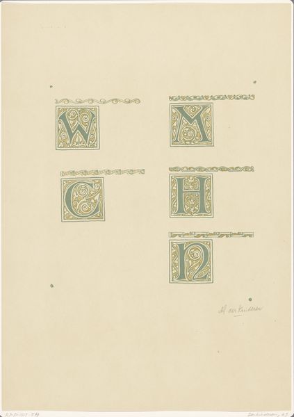
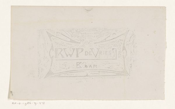
Reinier Willem Petrus de Vries made these letter designs on paper. There's a real formal elegance to this piece, yet the off-white of the paper and the drawn grid showing through, gives it a raw, sketch-like feel. The way the black ink sits on the page has a real presence. You can see the pressure and the movement of the artist's hand. Take for instance the top left V, surrounded by little botanical-looking details and dots. The way that black spreads and pools slightly gives it a tactile quality, like you could reach out and touch it. There’s a dialogue happening between utility and ornamentation, design and art. The influence of someone like William Morris comes to mind, with that same balance of function and decoration. ultimately, these designs aren’t about answers but about sparking curiosity.
Comments
No comments
Be the first to comment and join the conversation on the ultimate creative platform.
More like this