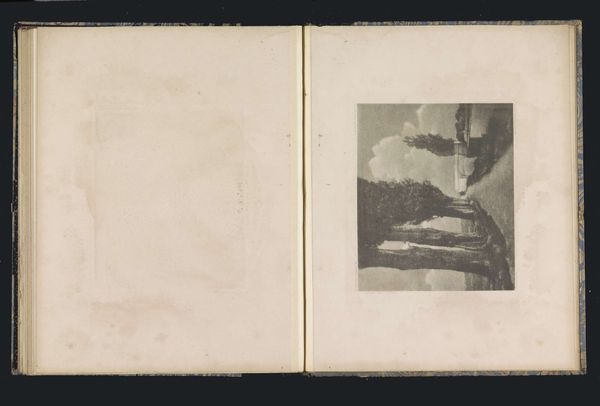
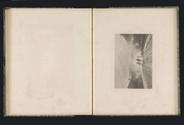
photography, gelatin-silver-print
#
aged paper
#
pale palette
#
pictorialism
#
ink paper printed
#
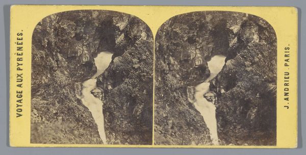
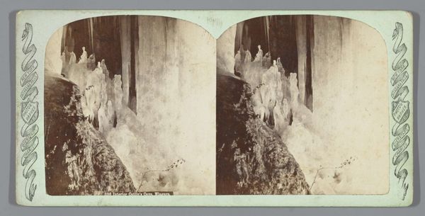
landscape
#
waterfall
#
white palette
#
photography
#
gelatin-silver-print
#
watercolor
#
realism
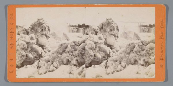
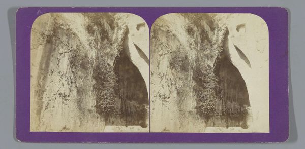
Dimensions: height 86 mm, width 175 mm
Copyright: Rijks Museum: Open Domain
Curator: This captivating stereo card presents "American Falls Seen Through an Ice Arch on Luna Island." Attributed to George E. Curtis, the gelatin-silver print was likely produced between 1866 and 1910. Editor: My immediate impression is that of stark beauty; the contrast between the delicate ice formations and the powerful waterfall is striking. It has an ethereal, almost ghostly quality due to the monochrome palette. Curator: Precisely. The material process is fascinating: Creating a stereo image involved specialized equipment and precise chemical processes to evoke depth. These cards were mass-produced for popular consumption, offering armchair travel experiences in an era of limited mobility, but still it is clearly made to look hand crafted like a watercolor.. Editor: Yes, there's that undeniable tension between the mechanical reproducibility and the romantic vision it presents. Formally, consider the composition; the icy arch frames the falls, drawing the eye into the receding space. The texture of the ice contrasts dramatically with the smooth water. Curator: Right, and let’s think about the workers producing these en masse. They become complicit in not just churning out identical products but propagating an ideological construct where ‘nature’ can be bought and owned by the consumer, commodified even to allow for personal wonder! Editor: But can’t you appreciate that from an aesthetic point, without denying those historical labor conditions that enabled that romantic sentiment in art to persist and spread during the time period through semiotics of popular objects? There's undeniable artistry at play here in balancing depth, contrast, and tone in what appears a flat 2D field. Curator: I suppose; however the societal circumstances cannot just be a side note or something completely dismissed; after all who exactly this kind of images catered towards indicates a very important conversation surrounding consumerism. The act of distribution itself must also become a main interest, more than some individual "artistry," whatever that may mean. Editor: I concede the card serves as both a beautiful composition, regardless of intention but, more importantly as an artifact representing evolving class dynamics surrounding art. Thanks for sharing insights!
Comments
No comments
Be the first to comment and join the conversation on the ultimate creative platform.
More like this