drawing, textile, paper, ink, pen
#
drawing
#
old engraving style
#
hand drawn type
#
textile
#
paper
#
personal sketchbook
#
ink
#
idea generation sketch
#
ink drawing experimentation
#
pen-ink sketch
#
ink colored
#
pen work
#
sketchbook drawing
#
pen
#
sketchbook art
Copyright: Rijks Museum: Open Domain
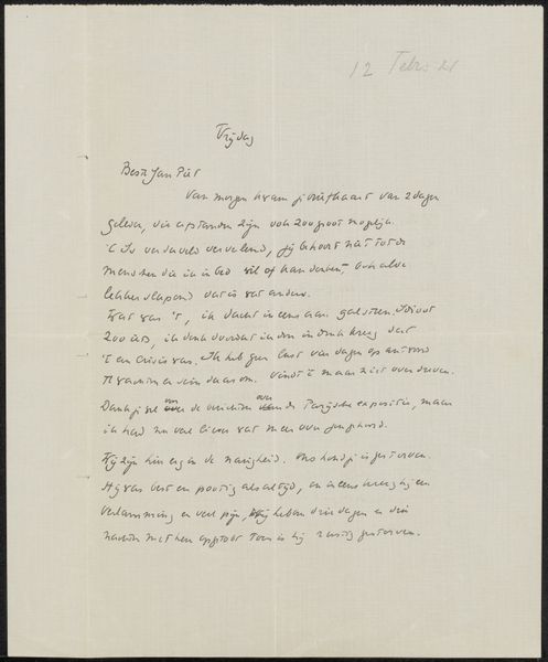
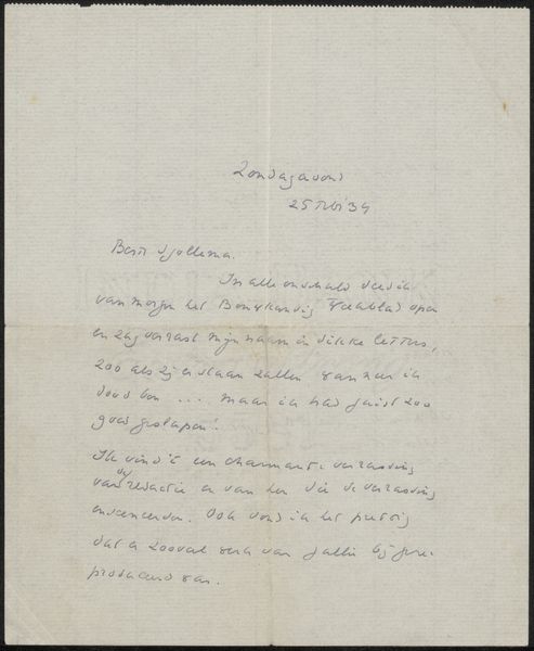
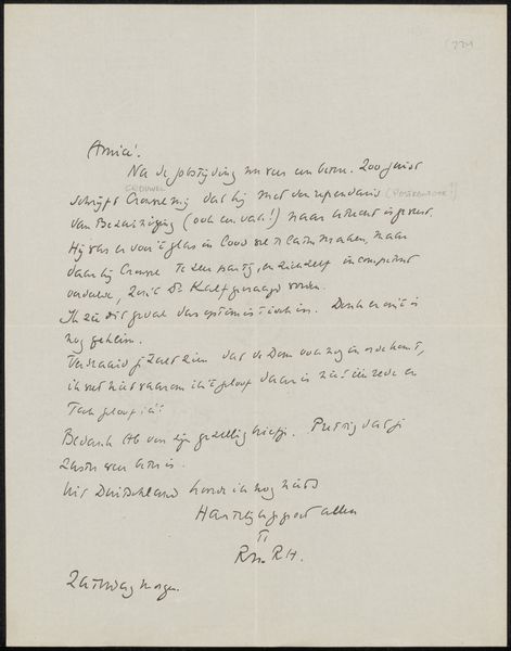
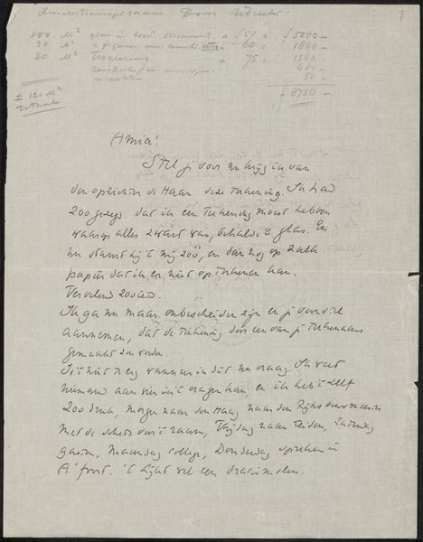
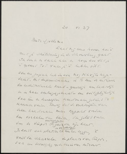
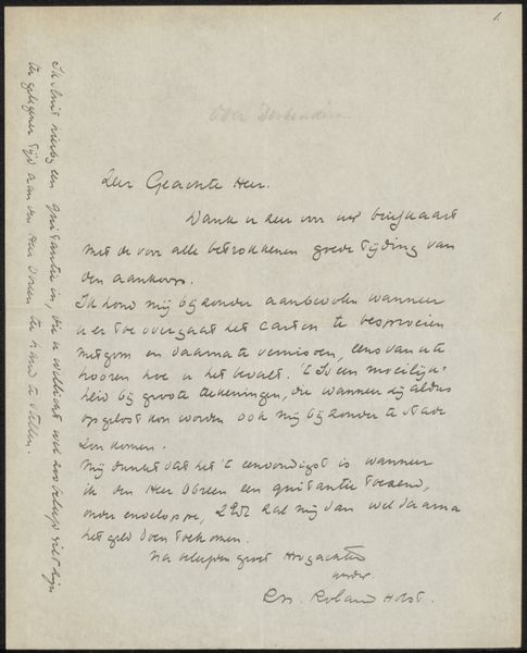
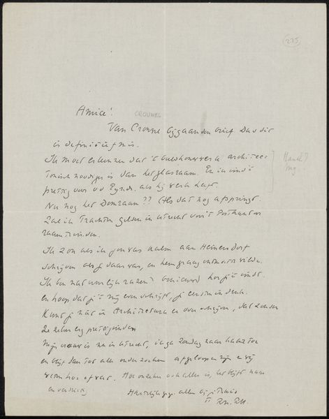
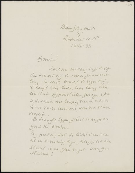
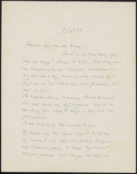
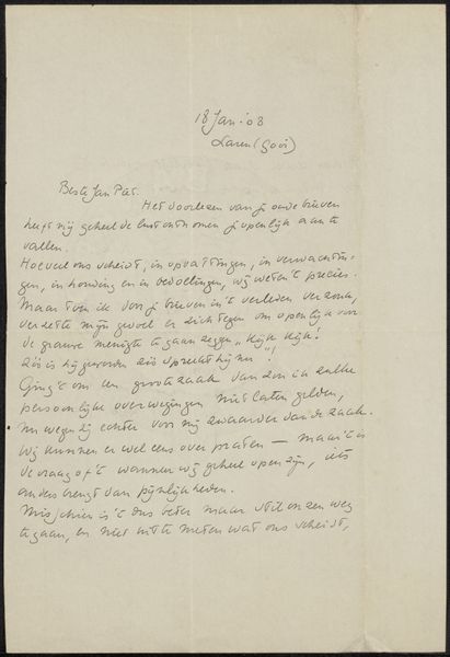
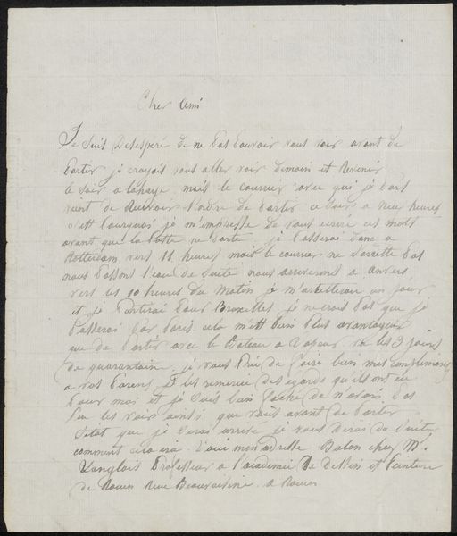
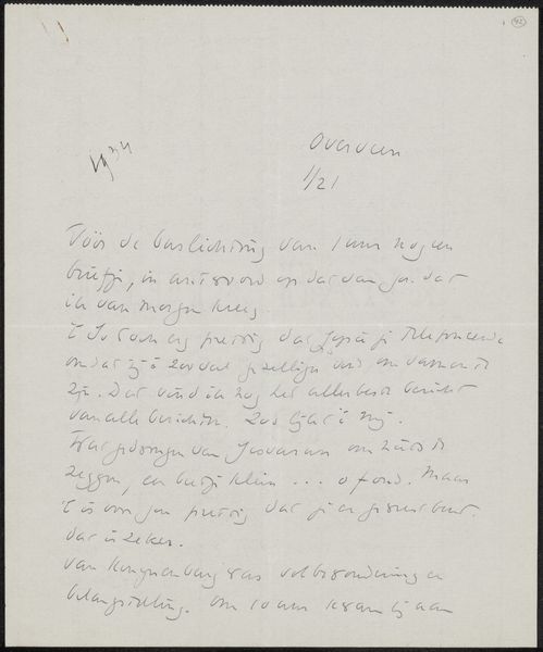
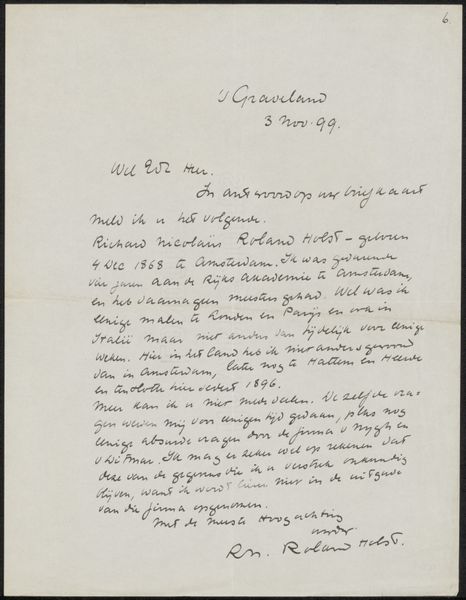
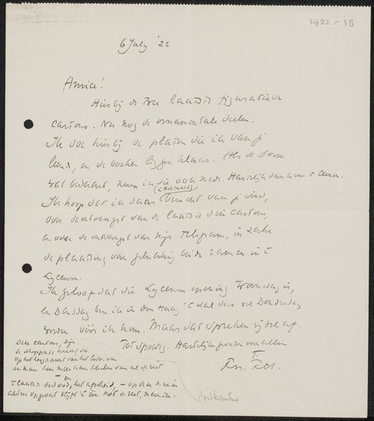
Curator: Here we have Richard Nicolaüs Roland Holst’s "Brief aan Willem Bogtman," dating probably from 1923 to 1926. It's ink on paper. Editor: It feels very personal, almost like peeking into someone's thoughts. The handwritten nature gives it an intimate feel. What catches your eye in terms of its formal elements? Curator: I'm struck by the distribution of text across the page. Note the contrast in densities – clusters of writing interspersed with relatively blank spaces. The artist uses this to create a visual rhythm. How does this compositional choice affect your perception? Editor: It definitely breaks up the text. My eye doesn't just scan it linearly. The placement gives each phrase or idea a sort of visual weight, setting off a contrast between different statements and points. Curator: Precisely. And what about the varying weights and styles of the lettering itself? Consider the semiotic potential within that choice. Editor: It gives an idea of an unfolding thought. As he's working, certain words may carry more significance in one moment than another, changing with the meaning as he sets out the intentions. How can we use that information to read its form in a contemporary manner? Curator: Well, consider that each stroke contributes to a unique visual language, and reflects on the inherent expressive capability present when constructing his intention and design, while adding to the drawing an image of layered meanings with shape, shadow and text all unified. Editor: So it’s not just about legibility, but the pure form of the mark-making itself. I suppose what you could extract is how you read and represent the author and his drawing. Curator: Precisely, leading us to understanding the pure essence of visual thinking in the work of Roland Holst, a very illuminating connection. Editor: I appreciate the idea of reading this not just for content, but also for the very deliberate distribution of visual textures.
Comments
No comments
Be the first to comment and join the conversation on the ultimate creative platform.
