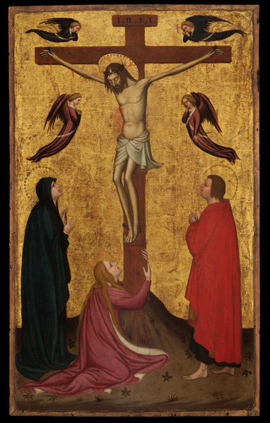
panel, tempera, painting, oil-paint
portrait
medieval
panel
allegory
tempera
painting
oil-paint
figuration
oil painting
history-painting
italian-renaissance
early-renaissance
portrait art
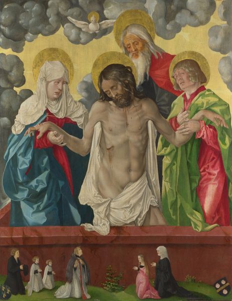
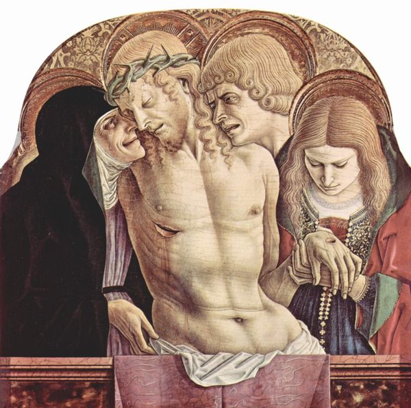
virgin-mary
christ
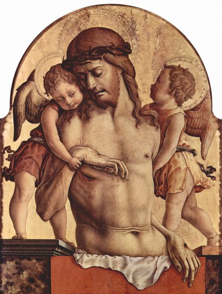
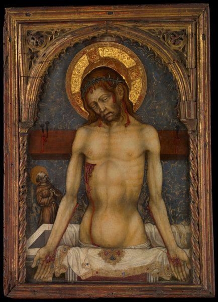
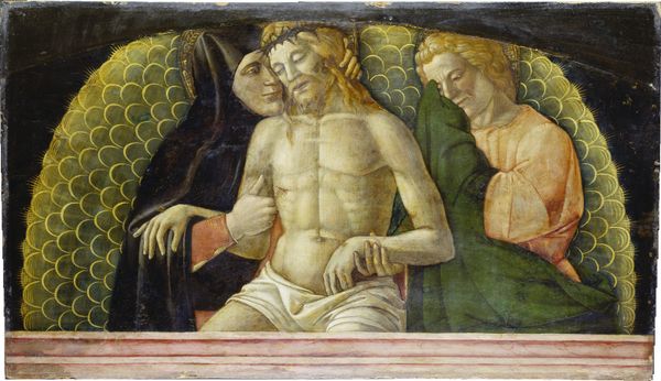
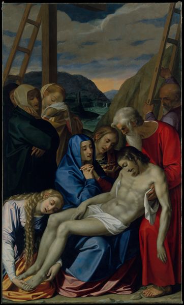
Dimensions: Overall 28 1/4 x 25 3/8 in. (71.8 x 64.5 cm); painted surface 28 x 25 1/8 in. (71.1 x 63.8 cm)
Copyright: Public Domain
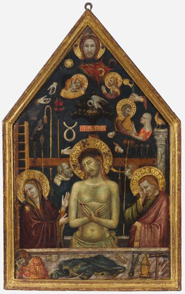
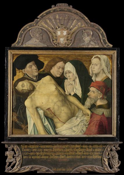
Editor: Here we have Carlo Crivelli’s "Pietà" from 1476, a tempera on panel now at the Met. What immediately strikes me is the raw emotion and almost graphic realism. What do you make of it? Curator: The composition compels close looking. Consider the formal arrangement: the rigid, horizontal line of the tomb set against the curved, almost decorative, gold background. Notice how this division accentuates the space of mourning, contrasting the divine realm implied by the gold and the earthly suffering rendered in the figures. Editor: So it’s about creating a visual division to represent spiritual versus corporeal? Curator: Precisely. The meticulous detail, particularly in Christ’s emaciated form, encourages us to consider the formal qualities of the work. His body, almost angular, becomes a study in line and form. Do you see how the artist uses color to further emphasize this division? Editor: I do. The muted tones of the figures are so different than the gold behind them, drawing the viewer's eye towards the human drama while still being aware of the holy space. Curator: Yes. Now, reflect on the arrangement of the figures. How do their postures and expressions contribute to the painting’s overall formal structure? The rigid verticality creates a rhythm that resolves into the horizontal lamentation. Editor: So the "Pietà" isn't just about religious sentimentality, but is deliberately designed using visual contrasts. I never would have thought to look at it that way! Curator: Formal analysis redirects us from sentiment to the visual rhetoric, allowing the forms themselves to tell the story.
Comments
No comments
Be the first to comment and join the conversation on the ultimate creative platform.