photography
#
studio photography
#
product shot
#
still-life-photography
#
photography
#
product photography
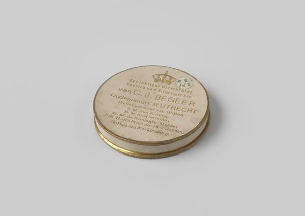
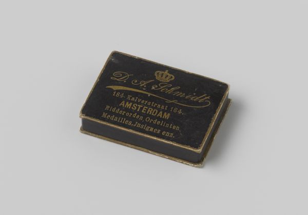
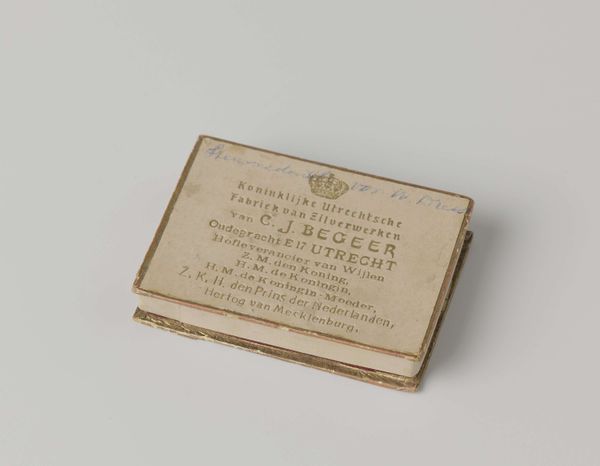
Dimensions: diameter 4.5 cm, depth 1 cm
Copyright: Rijks Museum: Open Domain
This lid for a silver token, by M. Vreugde, looks as though it's made from a kind of off-white cardboard. This sort of material offers a textured surface that catches light in an interesting way, making you want to touch it. The artist has carefully applied simple letterforms, with the lettering in dark ink, contrasted against the light surface. The font is simple, almost utilitarian, with a small crown motif at the top. The text gives the impression of being carefully considered, rather than slapped on. Look closely, and you'll notice slight imperfections in the application, like the uneven spacing between the letters. This connects, for me, with the work of someone like Dieter Roth, who embraced process, and delighted in the accidental. It's not just about what you make, but how you make it, and the traces that making leaves behind. In this way, this lid is a kind of readymade, where the materials used and the way they are put together are just as important as the design itself.
Comments
No comments
Be the first to comment and join the conversation on the ultimate creative platform.
More like this