drawing, pencil
#
pencil drawn
#
drawing
#
toned paper
#
light pencil work
#
shading to add clarity
#
pencil sketch
#
old engraving style
#
pencil drawing
#
pencil
#
limited contrast and shading
#
pencil work
#
academic-art
#
shading experimentation
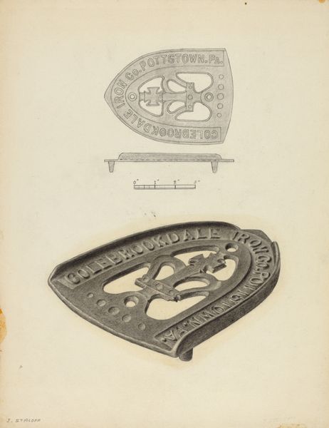
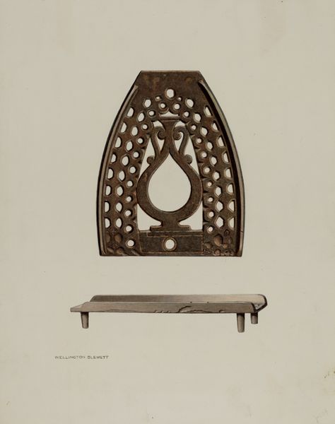
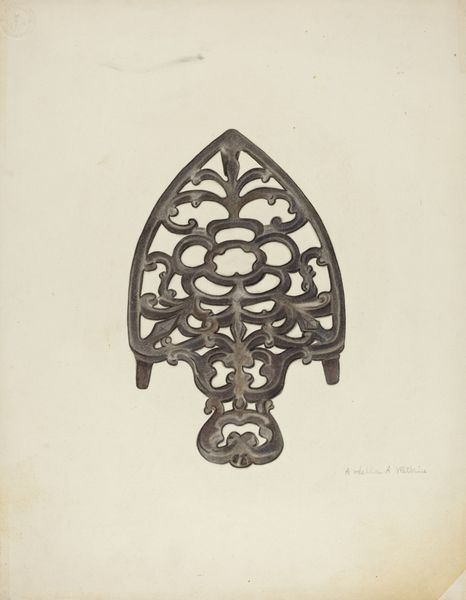
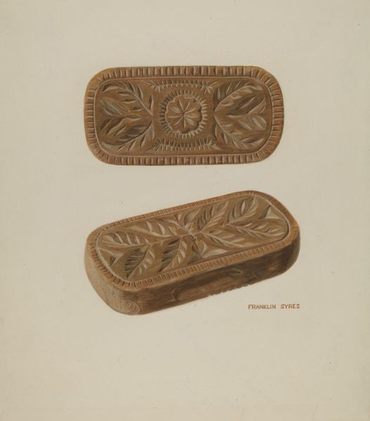
Dimensions: overall: 37 x 33.7 cm (14 9/16 x 13 1/4 in.) Original IAD Object: 5 7/8" long; 4 3/8" wide7/8" high
Copyright: National Gallery of Art: CC0 1.0
Curator: Before us is Milton Bevier's 1939 pencil drawing, "Trivet". Two views are presented: one, a straightforward elevation; the other, an oblique view lending depth. Editor: It strikes me as strangely beautiful, in its simplicity. There’s something about rendering this functional object with such care. The old engraving style gives it a certain dignity, doesn't it? Curator: Indeed. Note the precision in line work, and how the shading expertly delineates form and texture. The subtle tonality of the paper harmonizes perfectly with the medium. Observe the compositional elements—the way the two views interact creates a visual rhythm. Editor: I am compelled by how this work elevates an everyday tool, almost a relic of a past industrial landscape. The Colebrookdale Iron Company, once vital, now captured only in these ghostly pencil lines on toned paper. Consider the labor involved in both the manufacture of the trivet and this rendering of it. It really begs questions about the value we assign to objects and skills. Curator: Precisely, Bevier guides us to consider utilitarian objects with newfound contemplation. See how the choice of medium emphasizes delicacy? The artist is experimenting with shading techniques. It appears quite calculated. Editor: Yet there’s also a trace of the hand, a slight sketchiness. What stories do you think such items tell? Perhaps someone was employed in this type of industry in their own local community. These could easily have personal and poignant meanings beyond the aesthetic appeal of a composition. Curator: I'm convinced Bevier appreciated the beauty in its austere practicality. The cross emblem is clearly a formal feature. And so it invites contemplation about form itself and the nature of our perceptions. Editor: The fact it's drawn rather than, say, photographed also introduces distance, lending it a sort of antique character even when originally drawn in 1939. So, by depicting everyday things this way, we start considering labour, design, utility, but all viewed through an aesthetic sensibility. Curator: A most rewarding way to conclude our insights today. Editor: It really gives a feeling for how artistic intention and cultural artifacts intersect in time.
Comments
No comments
Be the first to comment and join the conversation on the ultimate creative platform.
More like this