drawing, paper, typography, pencil
#
drawing
#
light pencil work
#
art-nouveau
#
shading to add clarity
#
hand drawn type
#
paper
#
personal sketchbook
#
typography
#
idea generation sketch
#
ink drawing experimentation
#
geometric
#
pen-ink sketch
#
pencil
#
line
#
sketchbook drawing
#
decorative-art
#
sketchbook art
#
initial sketch
Copyright: Rijks Museum: Open Domain
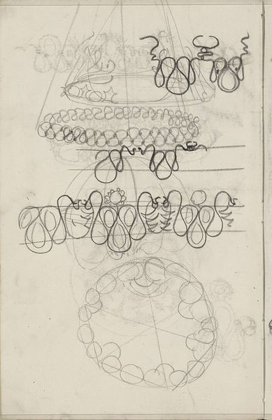
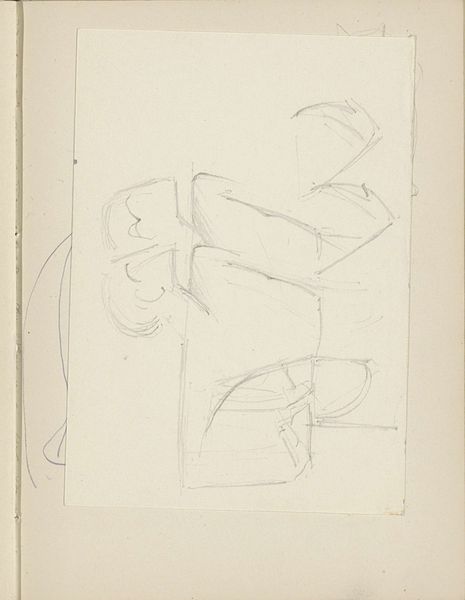
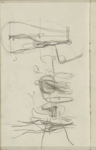
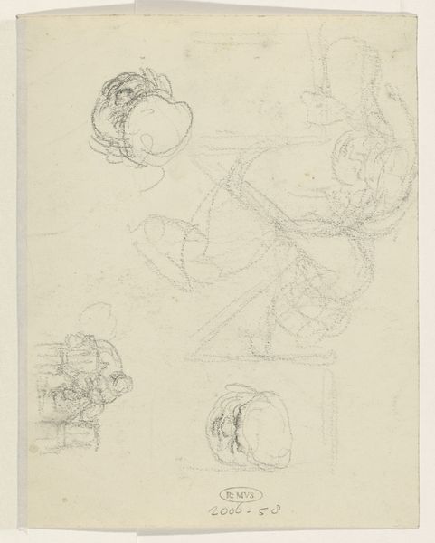
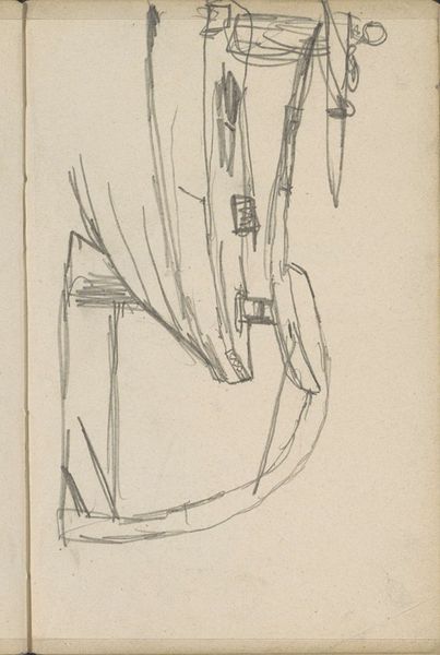
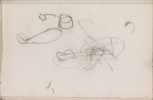
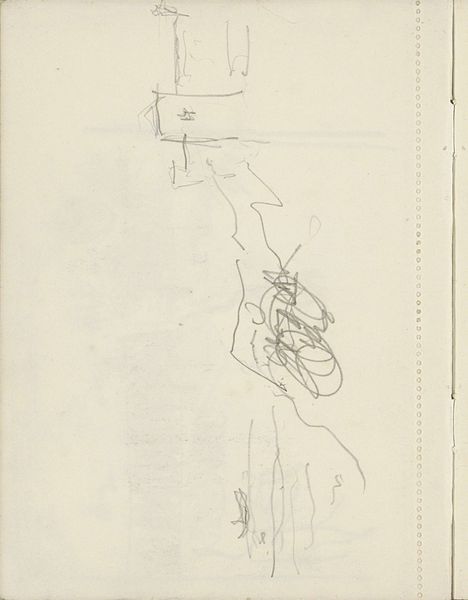
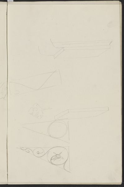
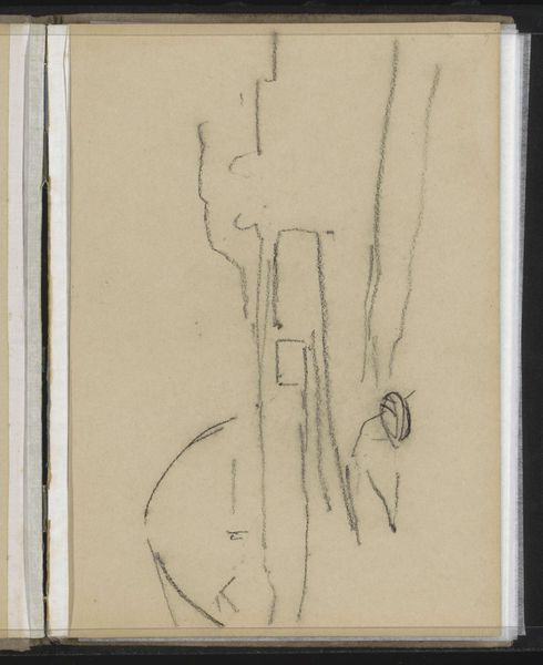
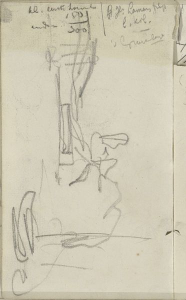
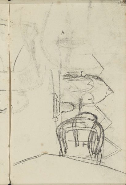
Curator: Look at these delicate pencil sketches, "Ontwerpen voor de letters 'A' en 'D'," or Designs for the letters A and D by Carel Adolph Lion Cachet, circa 1900, part of the decorative arts movement, and on view here at the Rijksmuseum. They offer us a fascinating peek into the artist’s creative process. Editor: My immediate reaction is how light and airy they are! It almost feels as though these letters are being whispered onto the page rather than drawn. What draws your eye first? Curator: I find the Art Nouveau styling of these letterforms very captivating. Look how the traditional structure of the letters 'A' and 'D' melts away, subsumed within curling lines and floral suggestions. You can almost envision them adorning a poster, bookplate, or some other functional art piece. Editor: Absolutely, there's an elegance and fragility inherent to Art Nouveau. But the decision to represent both letters in a geometrically constrained setting feels interesting. Why do you think Lion Cachet does this? Curator: By enclosing the letters, it seems Lion Cachet aims to harmonize his inspiration from nature and human symbolic convention. Notice also that these are just two of 26 characters, of infinite possibilities. We cannot see the entire system but we perceive its limitations from just these examples. Editor: I see what you mean. This resonates powerfully today when design relies so heavily on pre-packaged software. In his time, did Lion Cachet’s style also feel like an act of rebellion? Curator: It absolutely would have been perceived that way. Within these stylized forms and their geometric restraints, we can feel a sense of social reform bubbling in contrast with his classical subjects and techniques. To choose graphic design over a history painting would have represented a deliberate focus on popular culture and the future. Editor: And to your point, it suggests the power embedded in these letters which might, as text, contain anything and mean everything. I wonder what causes Lion Cachet to consider those tensions in this design? The image really makes me consider my own relationship with symbolic alphabets and digital interfaces today. Curator: It's rewarding to consider Lion Cachet's letter designs as objects for the future rather than the past. The possibilities for art objects which create cultural resonance are revealed in these preliminary explorations. Editor: Yes, I leave considering just how little of this visual history remains, given that sketchbooks are the most delicate cultural documents.
Comments
No comments
Be the first to comment and join the conversation on the ultimate creative platform.
More like this