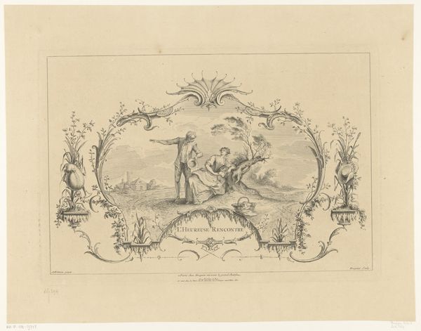
graphic-art, lithograph, print
#
portrait
#
graphic-art
#
lithograph
# print
#
romanticism
#
genre-painting
#
decorative-art
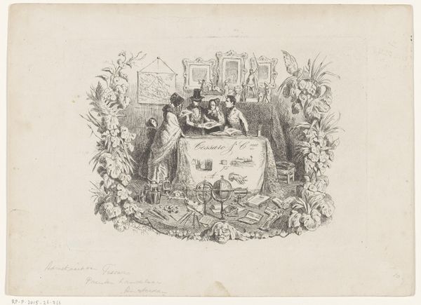
Dimensions: height 105 mm, width 143 mm
Copyright: Rijks Museum: Open Domain
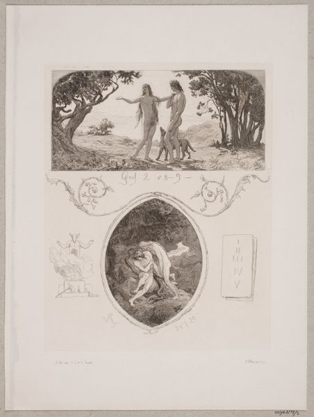
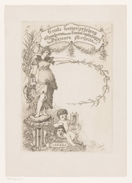
Curator: Here we have a business card dating from around 1850, "Visitekaartje van drukkerij Pierre Vande Steene te Gent," a lithograph created by the printer himself. It’s quite a charming piece, wouldn't you say? Editor: Charming and a bit cheeky, yes! The figure in yellow trousers strikes me as almost cartoonish against that explosion of flowers. There’s a vibrancy here, especially considering it was a humble business card. Curator: It is interesting to see the overt visual strategies implemented to legitimize the printer's shop. Look at how the ornate wreath around the figure in trousers frames the company details. The Romantic style merges with the practical purpose of advertising, a fascinating intersection. Editor: Absolutely. It suggests the status of printing and lithography at the time. The design elements, those meticulously rendered florals and that playful figure, point to a skilled artisan class establishing its value within a changing market. It is not just a lithograph but an attempt to show the care and detail applied in all levels of their work. Curator: Considering lithography was a relatively new technology at this point, the card also demonstrates a printer’s pride in their craft, and is meant to signal high quality. Also, there is the connection between industry and imagery to explore further. I imagine Vande Steene wanted this to circulate within specific networks, both business and social. Editor: Precisely! The fact that he placed himself so prominently within this decorative framework suggests a careful consideration of persona. His presence—rendered through the very techniques he's advertising—becomes a part of the brand itself. And note that it isn’t a likeness in portrait but through gesture! The social currency embedded within this single print is fascinating. Curator: Thinking about its materiality, the choice of lithography over other methods would also reflect Vande Steene's intention to signal modernity and refinement in his techniques to prospective clients, an intersection of the industrial and social spheres that makes it so compelling to examine. Editor: Yes, it’s an object that speaks volumes about the values, aspirations, and socio-economic forces shaping 19th-century Gent. And I find the figure really brings everything to life.
Comments
No comments
Be the first to comment and join the conversation on the ultimate creative platform.
More like this