drawing, paper, pencil
#
portrait
#
drawing
#
paper
#
geometric
#
pencil
#
modernism
Dimensions: height 76 mm, width 176 mm
Copyright: Rijks Museum: Open Domain
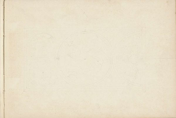
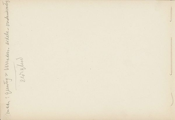
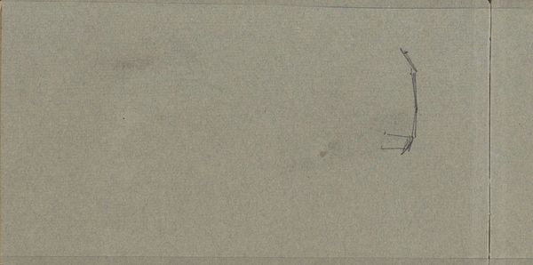
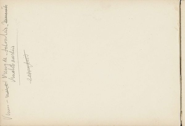
Reinier Willem Petrus de Vries made this design on graph paper for a memorial book for Hilversum, sometime between 1924 and his death in 1952. What strikes me is the use of the grid; it’s so matter-of-fact, so unpretentious, and yet it's the foundation for the whole piece. It feels honest, like the artist is laying bare his process, not trying to hide anything. The pencil on paper gives it an immediacy, a sense of being in the artist's studio, watching him work through his ideas. The lettering itself is precise. Notice how the letters of "Wilhelmina Koningin der Nederlanden" fill their little boxes, but they also seem to strain against them. It's a balance between control and freedom, a push and pull. I'm reminded of Agnes Martin's work with grids, but where she used color and texture to create a sense of depth, here the simplicity is stark. Like Sol LeWitt, the concept becomes the work. It highlights how even the most basic elements can be incredibly powerful, as if Vries is showing us the architecture of thought itself.
Comments
No comments
Be the first to comment and join the conversation on the ultimate creative platform.
More like this