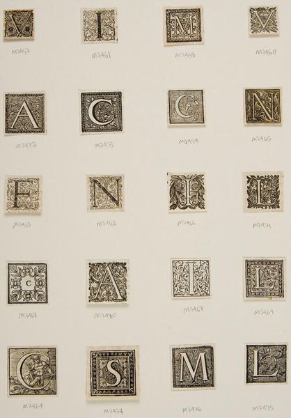
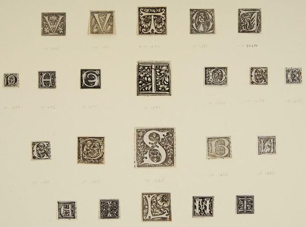
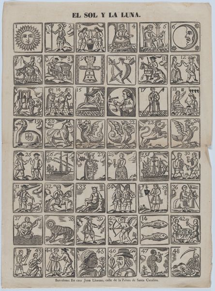
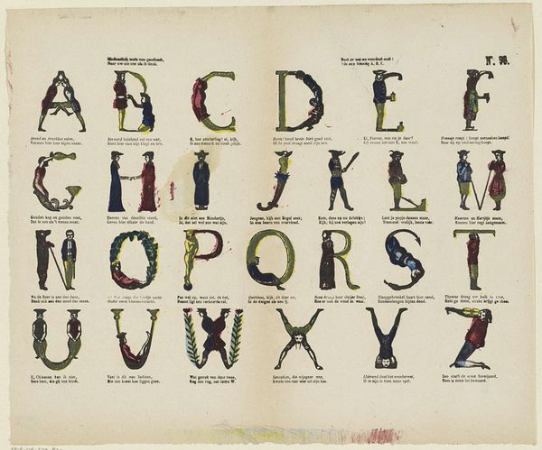
graphic-art, print, typography, engraving
#
graphic-art
# print
#
old engraving style
#
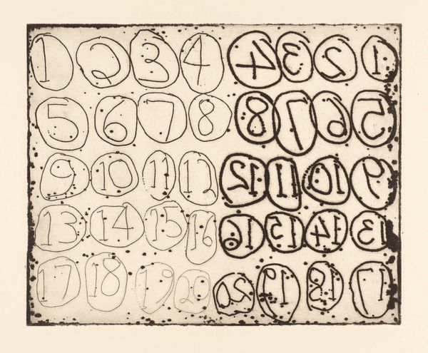
hand drawn type
#
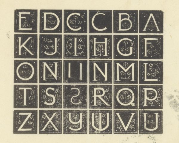
typography
#
engraving
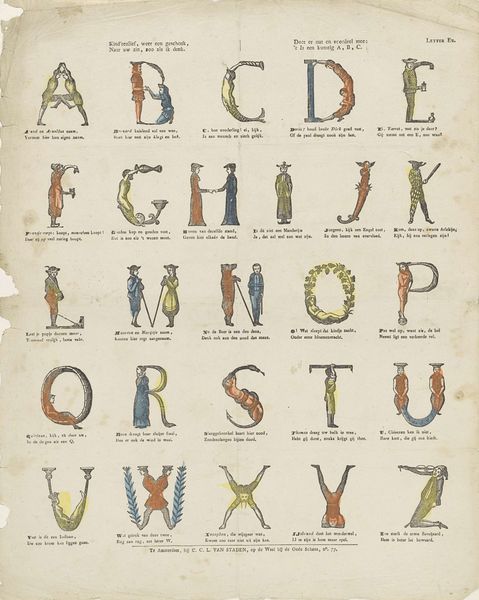
Dimensions: height 344 mm, width 412 mm
Copyright: Rijks Museum: Open Domain
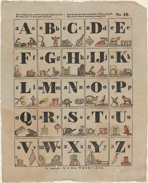
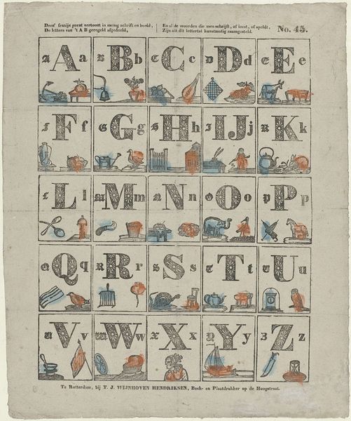
Curator: Looking at this work, the first thing that jumps out at me is how wonderfully old school and charming the individual drawings appear. Each letter, paired with an associated illustration... it’s delightful. Editor: Yes, it’s a tangible piece of material culture. This print, titled "Alfabet," was produced between 1828 and 1913, according to the museum records here at the Rijksmuseum. Attributed to Erve Wijsmuller, it’s a really interesting example of early mass-produced educational material. The hand-drawn nature of the letters and pictures also make the work compelling, but are these depictions all the result of engraving techniques? Curator: Precisely. The print's clarity indicates skill and deliberate artistry regarding these engravings. Also, note the paper's visible texture; it contrasts with the sharpness of the lines in each image. This speaks volumes about production, paper-making, and how the tools used impacted the visual outcome. Editor: Thinking about its social function, you can imagine a classroom using it to impart literacy skills within a particular ideological framework of education. I wonder what kinds of social values these images of things, like say the "Grenadier", subtly tried to communicate to young viewers, you know? Whose interests were really being served by it? Curator: Good point! I do love that “Kaas” and “Worst” both make an appearance! Also consider the labour: this wasn’t some simple photocopied sheet; these were crafted engravings on specific types of paper that demanded real technical expertise and significant human effort. Someone meticulously created these images, and many hands touched this object from conception to consumption. It's so much more than just an alphabet. Editor: Exactly. Examining this from a contemporary standpoint is important because it allows us to acknowledge both its artistic value and the underlying forces present when it was first made and consumed. Curator: So next time you look at some old alphabet print, think about the labour that went into its manufacture. And think about accessibility; I suspect it wasn’t free, and certainly wasn’t universally distributed. Editor: Indeed. Its simplicity belies a network of meanings linked to class, power and historical pedagogy, which all factor into its enduring historical significance.
Comments
No comments
Be the first to comment and join the conversation on the ultimate creative platform.
More like this