Copyright: CC0 1.0
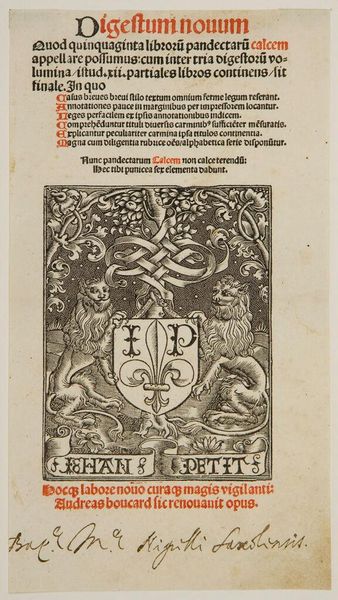
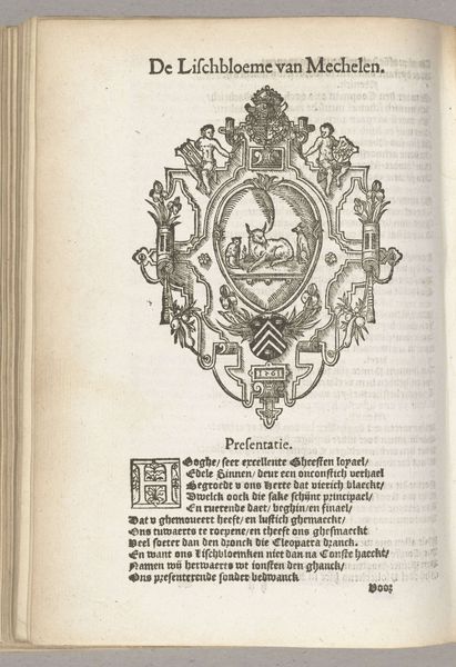
Editor: Here we have the "Border and Printer's Mark of François Regnault," by an anonymous artist. It's quite striking in its detail and the contrast of light and shadow. What design elements stand out to you? Curator: The work exhibits a fascinating interplay between the organic and the geometric. Note the symmetrical arrangement of the lions flanking the central emblem, juxtaposed with the more fluid, naturalistic rendering of the vines. The texture created by the density of line is quite compelling. Editor: I see what you mean about the symmetry and texture. Did the artist intend to create a specific mood with the stark black and white contrast? Curator: Undoubtedly. The deliberate use of chiaroscuro enhances the symbolic weight of the imagery, drawing the eye to specific points within the overall composition. It’s a very deliberate application of visual language. Editor: That's really insightful. I hadn't considered how the contrast contributes to the meaning. Curator: Indeed, analyzing the interplay of these formal elements unlocks deeper understanding. It's about how, not just what, is depicted.
Comments
No comments
Be the first to comment and join the conversation on the ultimate creative platform.
More like this