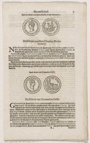
Titelpagina voor: Georgius Chanler, Nieuwe keysers chronica ofte Gheschicht-boeck van alle de roomsche, soo oostersche als westersche keyseren, 1617 1617
0:00
0:00
graphic-art, print, typography, woodcut, engraving
#
graphic-art
#
dutch-golden-age
# print
#
typography
#
woodcut
#
engraving
Dimensions: height 317 mm, width 195 mm
Copyright: Rijks Museum: Open Domain
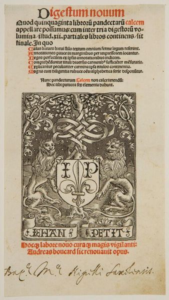
Curator: We're looking at the title page of "Nieuwe Keysers Chronica," or "New Emperors Chronicle," from 1617. Adolph Roelofsz Rutgers is credited as the artist for this Dutch Golden Age piece. It's a fascinating example of early modern printing, combining woodcut and engraving techniques. Editor: Immediately, the ornate borders and dense typography strike me as imposing. There's a strong sense of authority communicated, visually representing power and the weight of history, especially with the seals displayed towards the bottom. Curator: Absolutely. The chronicle itself details the history of Roman emperors, both Eastern and Western, and Rutgers' design emphasizes that historical weight. Notice how the shields are prominently displayed as signifiers of lineage, power and dynastic succession. These heraldic symbols link the text to specific families and territories. Editor: That makes me wonder, who was this text speaking to? Was it targeting a scholarly audience or appealing to a broader readership interested in displays of imperial authority during a time of shifting power structures in Europe? Curator: Good question! The publisher, Nicolaes Biestkens, was based in Amsterdam, a rising center of commerce and intellectual activity. So, while appealing to learned readers, these chronicles also served the rising merchant class. It was important to position themselves in the history of the time in order to achieve political clout. Editor: It’s a really intriguing combination. There is both a pursuit for verifiable knowledge with a conscious embrace of the symbols of power. These seals seem almost aspirational. It is meant to project authority as well as signal something deeper, rooted in tradition and even the divine right of kings. Curator: It highlights the visual rhetoric of early modern books. Rutgers and Biestkens were actively constructing a sense of historical continuity and legitimacy. These are some of the themes being captured during the rise of the Dutch Republic and how new, and traditional ways of asserting power existed together. Editor: Studying this artwork today brings an awareness to the way histories were actively produced through careful use of images, text, and strategic printing. Curator: Agreed. It makes you realize how complex even seemingly straightforward historical documents can be and encourages a deeper questioning about how history itself is presented and received.
Comments
No comments
Be the first to comment and join the conversation on the ultimate creative platform.
More like this