Dimensions: sheet: 51.12 × 57.15 cm (20 1/8 × 22 1/2 in.)
Copyright: National Gallery of Art: CC0 1.0
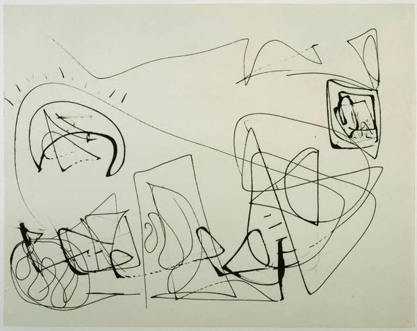
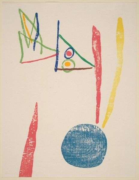
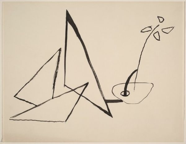
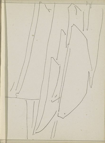
Editor: This is an Untitled drawing by Keith Sonnier, created in 1972. It's deceptively simple—just a series of lines and shapes. It feels very sparse and open. What stands out to you, what elements of its composition are most significant? Curator: Consider the tension between line and plane. The drawing engages primarily with line; each exists as its own entity in conversation with adjacent linear forms. Note the drawing’s placement on the page, activating and reifying negative space. We could say, then, that the negative space has the weight of a compositional object. What do you think this tension accomplishes in the overall aesthetic effect? Editor: It's interesting how the lines almost float, not really defining anything concrete but creating this sense of space. I guess the simplicity makes you focus more on the relationships between those individual lines and the space itself. Does the limited color palette add something to your reading? Curator: Yes, the sparing use of color—a touch of blue, green, and red—heightens their impact. Instead of depicting surface qualities, the lines assert the materiality of the paper, each colour and tonal variation marking the physical relationship between paper and pigment. Can we consider that these simple relations evoke emotions? Editor: Perhaps! It does have a very calming and contemplative effect. Thanks, this was a completely fresh reading of the artwork for me, much more than simple lines. Curator: I am gratified to hear that. Exploring the formal components has deepened my perspective as well.
Comments
No comments
Be the first to comment and join the conversation on the ultimate creative platform.