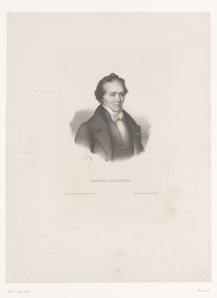
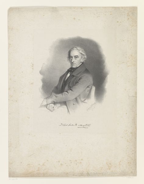
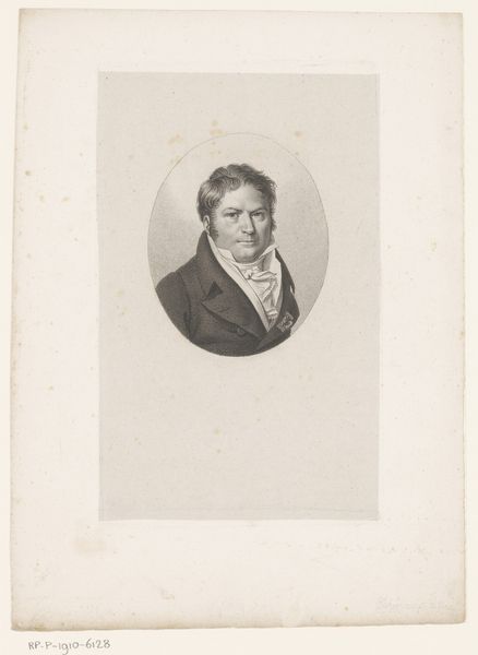
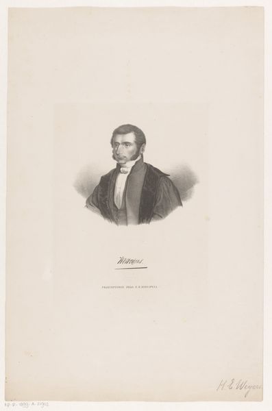
drawing, graphite
portrait
drawing
neoclacissism
graphite
history-painting
Dimensions: height 299 mm, width 234 mm
Copyright: Rijks Museum: Open Domain
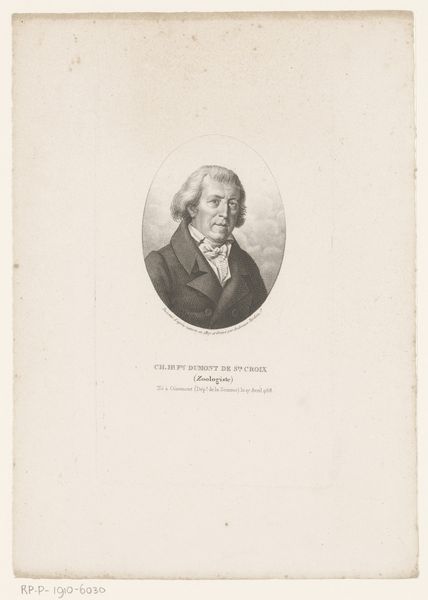
Editor: So, here we have a graphite drawing, *Portret van Karel van Poucke*, dating back to 1822, by Guillaume Philidor Van den Burggraaff. The soft lines and the way he seems to emerge from this cloud… It gives me a somewhat dreamlike, nostalgic feeling. What captures your attention in this portrait? Curator: Dreamlike, yes! Perhaps because portraits of this era often feel so stoic, even confrontational. I see someone intentionally placed amongst a swirling graphite cloud - an odd space that feels simultaneously intimate and otherworldly. Does this man preside over reality, or float within a self-contemplative paradise? Are we seeing the real Karel, or the artist’s impression? What do *you* think it communicates? Editor: Well, the inscription indicates he was quite the stateman… and I'd assumed this ethereal background to be an artistic, rather than biographical, touch. You think it tells us more than that? Curator: Maybe. Artists often play with symbolism, conscious or otherwise. The neo-classical style favored clear lines and order. So, why the deliberate softness here? Is it softening the edges of a powerful man, perhaps humanizing him? Or is this romantic inclination all Van den Burggraaff? The inscription becomes like a stone around this portraits neck. Funny isn’t it, how a ‘label’ can both inform and confine the art that carries it. Editor: Interesting! It gives a whole new dimension to how I perceived it. What began as an atmospheric choice suddenly seems riddled with contradictions. Thanks for this insight! Curator: Art always challenges, and sometimes delightfully frustrates our assumptions. A true joy!
Comments
No comments
Be the first to comment and join the conversation on the ultimate creative platform.