drawing, paper, ink
#
drawing
#
paper
#
ink
#
post-impressionism
Copyright: Rijks Museum: Open Domain
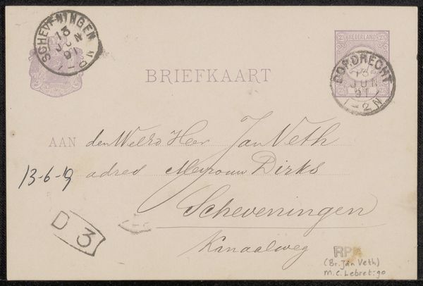
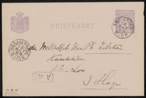
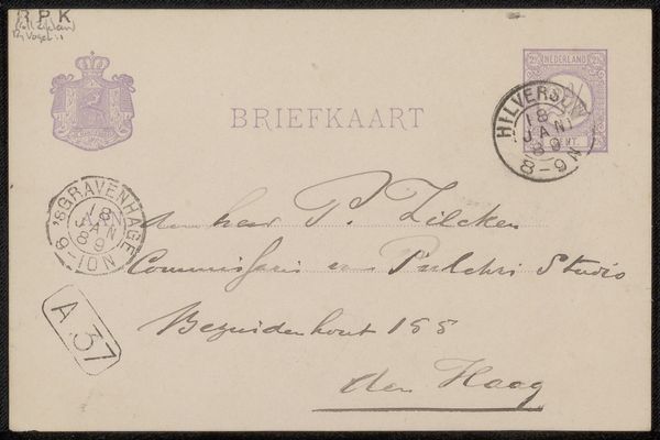
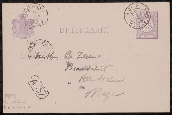
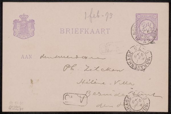
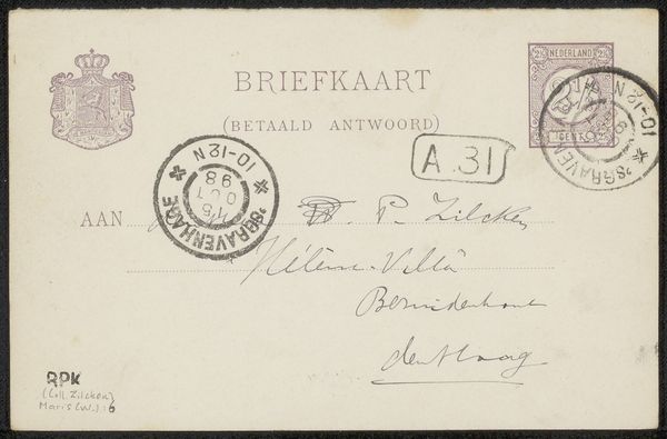
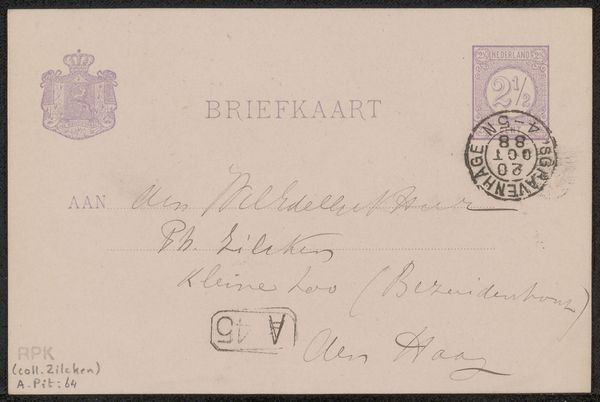
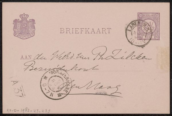
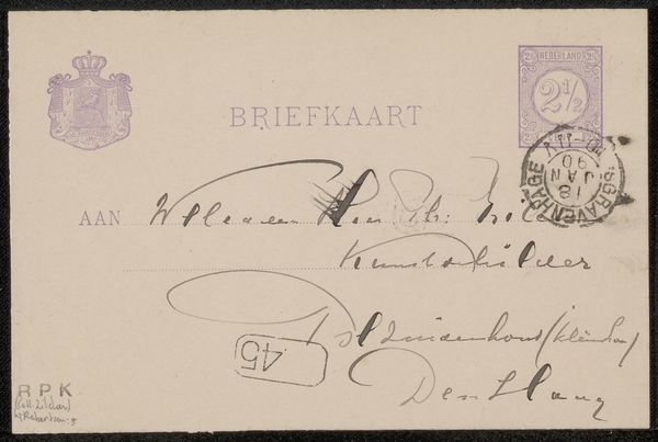
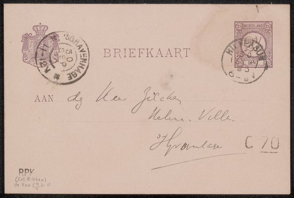
Editor: We’re looking at "Briefkaart aan Frans Buffa en Zonen," a postcard, potentially from 1889, crafted by Jozef Israëls. It’s ink on paper. What strikes me immediately is how fragile and intimate it feels, a little piece of history you could hold in your hand. What catches your eye about this piece? Curator: You know, it whispers of a bygone era, doesn’t it? I love that the ordinary—a simple correspondence—becomes art. See the postmarks? Amsterdam, The Hague. Imagine Israëls penning a quick hello. It feels like a tangible connection to his world. It also makes me think of the postal system becoming really affordable, really opening up communications in a more democratic manner. Does the address "Kalverstraat" resonate with you? Editor: Not particularly. Curator: Ah, it was—and still is—a bustling street in Amsterdam, like a Fifth Avenue or Oxford Street. To me it suggests the artist had just been running some errands! He was a popular guy and may have dashed this off really quickly! Now consider Frans Buffa – they were well-known art dealers. Editor: So, maybe a note about a potential sale, or an invitation? Curator: Perhaps! The beauty is, we can only guess. It's like glimpsing a snippet of a conversation. The ink itself seems to tell a story, doesn’t it? Kind of faded in some spots – aged. Each mark feels deeply intentional. Editor: That's true. I hadn't thought about it as a peek into a daily routine. It definitely personalizes the whole experience. I won’t just chuck postcards away from now on. Thanks! Curator: Wonderful.
Comments
No comments
Be the first to comment and join the conversation on the ultimate creative platform.
More like this