print, photography, albumen-print
#
portrait
#
aged paper
#
toned paper
#
homemade paper
# print
#
old engraving style
#
photography
#
personal sketchbook
#
hand-drawn typeface
#
thick font
#
history-painting
#
golden font
#
albumen-print
#
historical font
#
columned text
Dimensions: height 115 mm, width 89 mm
Copyright: Rijks Museum: Open Domain
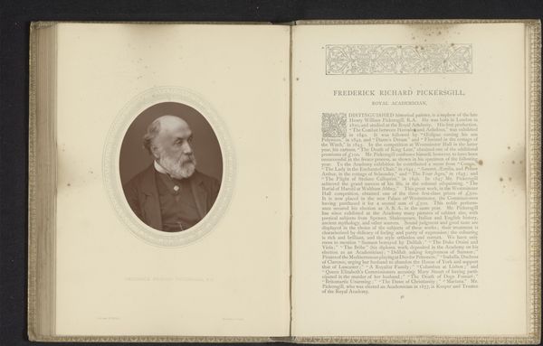
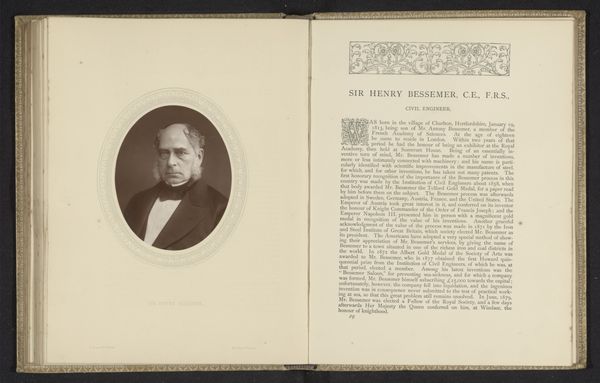
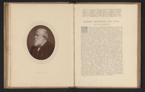
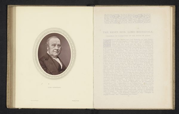
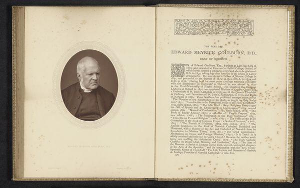
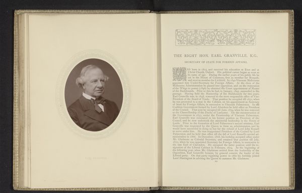
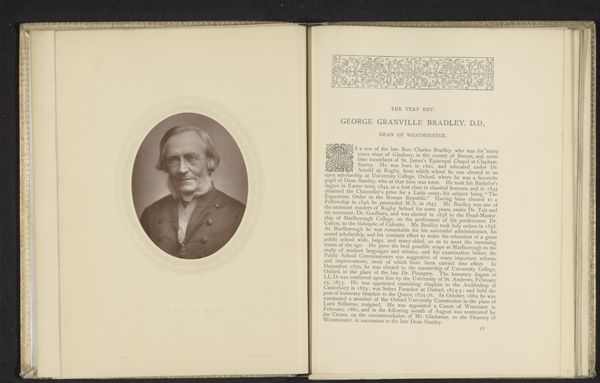
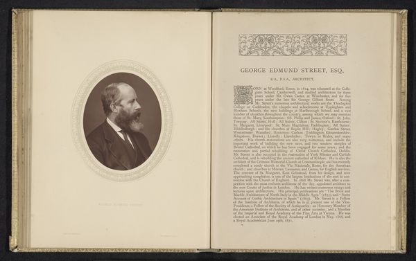
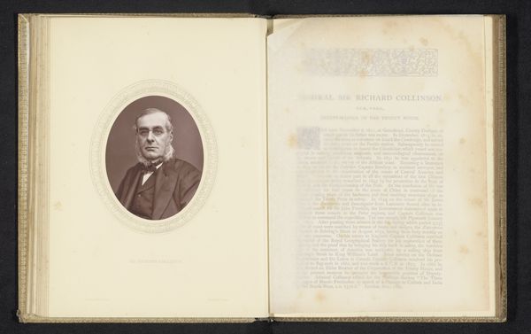
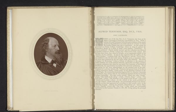
Editor: Here we have a portrait of Sir Fitzroy Kelly, Lord Chief Baron of the Exchequer, created before 1880 by Lock & Whitfield, an albumen print displayed in an open book. The aged paper and the sepia tones give it a sense of history and gravitas. How do you interpret the imagery presented here? Curator: Notice how the albumen print is meticulously placed opposite a dense block of text, within a book itself adorned with decorative elements. This presentation elevates the subject beyond a mere likeness. It's a deliberate act of enshrining Kelly within the visual and textual landscape of his time. It's cultural memory being actively constructed. Editor: So it's more than just a portrait? What would a contemporary audience feel upon viewing this? Curator: Consider the intended audience: likely those within legal or aristocratic circles, familiar with the weight of lineage and legacy. The facing text details Kelly's accomplishments, the font choice projects authority, and that stylized embellishment on the book pages mirrors illuminated manuscripts and ancient family seals, symbolizing a visual continuity with Britain's rich past. Editor: So the choice to include the biographical text, plus the print, elevates Kelly. Do you think the design adds to or detracts from the subject's presence? Curator: Both. It serves to legitimize him, tethering his image to a visual rhetoric of power. Yet, the photographic realism of his face offers a certain intimacy and authenticity, grounding the idealized presentation. What do you make of his direct gaze? Editor: It's compelling. It looks stern and stately, but framed within the design, there's also something fragile about him, perhaps amplified by the age of the print itself. I hadn’t noticed the subtle complexities of how images accumulate meanings and weight across time until now. Curator: Precisely. This work exemplifies how photographic portraits can embody, and ultimately shape, cultural memory. It also reminds us of the stories told through font choices and paper age!
Comments
No comments
Be the first to comment and join the conversation on the ultimate creative platform.
