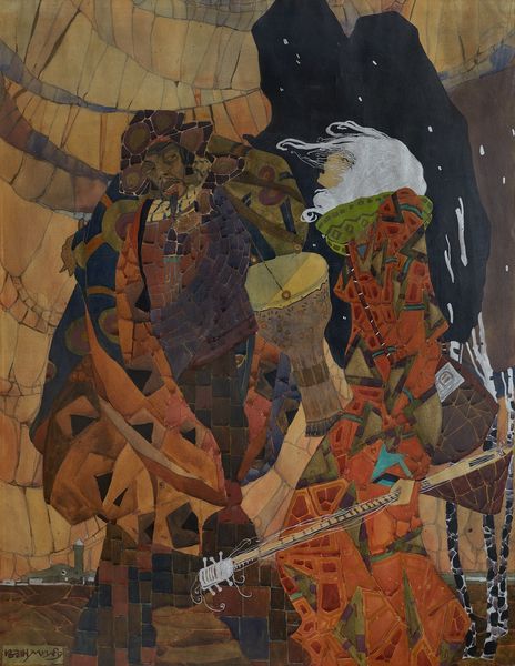
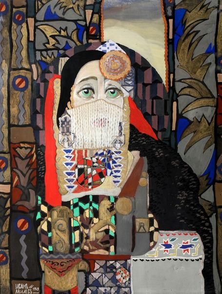
mosaic, mixed-media, tempera, painting, oil-paint, acrylic-paint, watercolor, mural
#
portrait
#
mosaic
#
mixed-media
#
art-nouveau
#
water colours
#
vienna-secession
#
tempera
#
painting
#
oil-paint
#
acrylic-paint
#
figuration
#
oil painting
#
watercolor
#
symbolism
#
genre-painting
#
history-painting
#
nude
#
mural
#
watercolor
Copyright: Public Domain: Artvee
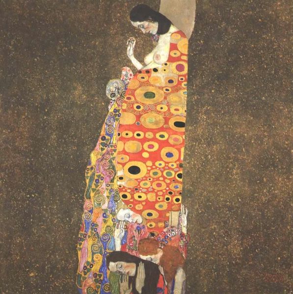
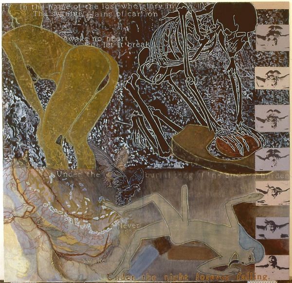
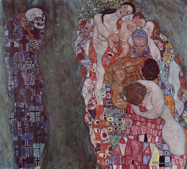
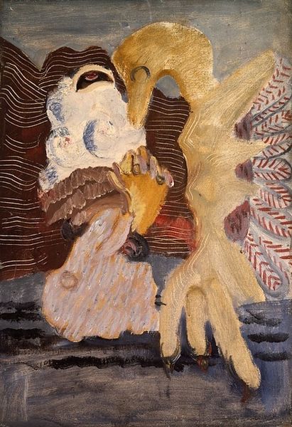
Editor: We are looking at a section of Gustav Klimt's "Beethovenfries; Die feindlichen Gewalten," or "The Hostile Powers" painted in 1901 using mixed media, including mosaic. This piece has a palpable sense of opposing forces, quite a visual feast. What structural elements strike you first? Curator: Immediately, it's the stark juxtaposition of textures. Note the smoothness of the figures on the left contrasted against the frenetic energy of the background. Klimt orchestrates this drama using a strategic deployment of pattern and line. Editor: So, it is almost a graphic representation of clashing ideals. But are there elements creating some kind of compositional unity? Curator: Precisely. Notice the echoing curvilinear forms throughout, binding the diverse elements. The serpent motif, for example, reappears subtly in various sections, creating visual harmony amidst the chaos. Consider the color palette as well: How does Klimt utilize gold to establish visual relationships? Editor: It seems to tie figures and monstrous forms. Gold appears, also, in otherwise discordant color areas. Curator: Yes, acting as a binding agent across the composition. And how might we read the vertical orientation of the canvas, segmented as it is, within a framework of contrasting energies? Editor: Well, now that you mention it, it seems that the more hostile, chaotic side weighs down more serene images with softer colorations. So, there is a hierarchical sense of spatial organization there! I’m starting to see Klimt's technique is an intentional commentary itself. Curator: Indeed. By deconstructing the visual grammar, we begin to understand how meaning is generated not only through symbolism, but through the pure act of structuring visual experience. Editor: Thanks! I hadn't considered just how significant the arrangements of forms contribute to conveying the work's intended message!
Comments
No comments
Be the first to comment and join the conversation on the ultimate creative platform.
More like this